What is Data Visualization in Python?
In this blog, we’ll explore the basics of data visualization in Python, its benefits, and how it can help you make better decisions based on data-driven insights. So, buckle up and get ready to unleash the power of Python for data visualization!
- Introduction to Data Visualization in Python
- Python Data Visualization Libraries
- Data Visualization in Python using Matplotlib
- Python Libraries for Data Visualization
- How to Visualize Data in Python
- Visualization of CSV Data by Python
- Visualization of TSV Data by Python
- Data Visualization Projects in Python
- Best Practices for Data Visualization in Python
- Conclusion
Watch this Data Analytics Course video to learn more about its concepts:
{
“@context”: “https://schema.org”,
“@type”: “VideoObject”,
“name”: “Data Analytics Course | Data Analytics For Beginners | Data Analytics Training | Intellipaat”,
“description”: “What is Data Visualization in Python?”,
“thumbnailUrl”: “https://img.youtube.com/vi/HqT54t87g1g/hqdefault.jpg”,
“uploadDate”: “2023-07-11T08:00:00+08:00”,
“publisher”: {
“@type”: “Organization”,
“name”: “Intellipaat Software Solutions Pvt Ltd”,
“logo”: {
“@type”: “ImageObject”,
“url”: “https://intellipaat.com/blog/wp-content/themes/intellipaat-blog-new/images/logo.png”,
“width”: 124,
“height”: 43
}
},
“embedUrl”: “https://www.youtube.com/embed/HqT54t87g1g”
}
Introduction to Data Visualization in Python
Data visualization is an essential part of data analysis since it helps display complex data clearly and clearly. Python is a popular programming language with many data visualization packages to construct visually attractive data visualizations.
- Data visualization refers to the act of graphically representing data and information. It helps data analysts, scientists, and commercial decision-makers in understanding complex data and observing patterns or trends.
- Python is a robust programming language that is popular in data analysis. It provides a diverse set of data visualization libraries that enable users to generate high-quality data visualizations. Some of the popular libraries are- Matplotlib, Seaborn, Plotly, and Bokeh. These libraries provide many plots and charts, such as line plots, scatter plots, bar plots, histograms, heat maps, and more.
- Data visualization in Python provides the capacity to spot patterns or trends in data, explain complicated data to non-technical stakeholders, and make data-driven decisions based on visualization insights.
- Python is a popular choice for data visualization due to its ease of use, flexibility, and ability to work with various data formats. It is also an open-source language, which means that users can contribute to the development of data visualization libraries and tools.
Want to know more about python? Enroll in this professional python course to learn from experts.
Python Data Visualization Libraries
Python is well known for its applications in data analysis and visualization. Here are some data visualization libraries in python you can use to gain insights for given data.
Matplotlib
Matplotlib is a Python library for creating static, animated, and interactive visualizations. It is one of the most popular visualization libraries in Python, and it is used by data scientists, engineers, and researchers around the world. Matplotlib can be used to create a wide variety of visualizations, including line charts, bar charts, pie charts, and scatter plots. It can also be used to create more complex visualizations, such as heatmaps and 3D plots.
pip install matplotlib
Pandas Visualization
Pandas Visualization is a collection of plotting functions that are built on top of Matplotlib. It provides a high-level interface for creating visualizations from Pandas DataFrames. Pandas Visualization makes it easy to create and customize visualizations, and it also provides a number of features that are not available in Matplotlib, such as the ability to drill down into dataframes and create interactive visualizations.
pip install pandas-visualization
Seaborn
Seaborn is a Python visualization library that is built on top of Matplotlib. It provides a high-level interface for creating attractive and informative statistical graphics. Seaborn makes it easy to create a wide variety of visualizations, including line plots, bar charts, heatmaps, and distribution plots. It also provides a number of features that are not available in Matplotlib, such as the ability to color code data and add annotations to plots.
pip install seaborn
Plotnine
Plotnine is a Python visualization library that is based on the grammar of graphics. The grammar of graphics is a declarative language for describing statistical graphics. plotnine provides a parser that can translate grammar of graphics descriptions into Matplotlib code. This makes it possible to create complex visualizations with a concise and easy-to-read syntax.
pip install plotnine
Plotly
Plotly is a Python visualization library that can be used to create interactive visualizations. Plotly visualizations can be embedded in web pages or shared on social media. Plotly provides a wide variety of visualization types, including line charts, bar charts, pie charts, and scatter plots. It also provides a number of features that are not available in other visualization libraries, such as the ability to create animations and 3D plots.
pip install plotly
Get to learn data analytics with a data analytics course offered by Intellipaat!
Data Visualization in Python using Matplotlib
Matplotlib is a popular Python data visualization package that allows you to generate a wide range of charts and plots. Here are the fundamental steps for creating a simple visualization with Matplotlib.
1. Import the necessary libraries and modules:
import matplotlib.pyplot as plt
import numpy as np
2. Create some data to plot:
x = np.linspace(0, 10, 100)
y = np.sin(x)
3. Create a figure and an axis object:
fig, ax = plt.subplots()
4. Plot the data:
ax.plot(x, y)
5. Customize the plot with titles, labels, and other features:
ax.set_title("Sine Wave")
ax.set_xlabel("X")
ax.set_ylabel("Y")
6. Show the plot:
plt.show()
This code facilitates the generation of a straightforward sine wave plot. Additionally, Matplotlib enables the creation of various plot types, including bar charts, scatter plots, and histograms. Moreover, it provides options for modifying plot colors, fonts, and styles. Due to the comprehensive documentation and strong community backing of Matplotlib, one can find numerous online examples and tools that aid in the creation of desired visualizations.
With python developer roles and responsibilities get to know what can be expected when you pursue your career in the same!
Python Data Visualization Libraries
In addition to Matplotlib, there are many other Python libraries available for data visualization. Here are some key points to consider regarding Python libraries for data visualization:
- Seaborn is a Python module that provides a higher-level interface for making statistical visuals on top of Matplotlib. It features more complex visualization techniques like heat maps, cluster maps, and violin plots.
- Plotly is a data visualization framework for the web that allows users to build interactive plots and charts. It is simple to use and supports a variety of data formats. Plotly is a popular choice for collaborative data analysis since it offers a cloud-based service for hosting and sharing visualizations.
- The Python library Bokeh has been specifically developed to generate interactive visualizations for web applications. It offers extensive support for various types of plots, encompassing line plots, scatter plots, bar charts, and other options. Bokeh stands out as a remarkable option for crafting interactive dashboards and data applications.
- ggplot is a Python library based on the popular R ggplot2 library and provides a similar interface for creating data visualizations. It provides users with a wide range of customization options, allowing them to create highly customized visualizations for their data.
- Altair is a declarative visualization library that empowers users to create intricate visualizations with minimal code. It employs a straightforward syntax and offers an extensive array of customization possibilities, thereby garnering significant favor among data analysts and visualization experts.
- Plotnine is a Python implementation of the popular ggplot2 library. It provides users with a similar interface for creating data visualizations and is particularly useful for creating publication-quality visualizations.
Prepare for your interviews with top python interview questions and answers and ace your interviews!
How to Visualize Data in Python

Python has many tools and packages for data visualization. Following are some general procedures to take while visualizing data in Python:
- Import the necessary libraries
- Load the data
- Choose the appropriate plot type for the data
- Customize the plot with labels, titles, and other features
- Show the plot
Selecting the right plot type for the data you’re displaying is critical. Line plots, for example, are suitable for displaying trends across time, whereas scatter plots help show connections between variables.
Under the concept of data analytics with the data analytics tutorial offered by Intellipaat!
Visualization of CSV Data by Python
To visualize CSV data using Python, you can utilize popular data visualization libraries such as Matplotlib or Seaborn. Here’s a general outline of the steps involved:
- Import the Required Libraries:
Import the necessary libraries for data manipulation and visualization. For this example, we’ll use pandas for data manipulation and Matplotlib for visualization.
import pandas as pd
import matplotlib.pyplot as plt
- Read the CSV Data:
Use pandas to read the CSV file and store it in a DataFrame.
df = pd.read_csv('your_file.csv')
- Explore the Data:
Before visualizing the data, it’s helpful to understand its structure. You can check the columns, data types, and basic statistics of the DataFrame.
# View the first few rows of the DataFrame
print(df.head())
# Get basic statistics of the data
print(df.describe())
# Check the column names
print(df.columns)
- Plot the Data:
Use Matplotlib or other data visualization libraries to create visual representations of your data. The specific type of plot will depend on the nature of your data and the insights you want to convey.
This is a basic example, but you can explore various plot types such as bar plots, scatter plots, histograms, or box plots, depending on your data and visualization goals. Matplotlib offers a wide range of customization options to tailor the plots to your specific needs.
# Example: Create a line plot of a numeric column
plt.plot(df['column_name'])
plt.title('Line Plot')
plt.xlabel('X-axis label')
plt.ylabel('Y-axis label')
plt.show()
- Save or Show the Plot:
Depending on your requirements, you can save the plot to a file or display it directly in the Python environment.
# Save the plot as an image file
plt.savefig('plot.png')
# Display the plot
plt.show()
Remember to customize the plot according to your specific data and visualization requirements.
Enroll to Intellipaat’s python course in Bangalore and make your career in python!
Career Transition


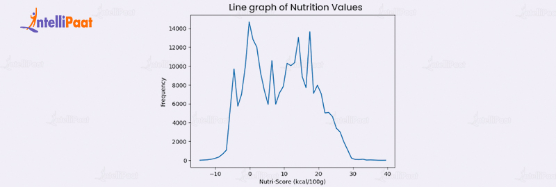
Visualization of TSV Data by Python
Below is an example of data visualization of TSV data by Python in the form of Line Graph:
We took a dataset of Open food facts from Kaggle. Open Food Facts is a free, open, collaborative database of food products from around the world, with ingredients, allergens, nutrition facts, and other information
You can download the dataset from Kaggle and import it to Google Colab using the following steps:
- Go to your Google Drive and create a folder named openfoodfacts to mount the dataset.
- Upload the en.openfoodfacts.org.products.tsv file to that folder. This file contains the data for over a million products in tab-separated format.
- Open a new notebook in Google Colab and mount your Google Drive by running this code:
from google.colab import drive
drive.mount('/drive')
- You will be asked to enter an authorization code. Follow the link provided and copy the code. Paste it in the box and press enter.
- Now you can access your Google Drive files from Colab. To read the Open Food Facts data, you can use the pandas library. Run this code:
import pandas as pd
import matplotlib.pyplot as plt
data = pd.read_tsv('/drive/MyDrive/openfoodfacts/en.openfoodfacts.org.products.tsv', sep='t')
data.head()
- This will show you the first five rows of the data. You can explore the data further using pandas methods and attributes, such as data.shape, data.columns, data.describe(), etc.
- To visualize the data, you can use libraries such as matplotlib, seaborn, plotly, etc.
For example, to plot the line graph of nutrition values of the products, you can run this code:
import plotly.express as px
import numpy as np

data_sorted = data.sort_values(by='nutrition-score-fr_100g')

bins = np.linspace(data_sorted['nutrition-score-fr_100g'].min(), data_sorted['nutrition-score-fr_100g'].max(), 51)

data_grouped = data_sorted.groupby(pd.cut(data_sorted['nutrition-score-fr_100g'], bins)).size()

plt.plot((bins[:-1] + bins[1:]) / 2, data_grouped)
plt.xlabel('Nutri-Score (kcal/100g)')
plt.ylabel('Frequency')
plt.title('Line graph of Nutrition values')
plt.show()
Data Visualization Projects in Python
Here are some examples of data visualization projects that with Python:
- Visualizing the distribution of a dataset using a histogram
- Creating a line plot to show trends over time
- Creating a scatter plot to show the relationship between two variables
- Creating a heatmap to show the correlation between variables
- Creating a bar chart to compare the values of different categories
Get a detailed overview of python with Intellipaat’s python tutorial!
Best Practices for Data Visualization in Python
Creating compelling data visualizations in Python requires more than selecting a library and creating a plot. Some best practices can ensure that the visualizations are clear, informative, and accurate. Here are some key points to consider when creating data visualizations in Python:
- Choose the most appropriate visualization type based on the data you want to represent. Different data types and structures are best represented using plots and charts. For example, line plots are best for showing trends over time, while scatter plots show relationships between variables.
- Keep the visualization simple and easy to read. Avoid cluttering the plot with unnecessary elements like grid lines, tick marks, and legends. Use colors and labels sparingly and only when necessary to avoid overwhelming the viewer.
- Use appropriate scales for the data being presented. For instance, logarithmic scales may be appropriate for data that span several orders of magnitude, while linear scales may be more suitable for data that vary within a small range.
- Label the axes and provide a clear title for the plot. This helps provide context for the viewer and ensures the plot can be easily understood.
- Provide context for the data being presented. This may include providing information about the data source, the time over which the data was collected, and any relevant units of measurement. This helps ensure the viewer can understand what the data represents.
- Test the visualization with different audiences to ensure it effectively communicates the intended message. This can help identify potential misunderstandings or areas where the visualization can be improved.
Enroll to Intellipaat’s data analytics course in Bangalore and make your career in data analytics!
Conclusion
In conclusion, Python empowers data scientists and analysts with a powerful set of tools and packages for creating stunning and informative data visualizations. From basic charts to interactive plots, Python’s versatile libraries enable users to transform raw data into captivating visual narratives. By adhering to best practices in data visualization, practitioners can unlock the true potential of their data and effectively communicate insights to diverse audiences. With Python’s rich ecosystem of visualization options and a commitment to best practices, the world of data becomes more accessible and impactful. So, let us embrace the power of Python and unleash the art of storytelling through compelling visualizations, bridging the gap between data and understanding.
We tried our best to clarify the topic, but if you are still left with any doubts, reach out to our python community page!
The post What is Data Visualization in Python? appeared first on Intellipaat Blog.
Blog: Intellipaat - Blog
Leave a Comment
You must be logged in to post a comment.