Statistics – correlation, causation and other tricky pitfalls
If you’re reading this, you’ve probably sat through a statistics class or two in your time. So surely you wouldn’t fall into any of the common pitfalls… would you? Well, bear with me and perhaps you’ll even learn something along the way. And just in case you think statistics are boring, I promise to add some stories about chocolate, movies and fake Churchill quotes to keep you going.
Counting is hard
Suppose you had a bag of M&Ms. You suspect such bags contain more M&Ms of some colors than others and decide to put it to the test. For the sake of argument, let’s say your bag contains 20 colors. You set your alpha at 0.05 (because, let’s face it, that’s what you always do, isn’t it?) and, based on the total number of sweets in the bag, determine how many M&Ms of a certain color you need to find in order to conclude that that number is significantly more than average.
You then start counting each color. And what d’ya know: one of the colors turns out to be present more than average – statistically significantly so! You’re all ready to draw your conclusions, but wait… In reality, what you just carried out were 20 separate experiments. And even if M&M bags were filled with (on average) the same amount of candy of each color, at a significance level of 5%, you should expect to find a statistically high outcome once in every 20 experiments.
Counting is hard, and not just when it comes to chocolate. Even if you know how to count, take a step back and think about what is being counted. As former ‘maths girl’ Ionica Smeets shows us (Dutch article), this can make a big difference. She continually tries to set things straight but unfortunately, as Mark Twain observed, “it is easier to fool people than to convince them that they have been fooled.”
So, there are many ways one can mess up one’s statistics. And whether it’s on purpose or by accident, many reported conclusions are false. That’s why I always treat statistical results with a healthy dose of suspicion. As Churchill allegedly once said, “Never trust a statistic that you haven’t faked yourself” (though it later turned out that the quote had a German source, possibly as Nazi propaganda. Just as Churchill probably also never said “There are lies, damn lies and statistics”.
Lucia de B.
The M&M example also gives a good indication, albeit somewhat simplified, of what went wrong in the notorious court case of Lucia de Berk. De Berk was a nurse sentenced for the murder of several patients. The verdict depended on a statistical calculation: the probability that an innocent person’s shifts would overlap with this many incidents was said to be only 1 in 342 million.
Unfortunately, there was an error in the calculation. The evidence consisted of a combination of data from multiple wards. A correction known as ‘Fisher’s method’ should therefore have been applied. Fisher’s method allows the user to combine results from several independent studies that all have the same null hypothesis. The correction would have resulted in a probability much greater than 1 in 342 million and might have lead to a completely different outcome at the trial. In 2010, seven years after the original verdict, De Berk’s name was cleared and all charges dropped.
In fact they made a movie out of the story. It’s less about the statistics behind the case and more about the DA who uncovers the new evidence, but I guess probably a better movie for that.
Correlation doesn’t imply causation
You’ve probably heard this phrase before. It refers to a subtle yet crucial difference between what we want to measure and what we can measure. For example, you’ve observed a certain effect (e.g. a drop in sales) and are interested to know what’s caused it: was it because you invested less in marketing? Was it due to the weather? Or was it because your secretary called in sick? Unfortunately, your data does not have the power to determine whether one of these was the cause. It can only tell you whether it coincided with the reduced sales. But that could be pure coincidence.
To get a good feel for the difference between correlation and causation – or if you just want to get a laugh out of statistics – I recommend you check out: Tyler Vigen’s spurious correlations site. This website lets you create your own ‘spurious correlations’: you can choose your favorite variables from a weird and wonderful set to obtain curiously high correlations. For example: ‘Females in New York who slipped or tripped to their death’ and ‘Visitors to SeaWorld Florida’ have a correlation of more than 98%! Which just goes to show…
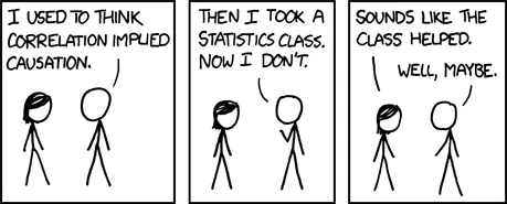
Correlation vs. Causation (www.xkcd.com)
This cartoon is my personal measure for how well people understand that ‘correlation does not imply causation’. If you don’t get it, you’ve got some work to do!
The post Statistics – correlation, causation and other tricky pitfalls appeared first on This Complex World.