
Flexbox in CSS: A Complete Guide
We’ll go over the fundamentals of Flexbox and show you how to get started with this powerful tool in this article.
Check out this insightful video on web design HTML and CSS tutorials for beginners.
{
“@context”: “https://schema.org”,
“@type”: “VideoObject”,
“name”: “Full Stack Web Development Course”,
“description”: “Flexbox in CSS: A Complete Guide”,
“thumbnailUrl”: “https://img.youtube.com/vi/ofekyjYd0xM/hqdefault.jpg”,
“uploadDate”: “2023-04-28T08:00:00+08:00”,
“publisher”: {
“@type”: “Organization”,
“name”: “Intellipaat Software Solutions Pvt Ltd”,
“logo”: {
“@type”: “ImageObject”,
“url”: “https://intellipaat.com/blog/wp-content/themes/intellipaat-blog-new/images/logo.png”,
“width”: 124,
“height”: 43
}
},
“contentUrl”: “https://www.youtube.com/watch?v=ofekyjYd0xM”,
“embedUrl”: “https://www.youtube.com/embed/ofekyjYd0xM”
}
Appendix
- What is Flexbox?
- Why do we need Flexbox in CSS?
- What is a Flexbox container?
- Properties for the Flex Items
- How Flexbox Works?
- Advantages of Flexbox
- Difference between CSS Grid vs Flexbox
- Best Practices for Using Flexbox
- Conclusion
What is Flexbox?
The CSS style module known as Flexbox, or Flexible Box Layout, makes it simple to handle its contents’ layout. This will enable you to produce sophisticated and dynamic designs with less code.
It also provides a more effective way to organize, align, and distribute space between things in a container. Flexbox container is a CSS-style parent element that produces a flexible Flexbox layout.
By describing the features of the container and its child elements, Flexbox allows you to manage the layout of a container and its contents. Before Flexbox, positioning, float attributes, and several manual computations were needed to create structures in CSS.
Why do we need Flexbox in CSS?
Flexbox provides a powerful and flexible way to create layouts in CSS. Its ease of use and responsiveness make it an essential tool for modern web development.
Flexbox is an advanced CSS layout tool that allows developers to quickly create flexible and adaptable layouts. Here are some of the reasons why we require Flexbox
- Responsive Design– With the growing popularity of mobile devices, building responsive designs have become a must. Flexbox enables developers to develop layouts that automatically adjust to the size of the screen, making responsive websites and applications easier to build.
- Flexibility–Flexbox is extremely adaptable and can be used to build a broad variety of layouts. It may be used in combination with the CSS grid to build strong and responsive designs. It can also be used with other CSS layout approaches to create even more complicated layouts.
- Space Distribution– Flexbox makes it easy to allocate space between layout elements. Developers can use this to construct layouts with equal spacing between elements or more complicated layouts with specified spacing needs.
- Alignment– Flexbox includes an effective alignment system that enables developers to position items both horizontally and vertically. This simplifies the creation of complex layouts and the alignment of parts.
What is a Flexbox container?
The “flex” value is a shorthand property in CSS that allows you to set the flexible properties of a flex container or item. It is used to create flexible layouts where the elements can adjust their size and position based on the available space.
When applied to a flex container, it sets the container’s main axis and cross-axis properties. When applied to a flex item, it sets the item’s size, order, and alignment properties within the container.
A flexbox container, also known as a flex container, is a CSS layout container that allows its child elements to be arranged flexibly along a single axis or in several dimensions. It includes a sophisticated and simple layout system that allows you to customize the size, location, and spacing of the container’s child elements.
You may design complicated and responsive layouts without resorting to hacks or workarounds by setting the relevant flexbox settings on the container. Modern browsers largely support the flexbox layout concept, which is commonly used for designing UI components, navigation menus, grids, and more.
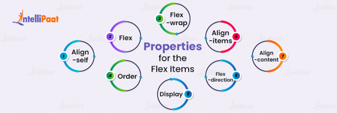
Properties for the Flex Items

Flex items are child elements of a Flexbox container that may be enhanced using numerous CSS attributes to control their size, location, and functionality within the Flexbox layout. Flexbox can also be utilized to regulate the arrangement and alignment of flex objects inside a container. Below are a few of the most popular properties we use for Flexbox. These properties can be applied to both the container and the individual flex items. By changing these properties, you can create complex and dynamic layouts with ease.
- Flex– a shortened term for the properties flex-grow, flex-shrink, and flex-basis. In CSS Flexbox layout, flex-grow defines the ability for a flex item to grow if necessary, flex-shrink defines the ability for a flex item to shrink if necessary, and flex-basis defines the initial size of a flex item before any remaining space is distributed.
- Align-self– This property is used to override the alignment set by the Flexbox container for a specific flex item. It can be used to align a single item along the cross-axis differently from the other items.
- Order– establishes the sequence in which the flex items should appear in the container. The default value is 0.
- Display– Defines the container as a flex container. The value should be “flex”.
- Flex-direction— determines the major axis’ direction. Row (default value), column, row-reverse, or column-reverse are the possible values.
- Flex-wrap– Determines whether the flex items should wrap onto the next line. The values can be no wrap (default), wrap, or wrap-reverse.
- Align-items– defines the cross-axis alignment for the items. Values can be Stretch (the default value), flex-start, flex-end, center, or baseline are the possible possibilities.
- Align-content– How the objects should be arranged along the cross-axis when the container has additional space. The values can be stretch, space-around, space-between, flex-start, or flex-end.
- Justify-content– If justified-content is set to flex-start, flex-end, center, space-between, space-around, or space-evenly, flex elements will be aligned along the main axis as specified.
Career Transition


How Flexbox works?
A flexbox layout is made up of a flex container and its child elements. The “flex” value is a shorthand property in CSS that allows you to set the flexible properties of a flex container or flex item.
By using the display feature with the value “flex”, the container is defined. The container’s child elements turn into flex items once it is classified as a flex container. The Flexbox properties can then be used to position and align the flex elements inside the container.
There are two types of axes in a Flexbox layout; the central axis and the cross axis. The central axis is the direction in which the flex items are laid out, and the cross axis is perpendicular to the central axis.
The flex-direction feature allows the main axis to be oriented either horizontally or vertically. The flex-direction default value is row, which arranges the items horizontally from left to right. If the value is changed to the column, the items will be laid out vertically from top to bottom.
The cross-axis is in the opposite direction of the main axis. By default, the cross-axis is perpendicular to the main axis. However, this can be changed using the flex-wrap property. When a flex-wrap property is set to wrap, items will wrap onto the next line, and the cross axis will become the main axis.
Wish to start learning Web Development or upskill yourselves, check and enroll in any Web Development courses.
Advantages of Flexbox
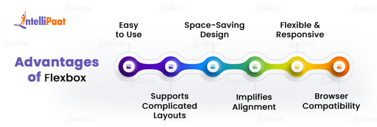
Flexbox is a beautiful option for developing modern, innovative, and responsive web designs since it has a lot of advantages over other CSS layout types.
In comparison to other CSS layout methods like float and placement, Flexbox has a number of advantages. Here are a few of the main benefits of utilizing Flexbox.
- Space-saving design—By dynamically changing the size and positioning of elements based on their content and available space, Flexbox enables you to make the most of the space on your website.
- Easy to use– Flexbox is a simple and intuitive layout solution that makes it easier to create responsive and flexible layouts.
- Supports complicated layouts— Flexbox is an effective tool for developing contemporary, responsive web designs since it can be used to create advanced layouts with several levels of nesting.
- Flexible and responsive—Flexbox is versatile and responsive, making it an excellent option for developing responsive web designs. You can use Flexbox to create layouts that adapt to various screen sizes and device orientations.
- Implifies alignment– Alignment is implied by the fact that Flexbox makes it simpler to center items both horizontally and vertically on your website.
- Browser Compatibility– Flexbox is supported by all modern web browsers, making it a reliable choice for designing web layouts.
Flexbox is a beautiful option for developing modern, innovative, and responsive web designs since it has a lot of advantages over other CSS layout types.
Want to learn more about Web Development? Read our complete guide on Web Development Tutorial now!
Difference between CSS Grid vs Flexbox
CSS Grid and Flexbox are both CSS layout components, although they perform different functions and have different characteristics. The following are some important distinctions between CSS Grid and Flexbox
Flexbox is best suited for flexible, one-dimensional layouts. whereas CSS Grid is best suited for complex, two-dimensional layouts, Both modules have advantages and disadvantages, and they can be combined to build even more powerful layouts.
| CSS Grid | Flexbox | |
| Layout | CSS Grid is developed for two-dimensional layout, which allows developers to create complicated layouts with rows and columns. | Flexbox is designed for one-dimensional layouts, allowing developers to construct flexible and responsive layouts that adapt to changing screen sizes. |
| Alignment | CSS Grid supports advanced alignment, allowing developers to arrange elements vertically and horizontally. | Flexbox is largely intended for aligning things along a single axis, with some limited capabilities for aligning items along a cross-axis. |
| Order | CSS Grid does not support | Flexbox allows developers to choose the order in which things display in the layout |
| Nesting | CSS Grid allows developers to build nested grids, allowing them to design advanced layouts with numerous layers of structure. | Nested layouts are not supported by Flexbox. |
Best Practices for Using Flexbox
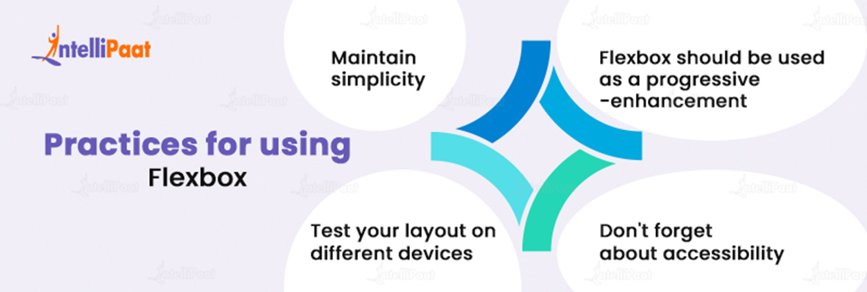
Flexbox is a powerful tool for designing flexible, responsive layouts, but it must be used properly and in accordance with recommended practices. Following these guidelines will allow you to build layouts that are both functional and accessible to all users.
It’s important to remember several practices when using Flexbox. Here are some of them to help you get the most out of Flexbox;
- Maintain simplicity– Flexbox is a great tool but with complicated layouts and arranged Flex containers, it’s easy to get carried away. Avoid unnecessary combining, and keep your layout as simple as possible.
- Flexbox should be used as a progressive enhancement– It’s best to start with a strong, fundamental layout using traditional CSS approaches and then enhance it with Flexbox as needed. This ensures that your layout is usable and accessible even for users who do not have contemporary browsers.
- Test your layout on different devices– Flexbox makes it simple to develop responsive designs. However, testing your layout on various devices is still necessary to ensure it works effectively for all users.
- Don’t forget about accessibility– Flexbox can help make your layout more accessible, but it must be used in a way that does not cause obstacles for disabled people. Test your layout using a screen reader and other assistive technology to verify that it is easy to browse.
Here are the top 30 objective-type sample CSS Interview questions and answers
Courses you may like
Conclusion
Flexbox is an extremely useful tool for simplifying layout design, increasing flexibility, and reducing the need for complex solutions. Flexbox allows you to easily create dynamic and responsive layouts while increasing accessibility and lowering the amount of code required. Flexbox can assist you in creating layouts that are both beautiful and useful, whether you are designing a basic website or a major online application.
To clear your doubts about Web Development, you can refer to our Web Technology Community!
The post Flexbox in CSS: A Complete Guide appeared first on Intellipaat Blog.
Blog: Intellipaat - Blog
Leave a Comment
You must be logged in to post a comment.