
Create Beautiful Tooltip Using CSS
With the support of CSS properties such as background color, font size, and border radius, you can customize your tooltips to match your brand or design aesthetic. Moreover, it helps in developing animations and transitions to make your tooltips more dynamic and interactive. This blog will highlight how to create beautiful CSS tooltips from basic to advanced levels.
- What is a Tooltip?
- Why Do We Need a Tooltip?
- Basic Tooltip Creation
- Adding Custom Styling to Tooltips
- Styling Tooltips with CSS Pseudo-elements
- Using jQuery to Create Tooltips
- Creating Responsive Tooltips
- Conclusion
Watch the video below to understand Full Stack Web Development in detail
{
“@context”: “https://schema.org”,
“@type”: “VideoObject”,
“name”: “Full Stack Web Development Course | Full Stack Developer Course | Intellipaat”,
“description”: “Create Beautiful Tooltip Using CSS”,
“thumbnailUrl”: “https://img.youtube.com/vi/ofekyjYd0xM/hqdefault.jpg”,
“uploadDate”: “2023-07-14T08:00:00+08:00”,
“publisher”: {
“@type”: “Organization”,
“name”: “Intellipaat Software Solutions Pvt Ltd”,
“logo”: {
“@type”: “ImageObject”,
“url”: “https://intellipaat.com/blog/wp-content/themes/intellipaat-blog-new/images/logo.png”,
“width”: 124,
“height”: 43
}
},
“embedUrl”: “https://www.youtube.com/embed/ofekyjYd0xM”
}
What is a Tooltip?
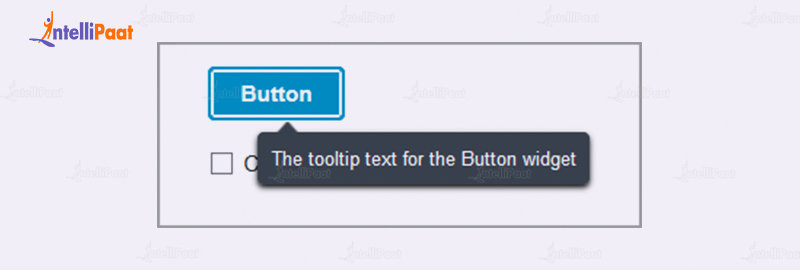
A tooltip is a small pop-up box that appears when the user hovers over a particular element, such as a link or image. The tooltip provides additional information or context about the element being hovered over, making the user experience more interactive and engaging. Tooltips are often used to provide additional information about the content’s abbreviations, acronyms, or technical terms.
Learn Basics, along with Advanced concepts of Web Development, by taking up one of the best online Web Development courses.
Why Do We Need a Tooltip?
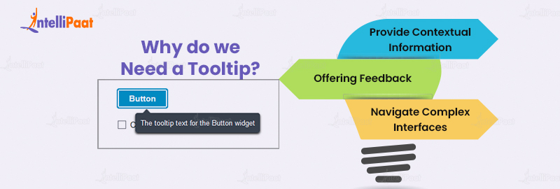
A tooltip serves the purpose of offering extra information that may not be immediately evident from the page’s content. Its primary function is to clarify the functionality or meaning behind an icon when users hover over it. Some notable points are mentioned in detail:
- Provide Contextual Information: Tooltips serve as valuable resources by offering contextual information that enhances users’ comprehension of the page’s content. They are particularly beneficial when clarifying acronyms or technical terms, providing users with tooltips that elucidate their meanings. This feature proves particularly advantageous for individuals who may be unfamiliar with the subject matter or specialized terminology.
- Offering Feedback: Another important use of tooltips is providing feedback to users when interacting with an element on the page. For example, when users hover over a button, we can display a tooltip that confirms the action that will occur when they click it. This helps users feel more confident about their actions and reduces the risk of errors.
- Navigate Complex Interfaces: In addition, tooltips serve as valuable aids for users in navigating complex interfaces, offering guidance and assistance. They play a crucial role in web development, such as providing explanatory tooltips for each field in a form, ensuring users understand the required information. Consequently, tooltips facilitate faster and more accurate completion of forms by users.
Basic Tooltip Creation
Crafting a fundamental tooltip is quite straightforward. The method involves appending the ‘title’ attribute to the desired HTML element, enabling the tooltip functionality. To illustrate, consider the following instance:
Hover over me
In the given instance, we incorporated the ‘title’ attribute within the ‘a’ tag to exhibit a tooltip when the user hovers over it. Nevertheless, the default tooltip lacks visual appeal and fails to align with the aesthetics of our website. Hence, we shall apply personalized formatting to enhance its appearance.
Adding Custom Styling to Tooltips
To add custom styling to our tooltips, we can use CSS. We can target the ‘title’ attribute and apply styles to it. Here’s an example:
a[title] {
  position: relative;
}
This block sets the position of anchor elements with a `title` attribute as “relative“. This means that any absolutely positioned elements within these anchors will be positioned relative to their normal position.
a[title]:hover:after {
  content: attr(title);
  padding: 5px 10px;
  color: #fff;
  background-color: #000;
  position: absolute;
  left: 0;
  top: 100%;
  z-index: 1;
  white-space: nowrap;
}
This block applies styles to the pseudo-element `:after` of anchor elements with a `title` attribute when they are being hovered over. The `content` property sets the content of the pseudo-element to the value of the `title` attribute. The `padding`, `color`, and `background-color` properties set the appearance of the content. The `position: absolute` positions the pseudo-element absolutely within the anchor. The `left: 0` and `top: 100%` properties position the pseudo-element at the bottom-left corner of the anchor. The `z-index: 1` property ensures that the pseudo-element appears above other elements on the page. The `white-space: nowrap` property prevents the content from wrapping onto multiple lines.
Output:

Want to crack your Web Development Interview? Read our Web Developer Interview Questions now!
Styling Tooltips with CSS Pseudo-elements

CSS pseudo-elements are powerful for creating custom tooltips. We can use the ‘:: before’ and ‘:: after’ pseudo-elements to add additional styling to the tooltip box. Here’s an example:
a[title] {
  position: relative;
}

a[title]:hover:after {
  content: attr(title);
  padding: 5px 10px;
  color: #fff;
  background-color: #000;
  position: absolute;
  left: 0;
  top: 100%;
  z-index: 1;
  white-space: nowrap;
}
Now let’s add some styles to the tooltip box using the ‘::before' pseudo-element. We will add a small triangle to the tooltip box to make it look more like a speech bubble. Here’s the updated CSS code:
a[title] {
  position: relative;
}

a[title]:hover:after {
  content: attr(title);
  padding: 5px 10px;
  color: #fff;
  background-color: #000;
  position: absolute;
  left: 0;
  top: 100%;
  z-index: 1;
  white-space: nowrap;
}

a[title]:hover:before {
  content: "";
  position: absolute;
  border-width: 5px;
  border-style: solid;
  border-color: #000 transparent transparent transparent;
  top: 100%;
  left: 50%;
  transform: translateX(-50%);
}
his block styles the pseudo-element `:before` of anchor elements with a `title` attribute when they are being hovered over. The `content` property is set to an empty string, so no content is displayed within the pseudo-element. The `position: absolute` positions the pseudo-element absolutely within the anchor element. The `border-width` property sets the width of the border for the triangular arrow. The `border-style: solid` defines the border as a solid line. The `border-color` property sets the color of the border, with the first value being the color of the bottom border, and the remaining values being transparent. This creates a triangle shape with only the bottom border visible. The `top: 100%` positions the pseudo-element at the bottom of the anchor element. The `left: 50%` centers the pseudo-element horizontally within the anchor element. The `transform: translateX(-50%)` moves the pseudo-element 50% of its own width to the left, centering it precisely below the anchor element.
Using jQuery to Create Tooltips
jQuery is a widely used JavaScript library that simplifies the process of adding interactivity and animation to web pages. With jQuery, we can enhance tooltips by incorporating advanced features like animations and custom triggers. Here’s an illustration:
Hover over me


$(function() {
  $('[data-tooltip]').tooltip();
});
In the given example, we enhanced the ‘a‘ tag by adding a ‘data-tooltip‘ attribute, which holds the text for the tooltip. To enable the tooltip functionality, we incorporated the jQuery library into our webpage. Using the ‘tooltip()‘ method, we initialized the tooltip feature, allowing us to customize its position, animation, and triggers according to our needs.
Career Transition


Creating Responsive Tooltips
Responsive design is crucial for modern websites as more and more users access the web using mobile devices with different screen sizes. We can make our tooltips responsive by using CSS media queries to adjust the styles based on the screen size. Here’s an example:
a[title] {
  position: relative;
}

a[title]:hover:after {
  content: attr(title);
  padding: 5px 10px;
  color: #fff;
  background-color: #000;
  position: absolute;
  left: 0;
  top: 100%;
  z-index: 1;
  white-space: nowrap;
}

@media screen and (max-width: 768px) {
  a[title]:hover:after {
    white-space: normal;
    max-width: 200px
  }
}
In the given example, we made changes to the styles of the tooltip box specifically for screens that are 768 pixels wide or smaller. We made use of a media query for this purpose. To make the text wrap properly within the tooltip, we used the ‘white-space‘ property. Additionally, we set a maximum width for the tooltip box using the ‘max-width‘ property. These adjustments ensure that the tooltip remains easy to read and accessible on smaller screens.
Conclusion
Tooltips offer a straightforward and powerful method to add extra information and context to our web pages. Through the utilization of CSS and JavaScript, we have the ability to craft visually appealing and adaptable tooltips that elevate the user experience and enhance the usability of our websites. Whether you are constructing a personal blog or working on an intricate web application, tooltips are a valuable asset in your repertoire. Feel free to dive in and explore their potential, allowing your creative ideas to flourish!
Drop your queries on our Web Technology Community and get a resolution!
The post Create Beautiful Tooltip Using CSS appeared first on Intellipaat Blog.
Blog: Intellipaat - Blog
Leave a Comment
You must be logged in to post a comment.