
Checkbox in React: The Complete Guide
Before diving into the comprehensive guide on checkboxes in React, it is essential to have a solid understanding of React fundamentals, including JSX syntax, component lifecycle, and state management. Familiarity with JavaScript ES6 features and basic HTML/CSS is also recommended. This prerequisite knowledge will enable readers to grasp the concepts in the guide effectively and apply them to their React checkbox implementations.
Table of Contents:
- What are Checkboxes in React?
- Best Practices of Using Checkboxes in React
- What are the Use Cases of Checkboxes in React?
- Various Components of the React Checkbox
- Various Checkboxes in React
- A Basic React Application for Checkbox
- Checkbox Styling in React
- Handling Multiple Checkboxes in React
- Conclusion
What are Checkboxes in React?

In React, checkboxes are implemented as components, providing developers with a versatile and customizable way to handle user input and manage state.
Checkboxes are created using the <input> element with the type attribute set to “checkbox“. This input element is then encapsulated within a React component, allowing developers to manage its state and behavior using React’s powerful features.
Checkboxes have two main states: checked and unchecked. When a user interacts with a checkbox, its state is updated accordingly, providing valuable information about the user’s selections.
Managing the state of checkboxes is a crucial aspect of checkbox implementation in React. Typically, the checkbox’s state is stored within the parent component using React’s state management mechanisms, such as hooks or class-based states.
When the checkbox is selected or deselected, an event handler function is triggered, updating the state accordingly. This state update then propagates down to child components, allowing them to reflect the checkbox’s current state and trigger any necessary actions.
In React, software developers have the option to employ the onChange event to manage checkbox events. This event is activated whenever there is a modification in the state of the checkbox. By defining a dedicated event handler function and associating it with the onChange event, developers gain the ability to execute specific actions in response to changes in the checkbox state. These actions may involve updating the state itself, initiating other user interface (UI) modifications, or performing manipulations on data. This approach enables developers to effectively handle checkbox events and seamlessly incorporate desired functionalities within their React applications.
Checkboxes in React can be customized and styled to match the desired look and feel of the application. CSS classes and inline styles can be applied to the checkbox component, allowing for various customization options. Additionally, third-party libraries and frameworks, such as Material-UI or React Bootstrap, provide pre-styled checkbox components that can be easily integrated into React applications, saving development time and effort.
When implementing checkboxes in React, it is vital to consider accessibility guidelines to ensure that all users can interact with the checkboxes effectively. This includes providing appropriate labels and descriptions for the checkboxes using the label element or aria-label attribute.
Ensuring proper keyboard navigation and focus management allows users to interact with checkboxes using keyboard-only navigation or assistive technologies.
A basic checkbox in React:
import React, { useState } from 'react';
const CheckboxExample = () => {
  const [isChecked, setIsChecked] = useState(false);
  const handleCheckboxChange = (event) => {
    setIsChecked(event.target.checked);
  };
  return (


        <input
          type="checkbox"
          checked={isChecked}
          onChange={handleCheckboxChange}
        />
        Check me!


  );
};
export default CheckboxExample;
To learn more about React JS check out Intellipaat’s React certification course.
Best Practices of Using Checkboxes in React

Checkboxes are an essential part of many web applications. When working with React checkboxes, it’s crucial to follow best practices to ensure optimal performance, maintainability, and user experience.
- Proper Initialization: When rendering checkboxes in React, it is essential to initialize their state correctly. Use controlled components to update the checkbox state by providing an initial value and an onChange event handler. This approach ensures that the checkbox value remains synchronized with the application state and allows for seamless integration with other components and form elements.
- Accessibility and Usability: Make your checkboxes accessible and user-friendly by adhering to web accessibility guidelines. Ensure that checkboxes have meaningful labels by associating the “for” attribute with the corresponding checkbox input element’s “id” attribute. This practice allows users to click on the label to toggle the checkbox. Additionally, consider providing visual cues such as focus styles and ARIA attributes to assist users with disabilities in understanding the checkbox’s state.
- Handling Checkbox Events: React provides the onChange event handler to capture checkbox state changes. It is crucial to handle this event properly to update the checkbox value and trigger the appropriate actions in your application. Avoid mutating the state directly; instead, use the
setState()method to update the checkbox state in an immutable manner. It ensures that React efficiently manages component rendering and reconciliation. - Grouping Checkboxes: Consider grouping them logically when working with multiple checkboxes to enhance usability and maintainability. Grouping checkboxes allows users to understand their relationships and select multiple options together. You can group checkboxes by using fieldsets and legends to provide a descriptive title for the checkbox group. Also, maintain a consistent layout and styling to create a cohesive user interface.
- Validation and Error Handling: In form scenarios, checkbox inputs may require validation to ensure data integrity. Implement validation logic to check for required selections, minimum/maximum selections, or custom validation rules. Provide clear error messages to users if the checkbox inputs fail validation. Displaying real-time validation feedback can significantly improve the user experience and prevent form submission errors.
- Performance Optimization: React offers various optimization techniques to improve the performance of checkbox components. Use React’s memoization techniques, such as
React.memo()orshouldComponentUpdate, to prevent unnecessary re-renders when the checkbox state hasn’t changed. Additionally, consider using event delegation or debouncing/throttling techniques for handling checkbox events to reduce the number of event listeners and improve performance. - Testing and Documentation: Comprehensive testing and documentation are essential for maintaining and scaling React applications. Write unit tests to verify the behavior and correctness of your checkbox components. Employ testing libraries such as Jest or React Testing Library for efficient and reliable test coverage. Document your checkbox components, including their props, usage instructions, and examples. This documentation will assist other developers in understanding and utilizing your checkbox components effectively.
To get in-depth knowledge of Reactjs check out our ReactJS Tutorial!
What are the Use Cases of Checkboxes in React?

The top six use cases of checkboxes in React, their benefits, and the practical applications are given below:
Multiple Selections: Checkboxes are commonly used to enable users to select multiple items simultaneously from a list. Users can easily indicate their preferences or make multiple selections by providing checkboxes next to each item. This use case is ideal for scenarios such as selecting multiple products for a shopping cart or choosing multiple options for a survey.
Form Submissions: Checkboxes are often employed in forms to capture user preferences or gather information. Checkboxes allow users to provide specific responses when combined with other form elements, such as text inputs and dropdowns. For instance, checkboxes can be used in a registration form to gather user consent, such as agreeing to terms and conditions or subscribing to a newsletter.
Filter and Sorting Options: Checkboxes are vital in providing filtering and sorting options to users in various applications. Users can easily refine their search results or organize data based on specific criteria using checkboxes. For example, checkboxes on an e-commerce website can filter products by price range, brand, or product features, resulting in a more tailored and efficient user experience.
Feature Toggling: Checkboxes are an effective way to allow users to toggle the visibility or functionality of certain features within an application. Users can enable or disable them based on their preferences by associating checkboxes with specific features or settings. This use case is particularly useful in applications that offer customizable features or settings, empowering users to personalize their experience.
Bulk Actions: Checkboxes provide an intuitive mechanism for simultaneously performing bulk actions on multiple items. In applications with lists or tables, checkboxes allow users to select multiple items and trigger actions like deletion, archiving, or marking as read. This functionality simplifies complex tasks and significantly enhances user productivity.
Conditional Rendering: Checkboxes can be leveraged to conditionally render components or content based on user selections. Developers can dynamically control what appears on the screen by associating checkboxes with specific elements. This use case is valuable for building dynamic user interfaces, such as showing additional form fields based on user preferences or displaying different page sections based on checkbox selections.
Applying for a Front End Developer job? Read our blog on React JS Interview Questions and get yourself prepared!
Various Components of the React Checkbox
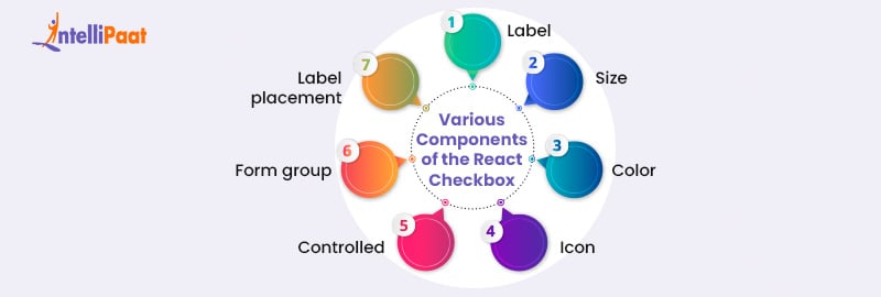
Below are the various components and attributes used in React checkboxes:
Label:
  <FormControlLabel control={} label="Label" />
  <FormControlLabel required control={} label="Required" />
  <FormControlLabel disabled control={} label="Disabled" />
Size:
<Checkbox
  {...label}
  defaultChecked
  sx={{ '& .MuiSvgIcon-root': { fontSize: 28 } }}
/>
Color:
<Checkbox
  {...label}
  defaultChecked
  sx={{
    color: pink[800],
    '&.Mui-checked': {
      color: pink[600],
    },
  }}
/>
Icon:
<Checkbox {...label} icon={} checkedIcon={} />
<Checkbox
  {...label}
  icon={}
  checkedIcon={}
/>
Controlled:
<Checkbox
  checked={checked}
  onChange={handleChange}
  inputProps={{ 'aria-label': 'controlled' }}
/>
Form group and Label placement:
      Label placement

        <FormControlLabel
          value="top"
          control={}
          label="Top"
          labelPlacement="top"
        />
        <FormControlLabel
          value="start"
          control={}
          label="Start"
          labelPlacement="start"
        />
        <FormControlLabel
          value="bottom"
          control={}
          label="Bottom"
          labelPlacement="bottom"
        />
        <FormControlLabel
          value="end"
          control={}
          label="End"
          labelPlacement="end"
        />
Various Checkboxes in React

Basic Checkbox:
The most commonly used type for representing binary choices in React is the basic checkbox. It consists of a simple checkmark symbol that changes its state when clicked. Here’s an example of how to implement a basic checkbox component in React:
import React, { useState } from 'react';
const BasicCheckbox = () => {
  const [isChecked, setIsChecked] = useState(false);
  const handleCheckboxChange = () => {
    setIsChecked(!isChecked);
  };
  return (


        <input
          type="checkbox"
          checked={isChecked}
          onChange={handleCheckboxChange}
        />
        Checkbox Label


  );
};
export default BasicCheckbox;
Checkbox Group:
A checkbox group allows users to select multiple options simultaneously. It is commonly used when there is a list of choices and users can select one or more items. React provides a straightforward way to handle checkbox groups:
import React, { useState } from 'react';
const CheckboxGroup = () => {
  const [selectedItems, setSelectedItems] = useState([]);
  const handleCheckboxChange = (event) => {
    const { value, checked } = event.target;
    if (checked) {
      setSelectedItems([...selectedItems, value]);
    } else {
      setSelectedItems(selectedItems.filter((item) => item !== value));
    }
  };
  return (


        <input
          type="checkbox"
          value="Option 1"
          checked={selectedItems.includes('Option 1')}
          onChange={handleCheckboxChange}
        />
Option 1
        <input
          type="checkbox"
          value="Option 2"
          checked={selectedItems.includes('Option 2')}
          onChange={handleCheckboxChange}
        />
Option 2
      {/* Additional checkbox options */}

  );
};
export default CheckboxGroup;
Controlled and Uncontrolled Checkboxes:
In React, checkboxes can be classified as either controlled or uncontrolled components. Controlled checkboxes have their state managed by React, while uncontrolled checkboxes manage their own state.
Controlled Checkbox:
import React, { useState } from 'react';
const ControlledCheckbox = () => {
const [isChecked, setIsChecked] = useState(false);
const handleCheckboxChange = () => {
setIsChecked(!isChecked);
};
return (
<input
type="checkbox"
checked={isChecked}
onChange={handleCheckboxChange}
/>
Checkbox Label
);
};
export default ControlledCheckbox;
Uncontrolled Checkbox:
import React, { useRef } from 'react';
const UncontrolledCheckbox = () => {
const checkboxRef = useRef(null);
const handleButtonClick = () => {
console.log(checkboxRef.current.checked);
};
return (
<input
type="checkbox"
ref={checkboxRef}
/>
Checkbox Label
);
};
export default UncontrolledCheckbox;
A Basic React Application for Checkbox

The Basic React Application illustrates the implementation of different types of checkboxes, such as basic, group, controlled, and uncontrolled, allowing users to interact with them and gain an understanding of their functionality.
import React, { useState } from 'react';
const App = () => {
  const [basicChecked, setBasicChecked] = useState(false);
  const [groupChecked, setGroupChecked] = useState([]);
  const [controlledChecked, setControlledChecked] = useState(false);
  const uncontrolledRef = React.useRef(null);
  const handleBasicChange = () => {
    setBasicChecked(!basicChecked);
  };
  const handleGroupChange = (event) => {
    const { value, checked } = event.target;
    if (checked) {
      setGroupChecked([...groupChecked, value]);
    } else {
      setGroupChecked(groupChecked.filter((item) => item !== value));
    }
  };
  const handleControlledChange = () => {
    setControlledChecked(!controlledChecked);
  };
  const handleUncontrolledClick = () => {
    console.log(uncontrolledRef.current.checked);
  };
  return (

      Basic Checkbox

        <input
          type="checkbox"
          checked={basicChecked}
          onChange={handleBasicChange}
        />
        Basic Checkbox

      Checkbox Group

        <input
          type="checkbox"
          value="Option 1"
          checked={groupChecked.includes('Option 1')}
          onChange={handleGroupChange}
        />
Option 1
        <input
          type="checkbox"
          value="Option 2"
          checked={groupChecked.includes('Option 2')}
          onChange={handleGroupChange}
        />
Option 2
Controlled Checkbox
<input
type="checkbox"
checked={controlledChecked}
onChange={handleControlledChange}
/>
Controlled Checkbox
Uncontrolled Checkbox
Uncontrolled Checkbox
);
};
export default App;
To use this code, you would need to set up a basic React project and replace the existing App.js file with the code above. This application will render a page displaying the different types of checkboxes (basic, checkbox group, controlled, and uncontrolled) along with their corresponding labels. Interacting with the checkboxes will trigger state changes and logging of the uncontrolled checkbox’s state when the button is clicked.
Remember to install the necessary dependencies and configure the React environment properly before running the application.
Career Transition


Checkbox Styling in React

Styling React checkboxes involves customizing the appearance of the checkbox elements to match the desired design and aesthetics. There are multiple approaches to styling checkboxes in React, including using CSS classes, CSS-in-JS libraries, or third-party UI component libraries. Below, we will explore two commonly used methods: CSS classes and CSS-in-JS.
Styling with CSS Classes: To style a React checkbox using CSS classes, you can add custom class names to the checkbox elements and define the corresponding styles in your CSS file. Here’s an example:
import React from 'react';
import './CheckboxStyles.css';
const StyledCheckbox = () => {
  return (


        Checkbox Label


  );
};
export default StyledCheckbox;
In the example above, we have a CSS file named “CheckboxStyles.css” where you can define the styles:
.checkbox-label {
  display: flex;
  align-items: center;
  /* Add any desired label styles */
}
.custom-checkbox {
  /* Add styles to customize the checkbox */
}
/* Additional styles for different states, e.g., checked */
.custom-checkbox:checked {
  /* Add styles for the checked state */
}
You can modify the class names and CSS styles according to your specific design requirements.
Styling with CSS-in-JS (e.g., Styled-Components): CSS-in-JS libraries like styled-components provide an alternative approach to styling React components. With styled-components, you can write CSS directly within your React component files. Here’s an example of styling a checkbox using styled-components:
import React from 'react';
import styled from 'styled-components';
const CheckboxLabel = styled.label`
  display: flex;
  align-items: center;
  /* Add any desired label styles */
`;
const CustomCheckbox = styled.input`
  /* Add styles to customize the checkbox */
`;
const StyledCheckbox = () => {
  return (


        Checkbox Label


  );
};
export default StyledCheckbox;
In this example, we define styled-components for the label and checkbox elements, encapsulating the styles within the component itself.
Remember to install the necessary dependencies (e.g., styled-components) before using CSS-in-JS libraries.
By applying CSS classes or using CSS-in-JS libraries, you can easily customize the appearance of React checkboxes. Feel free to adjust the provided code examples to match your specific design preferences and extend the styles as needed.
Handling Multiple Checkboxes in React
Handling multiple checkboxes in React is a common requirement when building web applications. In this guide, we will explore various approaches to efficiently managing multiple checkboxes in React components. We will discuss different techniques, including controlled components, uncontrolled components, and managing state using hooks. Additionally, we will provide code examples for each approach.
Controlled Components:
Controlled components are React components that derive their value and behavior from state. When handling multiple checkboxes, we can maintain an array of selected checkbox values in the component’s state. Each checkbox’s checked state is determined by whether its value exists in the array. When a checkbox is toggled, the state is updated to reflect the changes. By using the onChange event, we can handle updates to the state and re-render the component accordingly.
// Controlled Component Example
class CheckboxGroup extends React.Component {
  state = {
    selectedCheckboxes: [],
  };
  handleCheckboxChange = (value) => {
    const { selectedCheckboxes } = this.state;
    const index = selectedCheckboxes.indexOf(value);
    if (index === -1) {
      this.setState({ selectedCheckboxes: [...selectedCheckboxes, value] });
    } else {
      this.setState({
        selectedCheckboxes: selectedCheckboxes.filter((v) => v !== value),
      });
    }
  };
  render() {
    const { selectedCheckboxes } = this.state;
    return (


          <input
            type="checkbox"
            value="option1"
            checked={selectedCheckboxes.includes("option1")}
            onChange={() => this.handleCheckboxChange("option1")}
          />
Option 1
        {/* Additional checkboxes */}

    );
  }
}
Uncontrolled Components:
We can handle multiple checkboxes without explicitly managing their state by utilizing uncontrolled components. In this approach, we assign a reference to each checkbox and retrieve their values as required. We efficiently handle checkbox changes by attaching an event listener to the parent container. This technique proves beneficial when dealing with a substantial quantity of checkboxes or when the checkbox values are subject to change.
// Uncontrolled Component Example
class CheckboxGroup extends React.Component {
  checkboxes = {};
  handleCheckboxChange = () => {
    const selectedCheckboxes = Object.keys(this.checkboxes)
      .filter((key) => this.checkboxes[key].checked)
      .map((key) => key);
    console.log(selectedCheckboxes);
  };
  render() {
    return (


           (this.checkboxes["option1"] = ref)} />
Option 1
        {/* Additional checkboxes */}

    );
  }
}
Using React Hooks:
React Hooks introduced the capability to manage state and handle multiple checkboxes using the useState hook. This approach simplifies the component code by removing the requirement for class-based components. We can utilize the useState hook to create an array state variable that stores the selected checkbox values. Whenever a checkbox is toggled, the state gets updated through the onChange event.
// Using React Hooks Example
import React, { useState } from "react";
function CheckboxGroup() {
  const [selectedCheckboxes, setSelectedCheckboxes] = useState([]);
  const handleCheckboxChange = (value) => {
    if (selectedCheckboxes.includes(value)) {
      setSelectedCheckboxes(selectedCheckboxes.filter((v) => v !== value));
    } else {
      setSelectedCheckboxes([...selectedCheckboxes, value]);
    }
  };
  return (


        <input
          type="checkbox"
          value="option1"
          checked={selectedCheckboxes.includes("option1")}
          onChange={() => handleCheckboxChange("option1")}
        />
Option 1
      {/* Additional checkboxes */}

  );
}
Conclusion
This comprehensive guide has provided you with a thorough understanding of how to implement checkboxes in React effectively. Following the step-by-step instructions and best practices outlined in this guide, you can create robust and user-friendly checkbox components for your React applications. From handling state and events to styling and accessibility considerations, you now have the knowledge and tools to build checkboxes that meet the highest standards of functionality and design.
Remember to regularly update your knowledge of React and its related libraries to stay up-to-date with the latest advancements in checkbox development. By applying these insights, you will not only rank well in search engines but also deliver an exceptional user experience that keeps your audience engaged.
Solve your queries related to the topic, visit our community, and catch up with other learners.
The post Checkbox in React: The Complete Guide appeared first on Intellipaat Blog.
Blog: Intellipaat - Blog
Leave a Comment
You must be logged in to post a comment.