
TAF Day 1: How Visual Artist Nadieh Bremer Decorates Time and Space
Blog: The Tibco Blog
“Art is how we decorate space and music is how we decorate time.” That ‘visual’ insight comes from TIBCO Chief Analytics Officer, Michael O’Connell during the opening general session for TAF22.
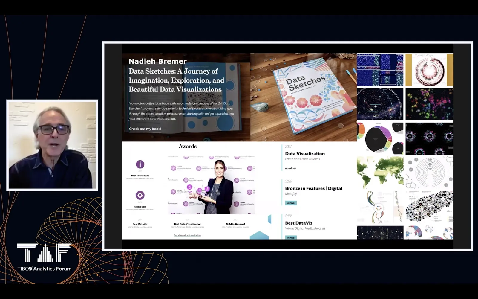
TAF22 burst into life with the opening session, “Visual Analytics in Time and Space,” featuring award-winning data visualization artist Nadieh Bremer. Bremer provided numerous examples of her stunning and memorable visualizations; each unfolding insights that had previously been locked away inside the datasets.
Visual Analytics in Time and Space
O’Connell and Bremer focused on the conference theme of “Visual Analytics in Time and Space,” offering examples of time trends, geospatial and space-time analytics, and detailing how these analytics are being used across many industries. They discussed their potential use in inclusive, innovative organizations and revealed how effective visual analytics quickly take us to insights, and then to actions on the business.
The Process of Creating Visual Art
A particularly fun portion of the session is when Bremer discusses with O’Connell how she tackles the challenge of presenting data that is both artistically engaging and revelatory. She gives a detailed review of her design process.
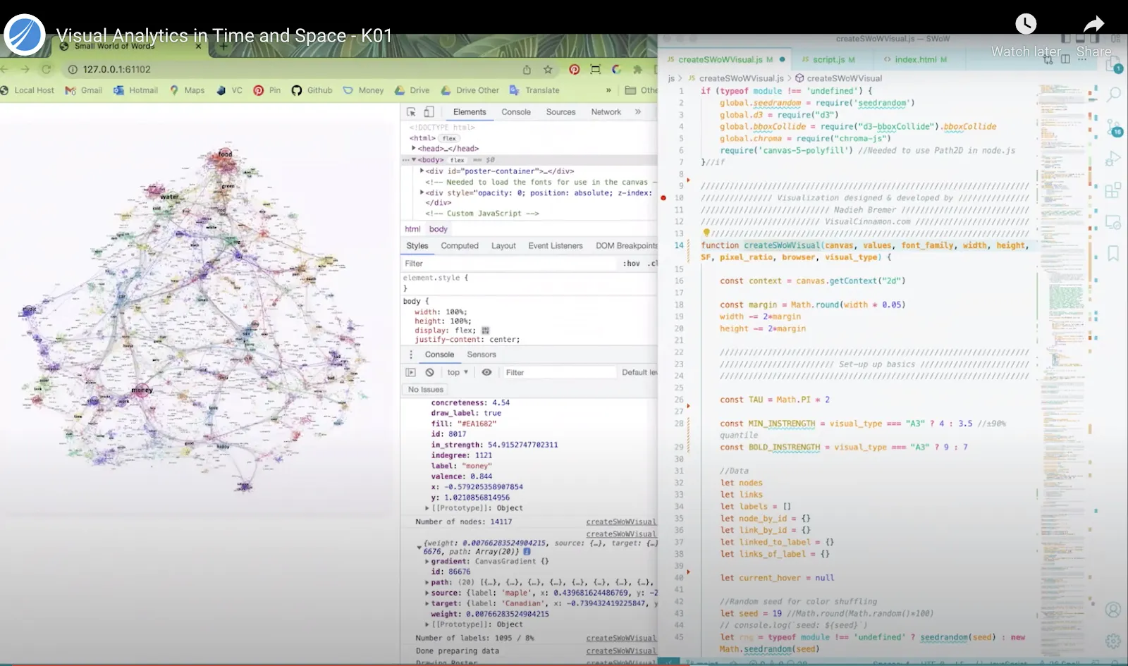
“I need two things to get started,” Bremer notes. “A goal and a dataset.” She then begins analyzing the data—with some datasets incorporating more entries than pixels on her screen! As she begins to understand the data and variables, she starts sketching with pen and paper and on her iPad. Freeform sketching is a big part of her process. She transitions this design stage into building the visualization on her 38-inch desktop screen. Bremer programs her visualizations in JavaScript.
Examples of Creating Visual Art from Data
A highlight of the session is when Bremer provides specific examples of her “representations of data through visual art.” She shows us the final work of art and walks us back through the process, including the development of the visuals, the intent, the dataset(s) she used, and what the client was hoping to achieve.
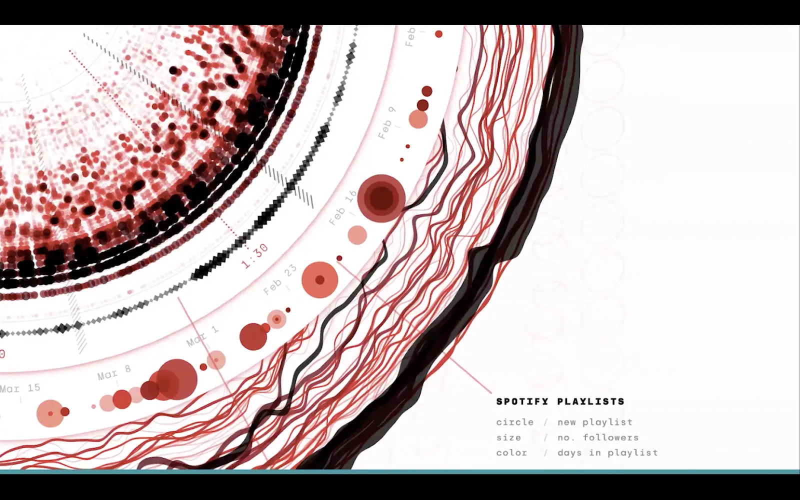
The crowd-favorite example, “Re-imagining the Golden Record,” dives into music streaming data from Sony Music Entertainment.
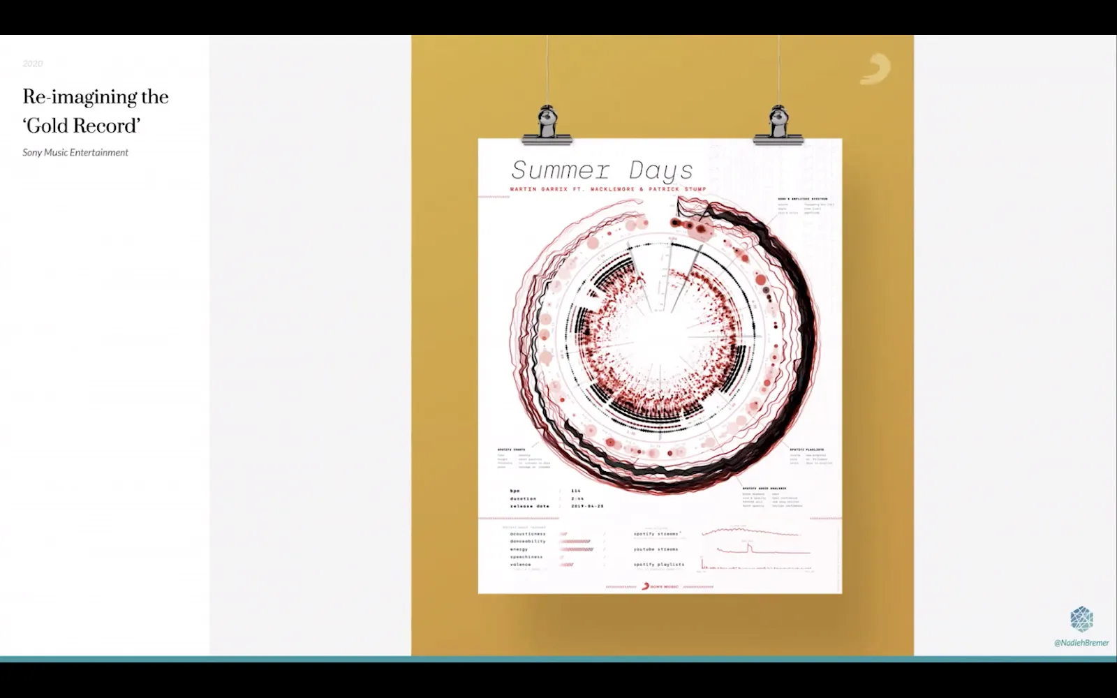
Sony Music: Re-imagining the Gold Record
- Visual art is in the shape of a record/gold record display
- Analysis dimensions: Time, Space
- Attributes of the data represented:
- The music itself
- The frequencies across the playtime
- The beats
- Other facets of the music, including danceability, energy, and valence
- Spotify and Youtube streaming data: number of streams, per country, per day
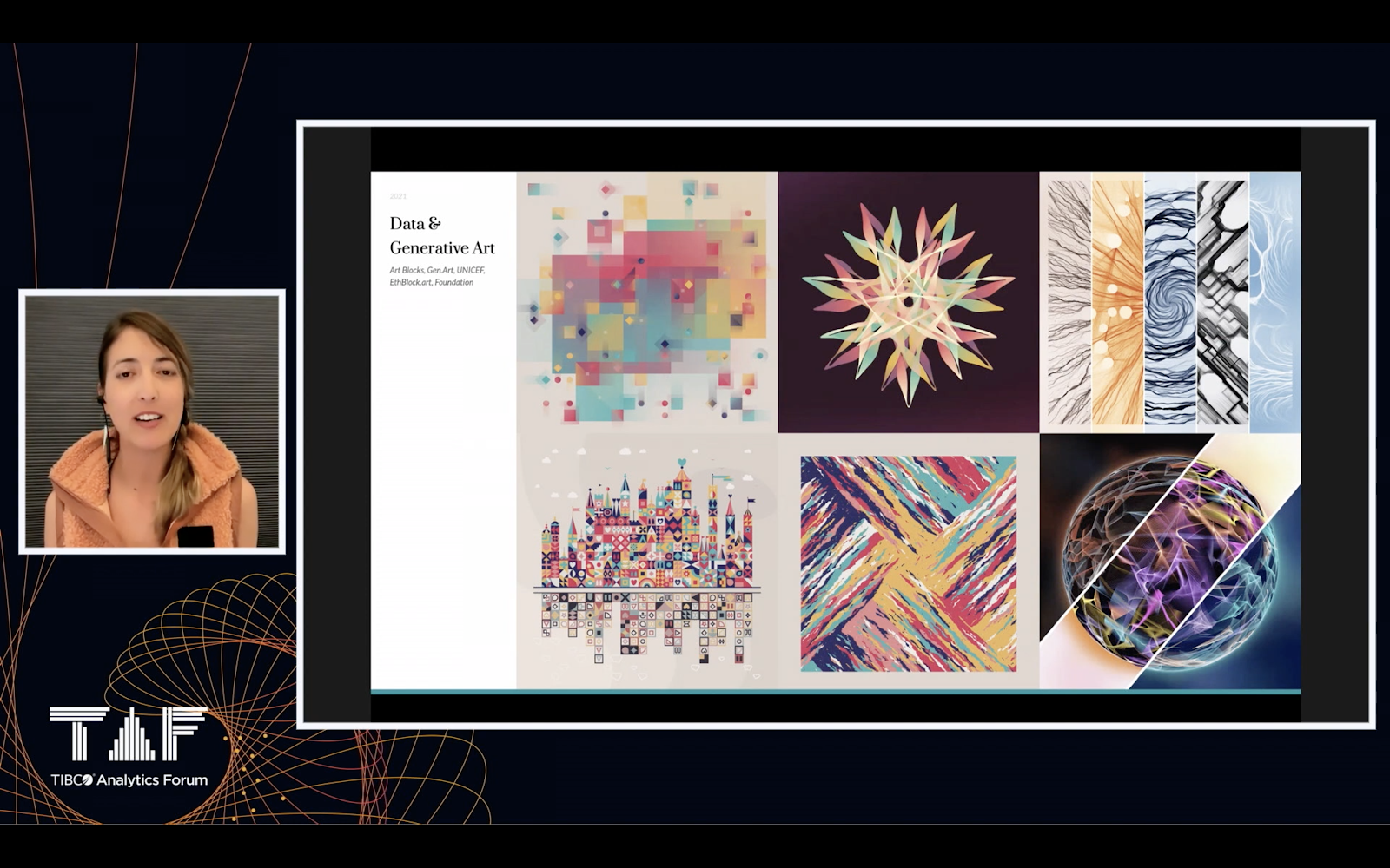
Generative Art and NFTs
Bremer and O’Connell concluded with a discussion on how her visual data art can be minted as non-fungible tokens (NFTs). Bremer’s visual data art NFTs include individual pieces, as well as works that are a part of a “long-form collection” or “generative art” where the buyer receives a ‘hash’ that goes through an algorithm and generates a unique work of art/visualization, by plugging in the hash to choose graphical attributes like colors and shapes.
Bremer’s amazing JavaScript-based visual art inspired a golden thread of innovation across the Day One TAF22 sessions. Right after the TAF22 Keynote, TIBCO’s Dr. Spotfire Neil Kanungo, and Data Scientist / Spotfire blogger Jose Leviaguirre, built and deployed a Time Series Difference Chart from scratch in 15 minutes using the Spotfire JavaScript Mods API.
The Keynote Session was rounded out with a Connected Intelligence Platform overview from Tobias Lehtipalo, VP of Product Management, and is available to watch on-demand here.
Self-Service Visual Analytics
Visual Analytics in Time and Space was just the first session of TAF22. Day One was a smashing success, filled with a stellar line-up of speakers, breakout sessions, and customer success stories. Plus, the largest audience ever.
If there are any sessions you missed or want to re-watch, they are now available on-demand through July 15. Access on-demand sessions directly from the TAF Agenda Page.
TAF22 Day One Highlights Include:
- Last year’s Spotfire Hackathon winner, Jolene Robertson (Petracana), led a session on using Spotfire for dashboard development, highlighting some of her developer tips and tricks.
- Other popular Spotfire ninjas Julie Sebby (SM Energy) and Sayali Patil (Gilead Sciences’ R&D Information Systems Manager) provided hands-on demos and tips for surfacing insights using Spotfire’s immersive visual analytics user experience.
- Bayer’s Head of Data Review and Operational Insights, Holger Schimanski) showed us how he has been creating new visualizations using the Spotfire Mods API.
- TIBCO’s CTO Nelson Petracek, and TIBCO data scientists discussed TIBCO LABS innovation programs in IoT, Digital Twins, and Process Mining.
TIBCO Product Management provided an exciting general session on “What’s New and What’s Next” in Spotfire, along with presentations on Spotfire Cloud Actions, Spotfire Spatial Analytics, and the new TIBCO ModelOps offering. Overall, a truly amazing day of visual analytics, integration, and data science. Day Two promises to be just as valuable.
All TAF22 sessions, including Visual Analytics in Time and Space, are available to watch live and on-demand. Register on the TAF site and bookmark sessions to add to your watchlist.
The post TAF Day 1: How Visual Artist Nadieh Bremer Decorates Time and Space first appeared on The TIBCO Blog.