Spotfire Tips and Tricks: Histograms Made Easy with Spotfire Data Panel
Blog: The Tibco Blog
A histogram is a graphical method of representing a large amount of data by way of bars, to reflect the distribution frequency and proportion or density of each class interval as a data visualization. TIBCO Spotfire analytic tool provides a quick and easy method to create histograms, which are common first step for planners and analysts to present information in a compact and organized way.
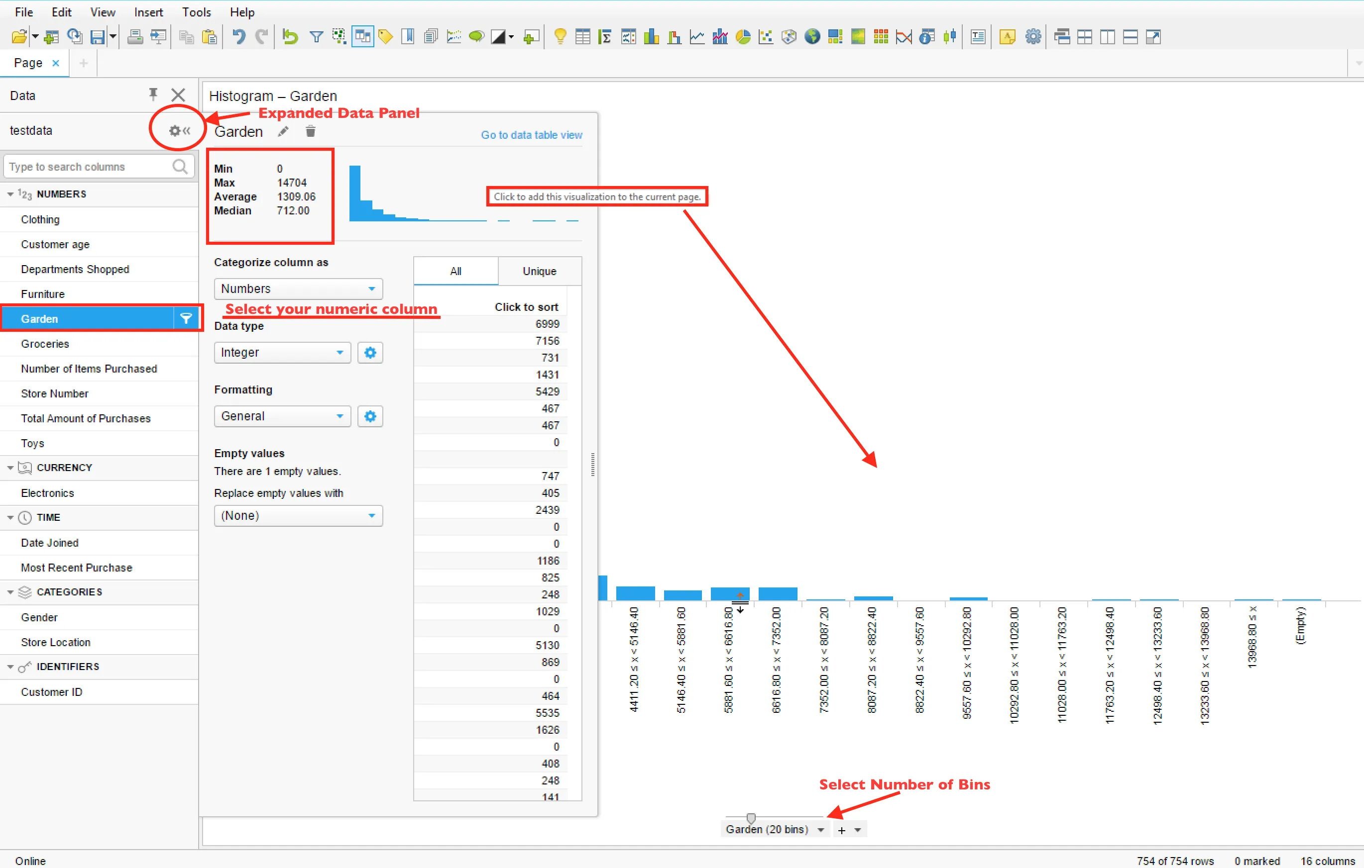
Numeric in-memory columns can be visualized as a histogram by clicking the histogram preview in the expanded data panel. In the image below, a histogram of the Garden column (how much each customer purchased in Garden department) is viewed using expanded data panel, providing quick insights into data. The user has ability to view basic information about the numeric column and at the same time, can quickly add this distribution as a visualization for further drill down. Click the histogram and the visualization will be added to the active page.
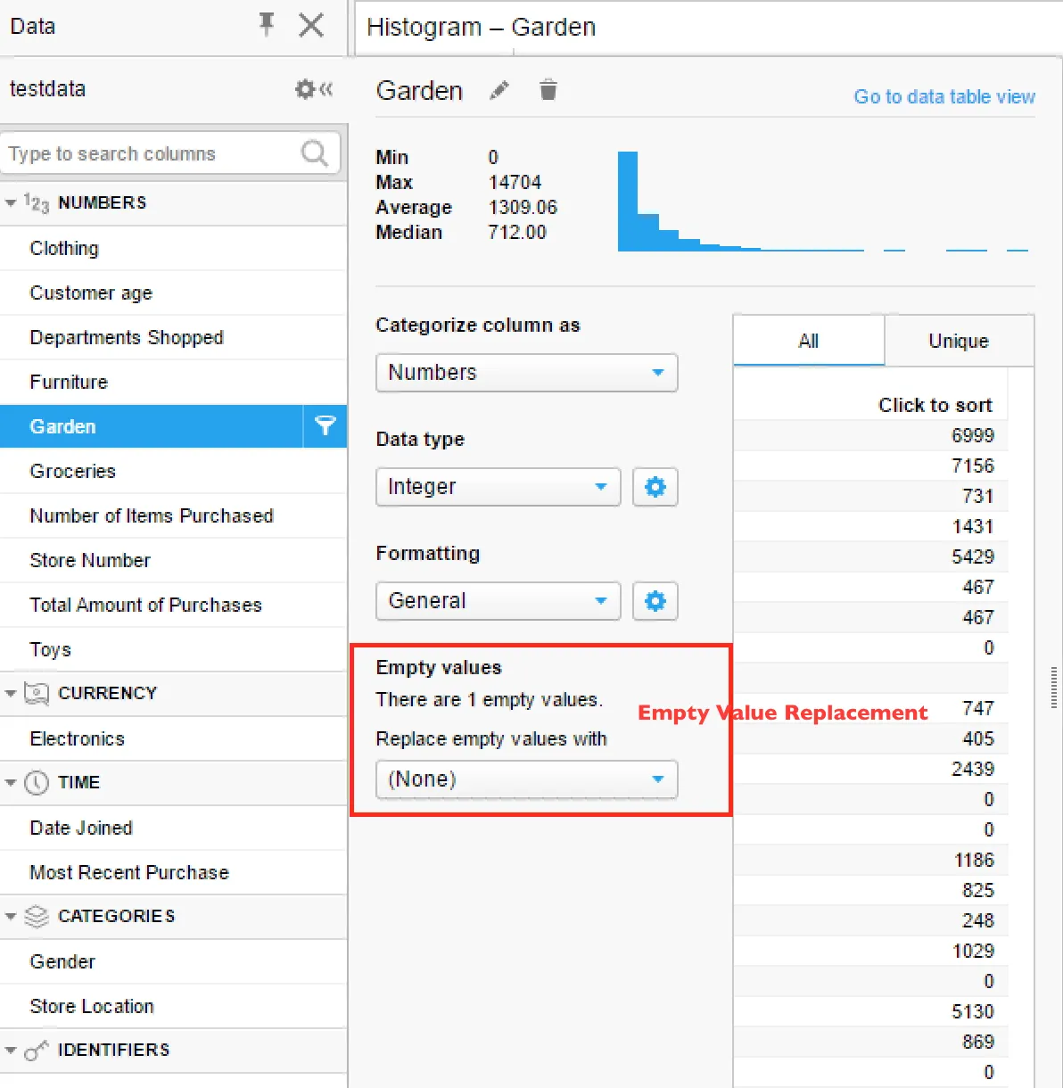
Empty value replacement
The data panel also provides the ability to replace empty Values. There is only one value, which is empty for this data.
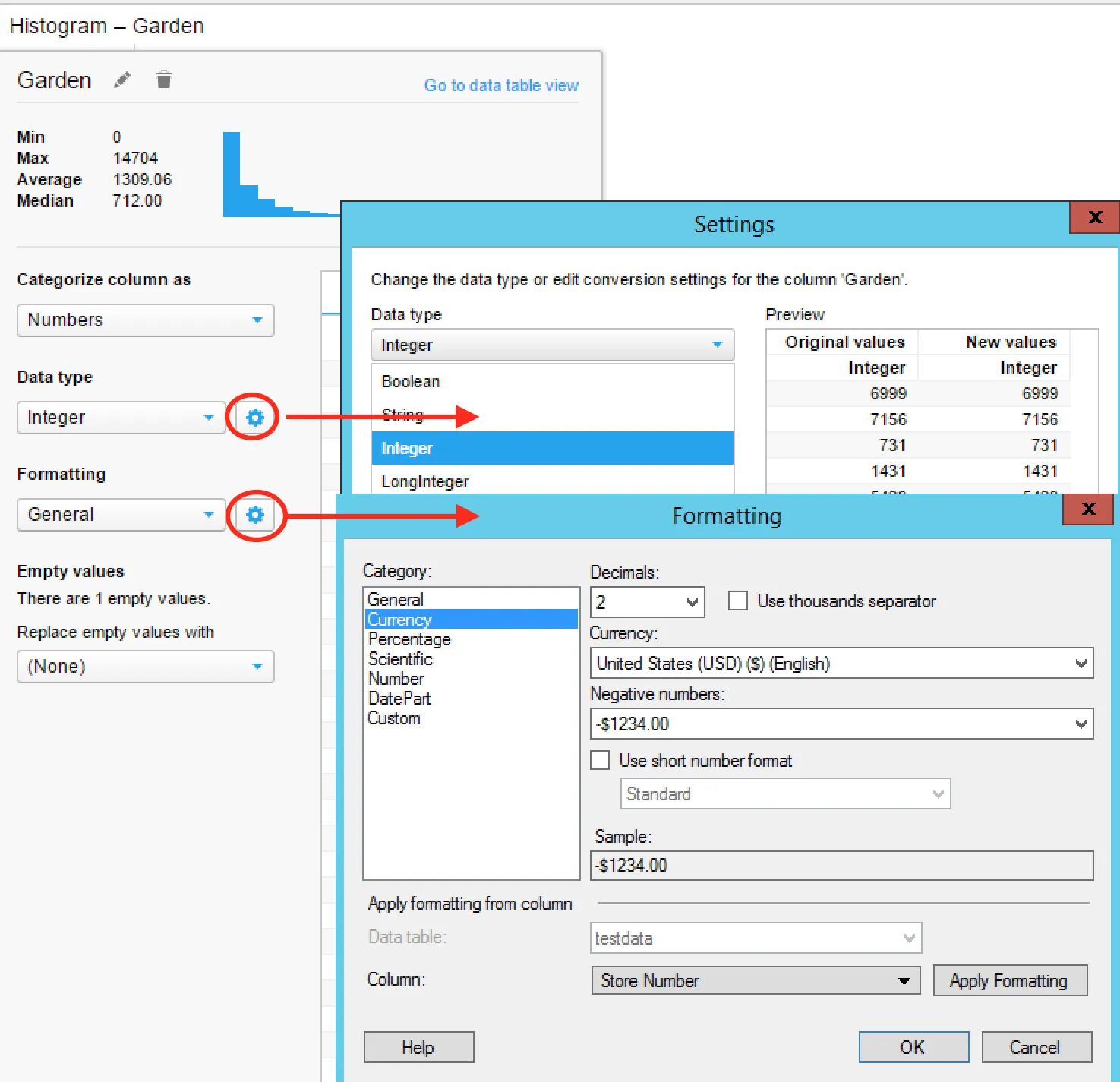
Data type and formatting updates
The user can also change data types of columns and define your formatting—all with one click actions! Spotfire also provides preview capability for changes made, making it intuitive to use.
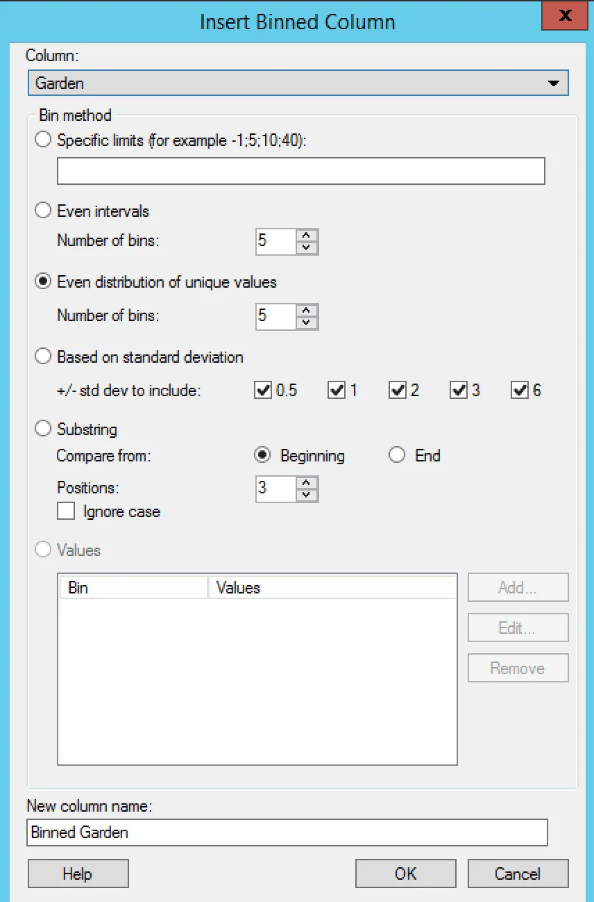
Custom bins
For the histogram, bins are equal in size by default. You can select slider to select number of bins, which is 20 as per image above. Spotfire provides an easy and simple way to define custom bins that may be based on specific limits, standard deviation, or substring binning in the case of string values. This new Binned column can be used like any other data column.
Learn more about histograms and then put these tips to good use when you try Spotfire for free!