How executive dashboards help leaders make informed decisions with confidence
Blog: Monday Project Management Blog
35,000.
That’s the estimated number of decisions the average adult makes per day, according to this Inc. article.
35 thousand.
That same article suggests the average decisions made per day for founders is “probably much higher.” This is because founders and other executives in organizations are tasked with reactive decisions and proactive ones – simple to complex, tactical to strategic, short term to long term.
“As any founder will tell you, the number of decisions they have to make in a day can get so overwhelming that by the time they get home, they can barely decide what to eat for dinner.” (Inc.)
Executive dashboards help leaders make business decisions with confidence.
And ultimately, that’s really the goal of any executive — confidently making a business decision.
In this blog post, we’ll discuss the various types of dashboards, explain the importance of a “single source of truth,” and explore how monday.com can help.
Not all dashboards are created equal.
First, a definition:
A business dashboard is generally a visual display of “at-a-glance” information about teams or the overall organization. Dashboards usually show high-level information like Key Performance Indicators (KPIs) or other specific objectives or business processes.
Dashboards give businesses the ability to monitor the health of their organization.
In some cases, dashboards serve as progress reports — quick hits for leaders to understand the general health of a business.
While all dashboards serve a similar purpose (visually display high-level detail), not all dashboards are created equal.
For example, one of the most common, most used types of business dashboards is the Google Analytics dashboards, used on 55% of all websites as of 2020. Google Analytics (or GA if you are hip) dashboards can be customized to display pretty much any website activity — visitors, pageviews, bounce rates, traffic sources, and so on.
A more recent type of dashboard, built-in response to the global pandemic, was the COVID-19 Dashboard by the Center for Systems Science and Engineering (CSSE) at Johns Hopkins University (JHU).
And then there are executive dashboards like the ones we have at monday.com:
monday.com dashboards are comprised of a back end (connecting a company’s files, boards, columns, and APIs) and a front end (displays this information in the form of charts, graphs, and gauges).
The analogy we like to use is that of a car dashboard.
A car dashboard is essentially your vehicle’s control panel. Its usually located directly ahead of the driver — though more and more car dashboards are now displayed on a tablet-like screen in between the driver and passenger seats). The car dashboard displays all relevant information for the vehicle’s operation. Today’s dashboards tend to show music, maps, and other non-automobile function-specific data.
Like an executive dashboard, the car dashboard is powered by “under the hood” (no pun intended) technology that is often customizable and user-specific.
With monday.com, our dashboards can extract any information you need from your boards — the back end — and display it in the form of a widget — the front end.
The various types of executive dashboard views
If you can think of a dashboard, it’s quite likely it exists in some format (see some of the monday.com dashboards).
If the dashboard is not available “out the box,” it’s probably customizable.
When it comes to executive-type dashboards, they typically fall into one of the following high-level categories:
- Management dashboard
- Analytics dashboard
- Operations dashboard
- Strategic dashboard
Management dashboards
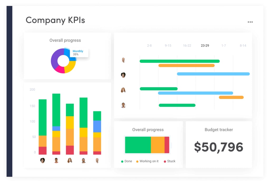
Management dashboards are most often KPI dashboards — helping executives understand the high-level metrics of the organization.
Within the KPI dashboards, teams most often choose marketing, sales, and customer success dashboards to display.
monday.com makes it super-easy to create the various KPI dashboards.
We find many clients set these up on big screens in their office HQs or — for remote teams and individuals — share out in a weekly email or Slack communication.
And unlike some executive dashboard solutions, there is no need for crazy-detailed Excel or Google sheets. Instead, simply select the data for your KPI dashboard from multiple monday.com boards and filter it as required.
We recommend using widget building blocks to create and customize your dashboard. We have dozens of widgets to choose from:
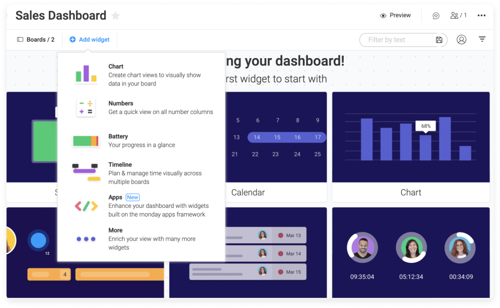
While you can choose from a variety of data-driven, business metric widgets (chart, workload, timeline, to-do list, and so on), we also think dashboards should be relevant, fun, and useful. Therefore we have other widgets such as music playlists, YouTube videos, or inspiring quotes of the day .. not all that dissimilar to modern-day car dashboards.
Finally, the data you choose is 100% up to you. Once you create an executive dashboard, you can completely customize it to display data from your workflow boards based on conditions and values, even down to individual data columns.
BONUS: monday.com boards and widgets are interconnected. When one data point is updated, it reflects on other dashboard elements that depend on it.
The benefits of executive dashboards
There are many advantages to using (monday.com) executive dashboards.
We’ll use this sales pipeline dashboard to step through the various benefits:
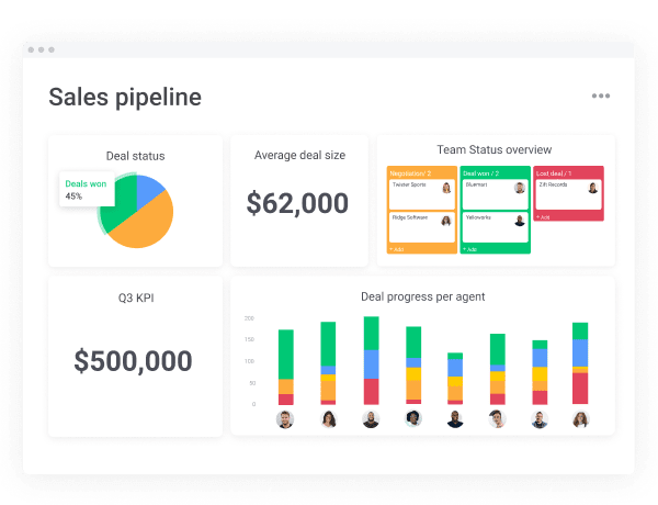
Visual presentation
Executive dashboards should be aesthetically pleasing, ideally using a variety of charts and graphs and other visual depictions of data. Incorporating different widgets – with different colors helps keep the dashboards interesting to look at.
Easily spot trends
When data are displayed on a dashboard, trends (both good and not so good) pop off the screen. You can easily spot when sales numbers, for example, are healing in the wrong direction or employee satisfaction is on a positive uptick.
Measure efficiencies (and inefficiencies)
Executive dashboards help leaders spot areas of weakness, places where inefficiencies may exist. Before “getting in the weeds” with data, leaders often turn to the high-level dashboards to spot where improvements can be made.
Consolidated reporting
The ability to pull in widgets and data from multiple sources and teams means executives can have “at-a-glance” reporting. There is no need to cross-reference multiple department dashboards when one (big) one will suffice.
Cross-device accessibility
Most, if not all, executive dashboards are compatible no matter the device or screen size. Here at monday.com, we like to say that screen size doesn’t matter.
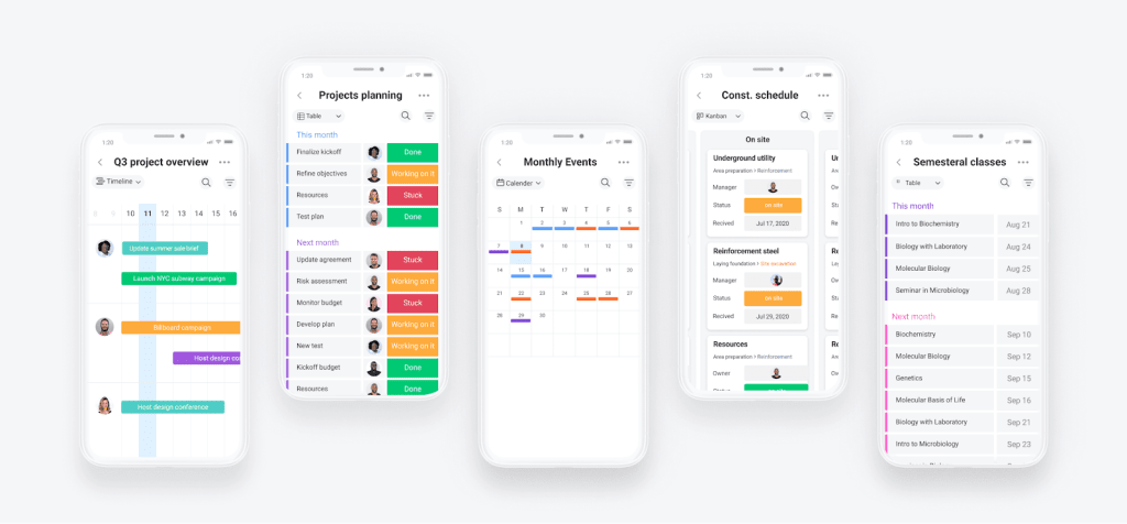
Communicate with everyone, whether you’re working from your couch, on the road, or in the office. Use our mobile app, desktop tool, or work in offline mode (coming soon).
Integrations
Finally, executive dashboards must be able to seamlessly integrate all of your favorite tools.
Our integration solutions help connect monday.com with the tools you already use to have all your team’s work in one place.
Monday.com: More than just executive dashboards
Executive dashboards are one of the many solutions we offer at monday.com.
Our Work OS means teams can manage everything in one workspace — planning, tracking, and delivering your team’s best work has never been easier.
Set up in minutes using one of our hundreds of visual and customizable templates and then save time with automations.
See why over 125K companies choose monday.com.
The post How executive dashboards help leaders make informed decisions with confidence appeared first on monday.com Blog.
Leave a Comment
You must be logged in to post a comment.