

How Analytics Developers Can Game Model Results
Blog: Enterprise Decision Management Blog

“There are three kinds of lies: lies, damned lies, and statistics” – Attributed to Benjamin Disraeli, British PM (1874-1880)
In assessing the predictive value of new scores or new data, significant weight is given to model performance measures. Examples of these measures — which quantify the effectiveness of a predictive model in distinguishing between the outcomes being predicted — include the Gini coefficient, KS (Kolmogorov-Smirnoff statistic), and ROC Area. These measures are appealing because they allow a straightforward means of comparing the relative effectiveness of two or more models. Think of them as scoring the scores — the score or data with the highest “score” looks like the best one to buy or use.
Score and data vendors often structure their validations in a way that produces a more compelling case for their product. And sometimes their efforts fall into the grey area of gaming — producing misleading results by tweaking the way the tests are run.
This post will be the first of a three-part series highlighting some of the ways in which the set-up of a score validation can greatly influence model performance results — and sometimes inflate them. My goal is to help potential users of scores and data evaluate their options and understand when they might be looking at skewed results.
A Tale of Two Ginis
I have seen studies claiming a credit risk score can offer as much as 20% improvement in credit risk assessment over a predecessor model, as measured by relative improvement in Gini.
That’s a great result — but can you trust it?
To understand that, we have to dig into how the studies are performed.
In one such study that cited 20+% predictive improvement, the measures are evaluated on narrowly defined credit segments. These credit segments are defined on the basis of the benchmark score being used in the evaluation.
What’s wrong with that? Defining your validation segments on the basis of the benchmark score truncates the population on that score, and disadvantages it relative to the ‘challenger’ score being evaluated . This in turn can result in significantly overstated gains being depicted from use of the challenger score.
To illustrate this, we calculated the same measure used in the study — % incremental Gini lift — only we compared our most recent FICO® Score (FICO® Score 9) to the previous version, FICO® Score 8. As shown in Figure 1, on an originations use case across the total population, we observe Gini values of .708 for FICO Score 9, and .694 for FICO Score 8. This translates to relative Gini improvement of 2%.

Why so little? FICO Score 9 is our 7th generation FICO Score, and over the 28+ years that we have been building FICO Scores, we’ve steadily refined our algorithm to mine as much signal as we can extract from the traditional credit report. As a result, the marginal gains offered from rebuilding the score have shrunk over time.
Figure 2 illustrates what happens to these relative lift measures when we start to define narrow credit segments using FICO® Score 8. The FICO Score 8 Gini for the population defined by having a FICO Score 8 of 670-739 is a scant .213.

Why did it drop? Gini measures the effectiveness of a model in “pushing apart” future good and bad performers. People within a 70-point FICO Score range will behave more similarly than people across the entire risk spectrum, so there’s less “pushing apart” that the score can do.
The FICO Score 9 Gini on this population with FICO® Score 8 = 670-739 is also quite low, but the relative difference is now much bigger — an eye-popping 48% improvement.
Two things caused the % Gini improvement figure to jump:
- The benchmark Gini measure is low, which in relative terms drives higher percent improvement figures
- The individuals who scored 670-739 on FICO Score 8 don’t all fall into this range on FICO Score 9 — some scored higher, some scored lower (the whole point of using a new score is that people will score differently). Therefore, the “pushing apart” effect looks greater, simply because the cohort is limited to a 70-point range on FICO Score 8, but not on FICO Score 9.
Gaming the Test
If this seems like a statistical trick to you, you’re right. Analysts know this, which is why they will ask very detailed questions about how % improvement figures in Gini (or KS or ROC) were arrived at.
Here’s more evidence of how it works: Figure 3 summarizes the % improvement figures that can be realized across different score ranges by virtue of defining the credit segments narrowly and on the basis of a benchmark score. The far right bar in the chart represents the total population score improvement of ~2%, which is in line with what clients might expect from a 7th generation model.
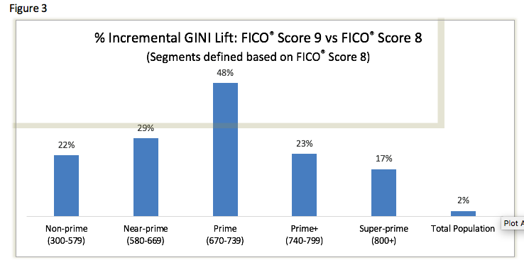
But if we wanted to skew validation results, we could pick any segment of customers defined by FICO Score 8, run the Gini tests and show an improvement of up to 48%. If a lender were to take the result for the “prime” population and conclude that their decisions are going to be almost 50% more profitable in the prime segment by switching to FICO® Score 9, they are going to be disappointed.
Rest assured — when we present performance improvement results for a new version of the FICO Score, we don’t do so on narrow segments of the population defined by the benchmark score being used in the evaluation. We want lenders to be confident that when they decide to invest in a new score (including the significant investment required to comply with OCC 11-12 model governance rules) they see their decision pay off as expected.
When assessing the value of new scores, make sure that you take a good hard look at the validation approach. In lieu of percent improvement statistics, consider less susceptible validation materials such as swap set analyses, which calculate the percentage of the population that would be swapped above/below key score thresholds as a result of switching from use of one score to another. Coupled with solid projections of profit per good account and loss per bad, you will find yourself in a much better position to realistically assess the potential ROI of a new score or data source.
Unfortunately, this isn’t the only way you can game score validation results. Stay tuned for future blogs posts where we reveal other dirty little secrets of model validations!
The post How Analytics Developers Can Game Model Results appeared first on FICO.
Leave a Comment
You must be logged in to post a comment.