EDA , XGBoost and Hyperparameter Tuning using pySpark on Databricks (Part III)
Blog: Indium Software - Big Data
This post is the continuation of post which covers the model building using spark on databricks. In this post we are going to cover EDA and Hyperoptimization using pyspark.
Load the data using pyspark
spark = SparkSession
.builder
.appName(“Life Expectancy using Spark”)
.getOrCreate()
sc = spark.sparkContext
sqlCtx = SQLContext(sc)
data = sqlCtx.read.format(“com.databricks.spark.csv”)
.option(“header”, “true”)
.option(“inferschema”, “true”)
.load(“/FileStore/tables/Life_Expectancy_Data.csv”)
Replacing spaces in column names with ‘_’
data = data.select([F.col(col).alias(col.replace(‘ ‘, ‘_’)) for col in data.columns])
With Spark SQL, you can register any DataFrame as a table or view (a temporary table) and query it using pure SQL.
There is no performance difference between writing SQL queries or writing DataFrame code, they both “compile” to the same underlying plan that we specify in DataFrame code.
data.createOrReplaceTempView(‘lifeExp’)
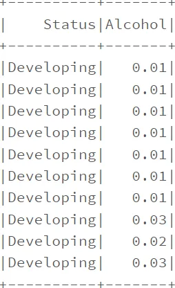
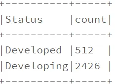
spark.sql(“SELECT Status, Alcohol FROM lifeExp where Status in (‘Developing’, ‘Developed’) LIMIT 10”).show()

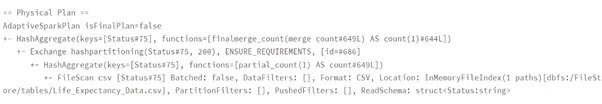
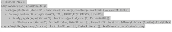
Performance Comparison Spark DataFrame vs Spark SQL
dataframeWay = data.groupBy(‘Status’).count()
dataframeWay.explain()
sqlWay = spark.sql(“SELECT Status, count(*) FROM lifeExp group by Status”)
sqlWay.explain()
Usage of Filter function.
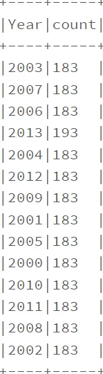
data.filter(col(‘Year'<2014).groupby(‘Year’).count().show(truncate=False)
data.filter(data.Status.isin([‘Developing’,’Developed’])).groupby(‘Status’).count().show(truncate=False)
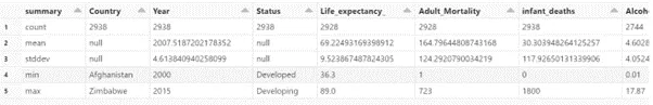
Descriptive Analysis.
display(data.select(data.columns).describe())
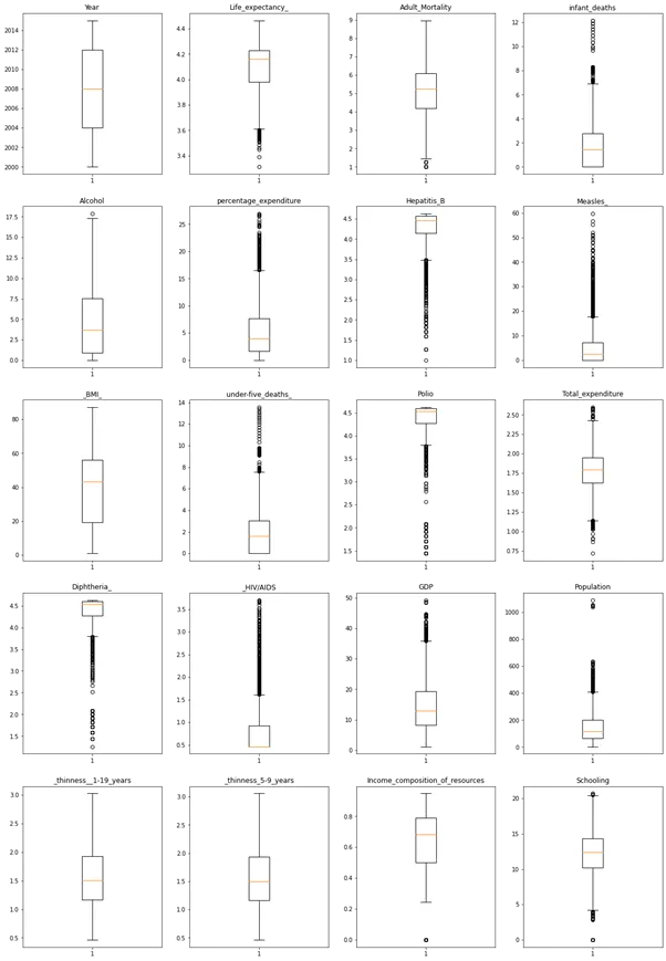
We will look at outliers in the data which cause the bias in the data.
Convert data into pandas dataframe
data1 = data.toPandas()
#interpolate null values in data
data1 = data1.interpolate(method = ‘linear’, limit_direction = ‘forward’)
Boxlplot using matlplotlib
plt.figure(figsize = (20,30))
for var, i in columns.items():
plt.subplot(5,4,i)
plt.boxplot(data1[var])
plt.title(var)
plt.show()
Boxplots are a standardized way of displaying the distribution of data based on a five number summary (“minimum”, first quartile (Q1), median, third quartile (Q3), and “maximum”).
The distribution of Data is as below,
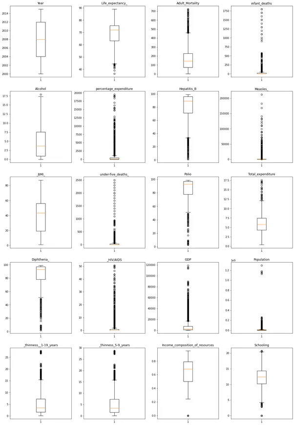
We can see most outliers in HIV/AIDS, GDP, Population, etc.
We need to treat the outliers, for this we will apply cube root function
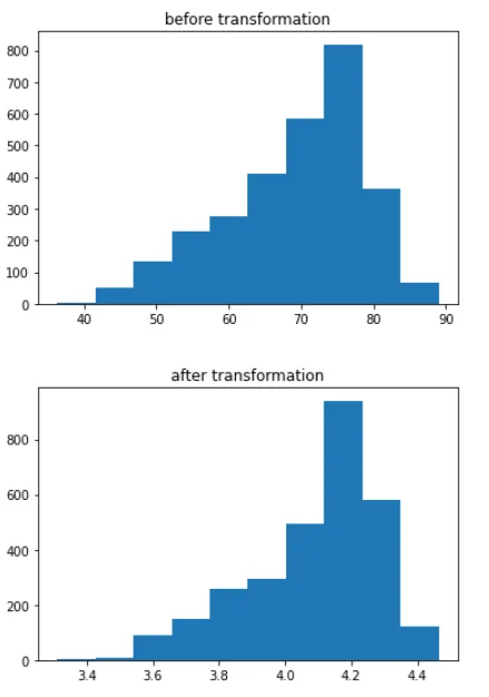
#Cube root transformation
plt.hist(data1[‘Life_expectancy_’])
plt.title(‘before transformation’)
plt.show()
data1[‘Life_expectancy_’] = (data1[‘Life_expectancy_’]**(1/3))
plt.hist(data1[‘Life_expectancy_’])
plt.title(‘after transformation’)
plt.show()
# for Adult_Mortality
plt.hist(data1[‘Adult_Mortality’])
plt.title(‘before transf’)
plt.show()
data1[‘Adult_Mortality’] = (data1.Adult_Mortality**(1/3))
plt.hist(data1[‘Adult_Mortality’])
plt.title(‘after transf’)
plt.show()
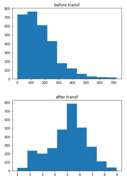
Similarly applying the cube root function for all other features, plotting the box plot again to see the outliers treatment.
Outliers are significantly reduced from the above observations.
Converting Status values to binary values,
data1.Status = data1.Status.map({‘Developing’:0, ‘Developed’: 1})
Feature Importance.
corrs = []
columns = []
def feature_importance(col, data):
for i in data.columns:
if not( isinstance(data.select(i).take(1)[0][0], six.string_types)):
print( “Correlation to Life_expectancy_ for “, i, data.stat.corr(col,i))
corrs.append(data.stat.corr(col,i))
columns.append(i)
sparkDF=spark.createDataFrame(data1)
# sparkDF.printSchema()
feature_importance(‘Life_expectancy_’, sparkDF)
corr_map = pd.DataFrame()
corr_map[‘column’] = columns
corr_map[‘corrs’] = corrs
corr_map.sort_values(‘corrs’,ascending = False)
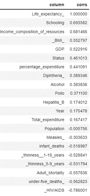
We considering features with positive correlation for model building.
VectorAssembler and VectorIndexer:
vectorAssembler combines all feature columns into a single feature vector column, “rawFeatures”. vectorIndexer identifies categorical features and indexes them, and creates a new column “features”. # Remove the target column from the input feature set.
featuresCols=[‘Schooling’,’Income_composition_of_resources’,’_BMI_’,’GDP’,’Status’,’percentage_expenditure’,’Diphtheria_’,
‘Alcohol’,’Polio’, ‘Hepatitis_B’, ‘Year’, ‘Total_expenditure’]
vectorAssembler = VectorAssembler(inputCols=featuresCols, outputCol=”rawFeatures”)
vectorIndexer = VectorIndexer(inputCol=”rawFeatures”, outputCol=”features”, maxCategories=4)
The next step is to define the model training stage of the pipeline.
The following command defines a XgboostRegressor model that takes an input column “features” by default and learns to predict the labels in the “Life_Expectancy_” column.
If you are running Databricks Runtime for Machine Learning 9.0 ML or above, you can set the `num_workers` parameter to leverage the cluster for distributed training.
from sparkdl.xgboost import XgboostRegressor
xgb_regressor = XgboostRegressor(num_workers=3, labelCol=”Life_expectancy_”, missing=0.0)
Define a grid of hyperparameters to test:
— maxDepth: maximum depth of each decision tree
— maxIter: iterations, or the total number of trees
paramGrid = ParamGridBuilder()
.addGrid(xgb_regressor.max_depth, [2, 5])
.addGrid(xgb_regressor.n_estimators, [10, 100])
.build()
Define an evaluation metric. The CrossValidator compares the true labels with predicted values for each combination of parameters, and calculates this value to determine the best model.
evaluator = RegressionEvaluator(metricName=”rmse”, labelCol=xgb_regressor.getLabelCol(), predictionCol=xgb_regressor.getPredictionCol())
Declare the CrossValidator, which performs the model tuning.
cv = CrossValidator(estimator=xgb_regressor, evaluator=evaluator, estimatorParamMaps=paramGrid)
Defining Pipeline.
from pyspark.ml import Pipeline
pipeline = Pipeline(stages=[vectorAssembler, vectorIndexer, cv])
pipelineModel = pipeline.fit(train)
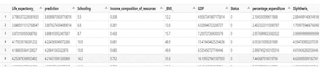
Predictions.
predictions = pipelineModel.transform(test)
display(predictions.select(‘Life_expectancy_’,’prediction’,*featuresCols))
rmse = evaluator.evaluate(predictions)
print(“RMSE on our test set: %g” % rmse)
Output: RMSE on our test set: 0.100884
evaluatorr2 = RegressionEvaluator(metricName=”r2″,
labelCol=xgb_regressor.getLabelCol(),
predictionCol=xgb_regressor.getPredictionCol())
r2 = evaluatorr2.evaluate(predictions)
print(“R2 on our test set: %g” % r2)
Output: R2 on our test set: 0.736901
For the observations of RMSE and R-Squared we can see there is 73% of the variance of Life_Expectancy_ is explained by the independent features. We can further improve the R-squared value by including all the features except ‘Country’.
featuresCols = [‘Year’, ‘Status’, ‘Adult_Mortality’, ‘infant_deaths’, ‘Alcohol’, ‘percentage_expenditure’, ‘Hepatitis_B’, ‘Measles_’, ‘_BMI_’, ‘under-five_deaths_’, ‘Polio’, ‘Total_expenditure’, ‘Diphtheria_’, ‘_HIV/AIDS’, ‘GDP’, ‘Population’, ‘_thinness__1-19_years’, ‘_thinness_5-9_years’, ‘Income_composition_of_resources’, ‘Schooling’]
vectorAssembler = VectorAssembler(inputCols=featuresCols, outputCol=”rawFeatures”)
vectorIndexer = VectorIndexer(inputCol=”rawFeatures”, outputCol=”features”, maxCategories=4)
xgb_regressor = XgboostRegressor(num_workers=3, labelCol=”Life_expectancy_”, missing=0.0)
paramGrid = ParamGridBuilder()
.addGrid(xgb_regressor.max_depth, [2, 5])
.addGrid(xgb_regressor.n_estimators, [10, 100])
.build()
evaluator = RegressionEvaluator(metricName=”rmse”,
labelCol=xgb_regressor.getLabelCol(), predictionCol=xgb_regressor.getPredictionCol())
cv = CrossValidator(estimator=xgb_regressor, evaluator=evaluator, estimatorParamMaps=paramGrid)
pipeline = Pipeline(stages=[vectorAssembler, vectorIndexer, cv])
pipelineModel = pipeline.fit(train)
predictions = pipelineModel.transform(test)
New values of R2 and RMSE.
rmse = evaluator.evaluate(predictions)
print(“RMSE on our test set: %g” % rmse)
evaluatorr2 = RegressionEvaluator(metricName=”r2″,
labelCol=xgb_regressor.getLabelCol(), predictionCol=xgb_regressor.getPredictionCol())
r2 = evaluatorr2.evaluate(predictions)
print(“R2 on our test set: %g” % r2)
Output: RMSE on our test set: 0.0523261, R2 on our test set: 0.92922
We see a significant improvement in RMSE and R2.
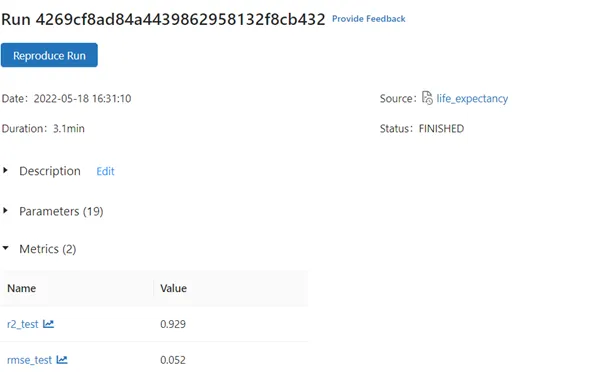
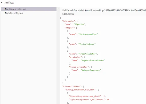
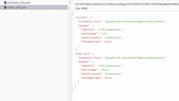
We can monitor the hyperparameters max_depth, n_estimators from Artifacts stored in JSON formats estimator_info.json, metric_info.json.
Conclusion
This post has covered Exploratory Data Analysis, XGBoost Hyperparameter Tuning. Further posts would be covering deployment of model using Databricks.
Please see the part 1 : The End-To-End ML Pipeline using Pyspark and Databricks (Part 1)
The post EDA , XGBoost and Hyperparameter Tuning using pySpark on Databricks (Part III) appeared first on Indium Software.