Customer Analytics Series #3: Propensity Analysis with Customer Analytics Templates for Spotfire
Blog: The Tibco Blog
Let’s take on the role of a marketer working for a retailer. We are running a promotional campaign for various products. Which customers should we target in the campaign and with which products? How do we know when to promote a product and when not to in order to keep the offers personalized?
Propensity analysis offers some common approaches to find answers to these questions. The customer analytics propensity analysis template for Spotfire in the customer analytics template series lets us perform one of these analyses. We will use the example that comes with the template to see how we can conduct an analysis to determine products to recommend to customers, identify cross-sell opportunities, and make personalized offers.
When conducting a propensity analysis, we are interested to find the propensity for a customer to perform a certain action, for example, to buy a product. In other words, we are trying to predict how likely it is that a customer will perform that action. Different types of algorithms, such as decision trees, random forests, and logistic regression, may be used to perform this prediction. Commonly, the algorithms have to “learn” from a set of historical data to find a model that calculates the prediction. In order to find the model, the algorithms are told which variables are likely to have an effect on the predicted outcome. The algorithms then learn to predict based on the values of those variables.
The historical customer purchase data used by the template is prepared with the customer analytics data pre-processing template. The sample data set in the template contains purchases made by customers during a period when there was no promotion and during a period when there was a promotion. We would like to find the propensities for customers to purchase from certain product categories during a promotion based on what they bought in the past, when no promotion was held.
While it is not uncommon for propensity analyses to be done on a single product or category, the template’s example takes the idea further. Let’s assume that we have identified 4 product categories to promote in a campaign for which we are currently planning. To each customer, we would like to promote the category he is most likely to buy and we would also like to make a cross-sell recommendation of a second category where appropriate.
The first step to the analysis is to define which are the product categories whose propensities are to be predicted (i.e. the categories to be promoted) and which are the product categories whose historical purchases are to be used to predict those propensities. These variables are called response and explanatory variables, respectively, and can be selected using the template. Figure 1 shows the 4 categories chosen for the response variables are men’s running clothes, men’s sweaters, women’s sweaters, and women’s tops.
Figure 1: Response and explanatory variables
The algorithm used in the template calculates the propensity (a value between 0 and 1) of each customer buying each of the 4 product categories. The 4 categories are then ranked for every customer and the top two categories (with the highest propensities) for each customer are picked for further analysis using the propensity plots shown in Figure 2.
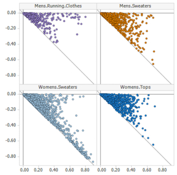
Figure 2: Propensity plots
Let us now look at how to interpret the propensity plots, using the plot for men’s running clothes in Figure 3 as example. The points in the plot represent the customers for whom the top-ranked product category is men’s running clothes. The values on the horizontal axis are the customers’ propensity scores for their top-ranked product category (i.e. men’s running clothes). The values on the vertical axis are the differences in the customers’ propensity scores for their second-ranked product category and their top-ranked category. In other words, the horizontal axis measures how likely it is the customer will purchase men’s running clothes. The further right a customer appears on the plot, the more likely it is that he purchases from this category. The vertical axis tells us if it is as likely that the customer will purchase his second-ranked product category. The higher up a customer appears on the plot, the closer his propensity to purchase his second-ranked product category is to that of him purchasing men’s running clothes. Figure 3: Propensity plot and table for customers whose top-ranked category is men’s running clothes
Having this understanding of the propensity plots, we would naturally like to target customers who appear to the right of each plot with offers of their top-ranked product categories. Out of this group of customers, those that appear in the top right portion of the plots are good candidates to whom we can make cross-sell offers. These customers are highlighted in Figure 3. Not only do they have a high propensity score for buying men’s running clothes, they also have high propensity scores for their second-ranked product categories, as shown in the column “propensity.2” in the accompanying table.
In Figure 4, we find customers whose top product category is women’s sweaters. The customers that appear in the bottom right portion of the plot are highlighted. They have a high propensity for buying women’s sweaters. However, the propensities of them buying their second-ranked product fall far behind, as shown in the column “propensity.2” in the accompanying table. These customers are candidates to whom we would offer promotions on women’s sweaters, but not another product category.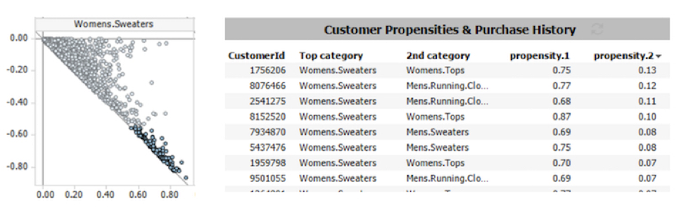
Figure 4: Propensity plot and table for customers whose top-ranked category is women’s sweaters
The propensity plots in the template makes it easy for us to identify customers to whom to offer personalized promotions of various product categories. You may do this propensity analysis on your own data by downloading the customer analytics propensity analysis template for Spotfire from the TIBCO Community site.
This post is the third in the Customer Analytics Templates for TIBCO Spotfire series. Here are the first two posts on knowing and segmenting your customers. Ready to try? Download a free trial of TIBCO’s Spotfire analytics platform.
Leave a Comment
You must be logged in to post a comment.