
4 Ways Data Visualization Helps Your Organization
Blog: The Tibco Blog
According to MIT, 90 percent of information translated to the brain is visual, and the human brain can process images in as little as 13 milliseconds. What does this mean for your business?
It means visualizations can transform the way you work. Data visualization is a graphical representation of data. Interactive data visualization enables companies to drill down to explore details, identify patterns and outliers, and change which data is processed or excluded.
4 Data Visualization Capabilities
Here are four ways data visualization can help your organization:
- Improved response times: Data visualization puts the data into the users’ hands, allowing them to quickly identify issues and improve response times.
- Greater simplicity: Using visualizations allows users to get the big picture and see the details at the same time. Users only interact with relevant data, simplifying understanding.
- Easier pattern recognition: Have you ever tried to find patterns in data while reviewing thousands of lines in a spreadsheet? Data visualization allows users to better absorb the data and see new paths. They can identify new patterns and trends that were impossible to see using tabular data. It allows decision makers to view data with graphical representations, including bubble charts, treemap charts, and donut charts.
- Enhanced collaboration: Collaboration gives teams access to the strengths and skills of everyone involved by combining the experiences of the entire group. These skills can be used to solve problems faster and improve innovation. Advanced visualizations make it easier for teams to collaborate. Instead of having to consume tens of thousands of lines of data, they can rely on visual representations that consolidate the data.
The bottom line: visualizations allow you to discover solutions quicker, explore potential trends, and improve decision making.
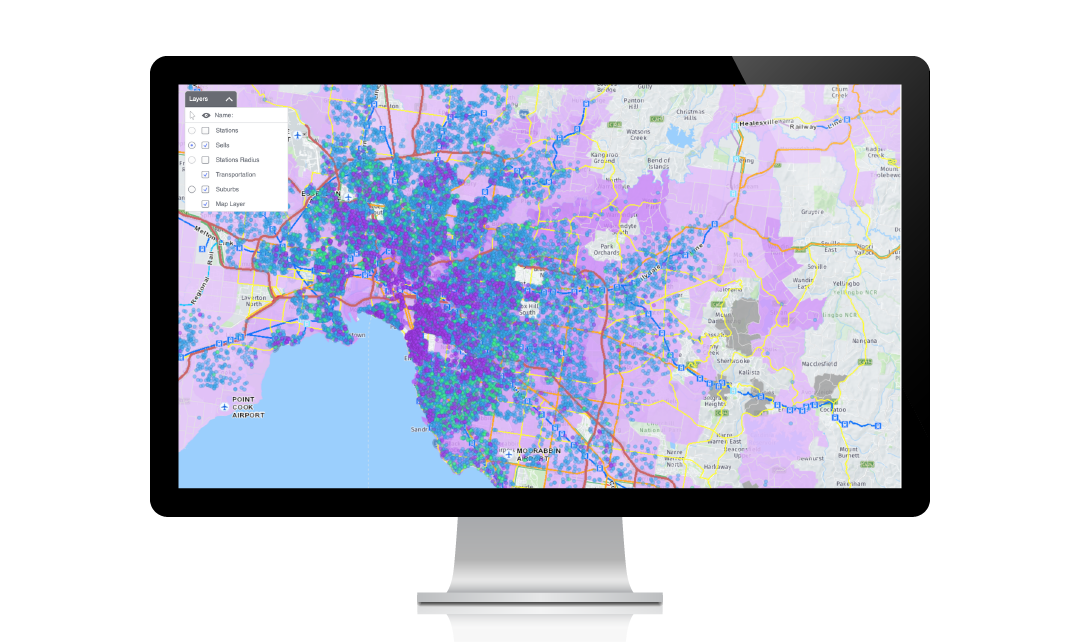
TIBCO Spotfire Visualizations
Ready to utilize data visualization in your company? TIBCO Spotfire software is the most complete analytics solution on the market, enabling everyone to explore and visualize new discoveries in data through immersive dashboards and advanced analytics. Spotfire analytics delivers capabilities at scale, including predictive analytics, geolocation analytics, and advanced analytics. And with Spotfire Mods, you can build tailored analytic apps rapidly, repeatedly, and to scale.
TIBCO Spotfire advanced analytics helps you:
- Gain richer insights with AI-infused visual analytics and custom analytics app creation
- Combine historic and streaming data to predict trends via data science and embedded analytics
Learn more about TIBCO’s leading analytics solutions here.
This blog was originally published by TIBCO on 10/7/2014.
The post 4 Ways Data Visualization Helps Your Organization first appeared on The TIBCO Blog.