What’s a “Data Function” and Why it is Such an AI Enabler?
Blog: The Tibco Blog
Many uses of artificial intelligence or machine learning are well served using high-quality visuals depicting discoveries or predictions. To achieve this efficiently, techniques and algorithms should be well integrated into the tool’s visualization architecture. Leland Wilkinson’s “The Grammar of Graphics” (Springer, 2005) is an inspiration for many open source and proprietary visualization systems (including portions of TIBCO Spotfire). Most implementations concentrate on the book’s primary guidance around the graph algebra and mapping aesthetics to data. That concept works nicely to provide a very wide variety of visualization capabilities and options.
The book also notably addresses how analytics interact with visualizations. Rather than considering a visualization as simply the display vehicle for the output of a routine the book instead argues an approach where analytics perform “in the service of the visualization”. This subtle, but very important distinction allows rich visualizations capable of multiple layers of analytic content without having to perform a lot of data manipulation outside the visualization tool to force fit complex analytic result data structures into a single table.
This architectural concept is demonstrated in the TIBCO Spotfire “data function” feature. Data functions are the place where visualizations and analytics interact in the product. Any visualization can have multiple data functions performing calculations to support it and each data function can produce any number of tables of output. The resulting variables in those tables can be used for position and aesthetics across the visualization. This goes far beyond typical tools offering predictive analytics integration that simply augment a table with additional output columns.
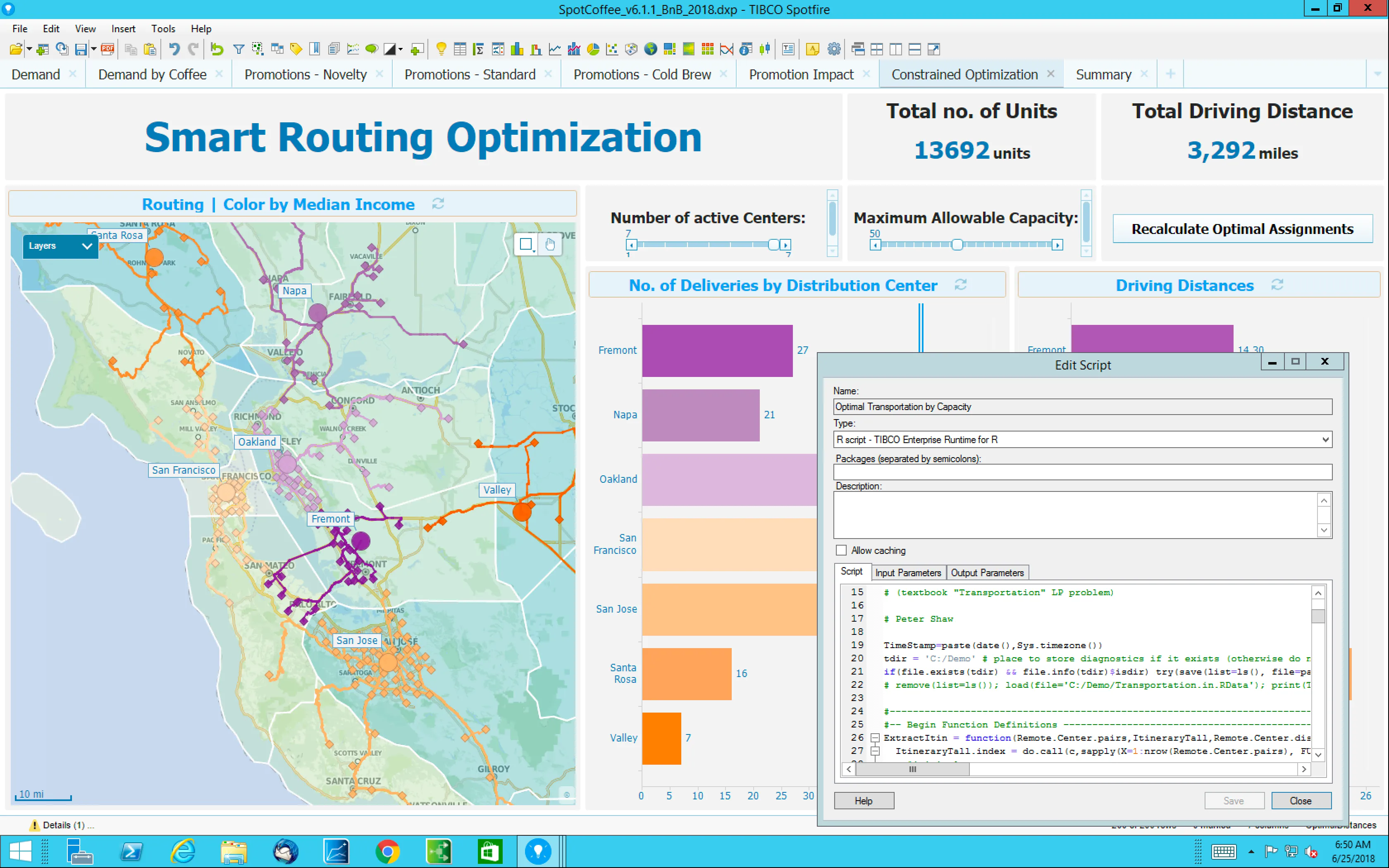
The results can be seen in examples that use different algorithms such as route optimizations, contours, and inventory predictions that all come together into a single visualization (a map) in a very development-friendly way. Further, since UI controls are directly tied to algorithm specification parameters, data functions simplify the authoring experience by data scientist for their dashboard users.
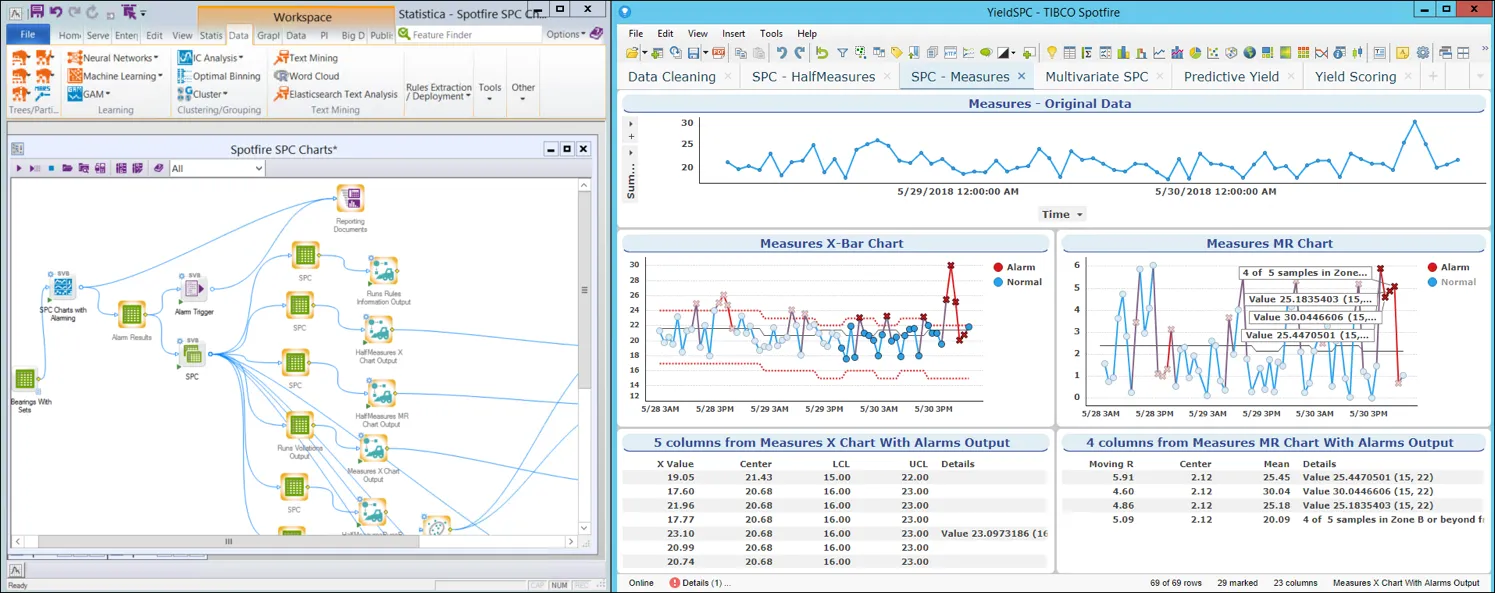
 The above example uses R algorithms executed in Spotfire’s built-in TERR engine; however, other statistics or ML tools can similarly be used. The latest release of Statistica now also supports defining data functions via Statistica workflows. In the example below, thresholds and warning levels required for a statistical process control chart are calculated using a Statistica workflow. These calculations happen dynamically—the execution is initiated by user actions—such as selecting a range of data to evaluate.
 The Spotfire data function is a true gem that is very practical for developing modern, data-driven, visually rich AI applications.