
Seeing is believing: data visualization takes insights to a whole new level
Data visualization is nothing new. From simple bar charts or Venn diagrams to more complex images, people have always used visualization to make abstract data clearer. But with the dawn of Big Data, the world of data visualization has been transformed. ORTEC’s Frank Mak discusses some of the challenges and opportunities data visualization offers today’s forward-thinking organization.
So how exactly are things changing in data visualization? “Where in the past people often just had spreadsheets with data, the trend in the market in recent years is for everything to be visualized. But to be effective, visualization must reveal relationships within the data, from which you can discover trends, detect outliers, etc. With these insights you can identify what needs to be done and, with good use of visualization, persuade people of the urgency to take action.”
Frank gives a simple example. “Suppose you have data on mobile phone subscriptions. By visualizing the data by age it may become strikingly clear that there is a huge difference in behavior between older and younger people in terms of bundle preference, download capacity and contract length. With visualization, your colleagues understand what’s happening, why it’s happening and how to influence it.
Art meets Science
Frank agrees with the view of some that data visualization is at the intersection of art and science: taking hard statistics and visually making them ‘come alive’ for the viewer. He cites the famous case of Anscombe’s Quartet.

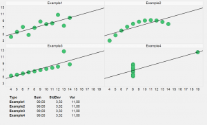
Anscombe’s Quartet Example
“In this case, you see four different data sets with almost identical statistical measures — the same standard deviation, etc. But when you visualize them as graphs, you see four very different curves. In one graph, for example, you see a clear outlier that you don’t see in the others.”
The point is, of course, that looking at data graphically isn’t just a way to make it understandable for the non-statistician or fun for that manager with the rather short attention span. Visualizing data in the right way reveals things that even the most experienced data analyst wouldn’t otherwise see.
Beyond Excel
So what’s the difference between simple graphical visualizations, such as you get in a programme like Excel, and what a company like ORTEC can provide? “We create the most sophisticated analytical solutions, involving high complex algorithms but make the outcomes easy interpretable by business end-users.
“For example, when computing the optimization of a client’s ticket pricing, we calculate millions of prices a day. Without visualization, our outcomes are considered a black box. But with visualization people are able to analyse the outcomes quickly and easily. They can set their high-level KPIs and our visualization then shows the deviations from those KPIs. So for example with actual compared to forecasted bookings of a flight, they can zoom right in to a detailed level using visualization, then interpret and act on the results.”
As well as data visualization within ORTEC’s own tools, Frank and his colleagues work with technology created by partners such as TIBCO’s Spotfire, whose tool he feels is strong both visually and analytically. “There are obviously many other analytics and business intelligence vendors in the market, and we know how to work with these tools, too. So we can use a client’s preferred system or, if they don’t have one, provide the in-house technology to deliver what they need.”
Moreover, modern tools such as the solutions ORTEC provide offer complete reproducibility and accountability. Visualization is done on the direct source of data, instead of an external spreadsheet. People can start to look at the ‘why’ without having to question the source or integrity of the data.
4 Reasons to believe
If someone was still sceptical, what reasons would Frank give to persuade them of the added value to their business of the serious use of data visualization? “First, it’s important for everyone to have good insights into what’s happening now. So if you make a decision it’s immediately possible to visualize its implications.
“Secondly, looking ahead. If your tool forecasts a sharp increase in sales, for example, and you can visualize what the impact will be on staffing levels, visualization can both persuade people of the need to take action and show them exactly what action to take.
“Thirdly, data integration. With today’s tools you can integrate multiple sources of data. For example, by planning data from a spreadsheet and enterprise data on a production plan, and then combining this with relevant financial data. Seen separately, it’s difficult to get a full picture. But integrate all this data and you really see the impact decisions would make on the business as a whole.
“Finally, management. Managers like to see things laid out simply and clearly. They can then understand what’s happening and make better business decisions. Plus visualization is a huge time-saver — and you show me a manager who’s not under time pressure!”
 Frank Mak works as a business analytics consultant at ORTEC Consulting. Frank has a broad experience ranging from the Retail and Oil, Gas, Chemicals and Energy industries to healthcare and is mainly active in the fields of Business Modeling and Exploratory and descriptive analytics.
Interview conducted and written by: Tom Collingridge.
The post Seeing is believing: data visualization takes insights to a whole new level appeared first on This Complex World.
Leave a Comment
You must be logged in to post a comment.