Seeing Eye to Eye—Colorblindness and Out of the Box Spotfire Tools
Blog: The Tibco Blog
Problem Description:
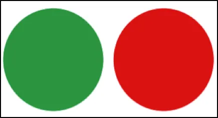
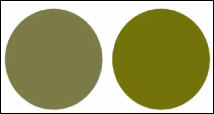
In the United States, approximately 1 in 10 males suffers from red/green color blindness. In other words, about 10% of men in America cannot distinguish between the colors red and green. This is a genetic medical condition unique to males. To illustrate, consider the red and green circles in Figure 1. A person who is red/green colorblind sees these same colored circles as shown in Figure 2.
This fact needs to be understood and taken into account when designing analytical dashboards. For example, if you create a visualization where the range of high and low values are displayed using a color spectrum that goes from red (high values) to green (low values), odds are that one in ten males who look at that visualization will not be able to distinguish the differences you are trying to highlight.
Fortunately, Spotfire makes it simple to respond to these viewing needs. In this blog, I will demonstrate how to use out-of-the-box Spotfire tools to create color schemes and custom color pallets, which are sensitive to the needs of the colorblind. This is not intended to be an educational treatise on colorblindness. There are many online resources you may consult for an in-depth discussion of what colorblindness is and how to design visualizations for it. I will simply focus on the Spotfire tools that will enable you to respond to these needs.
Direct in-visualization color assignment
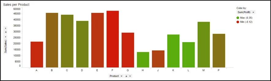
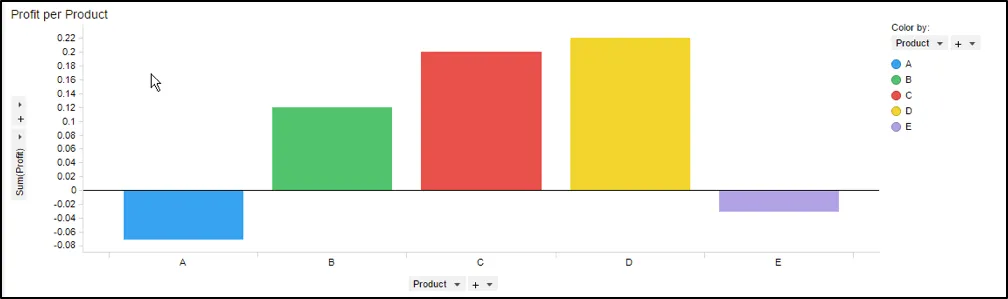
Example: Consider the bar chart shown in Figure 3. The height of the bars represents overall sales, while the color of the bars indicates how profitable a given product has been. The degree of profitability is displayed using a red-green spectrum. For the colorblind, the profit differences between products would be nearly indistinguishable because of the red/green scheme being used.
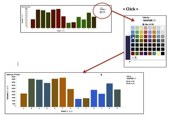
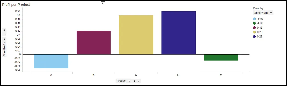
Solution: Simply use the point-and-click color assignment feature to change the profit differences to be displayed using a blue-orange color scheme. Just a few clicks and the problem is resolved. The bar chart shown in Figure 4 still conveys the profitability information, but in a manner that enables the colorblind to see and benefit from that information.
Custom reusable color schemes (Create your own colorblind pallet)
Example: Consider the bar chart shown in Figure 5. Some of the colors shown in this bar chart would be difficult for the colorblind to distinguish. To improve the viewing experience for all, let’s suppose that you would like to use a colorblind-sensitive color scheme like the one shown in Figure 6. However, you would like to save this new color scheme so that it can be reused anytime you wish.
Solution: Create and save a new custom document color scheme.
Step 1: Select “Color” from the properties dialog box . Select the colors you wish to use in the new color scheme, as shown below.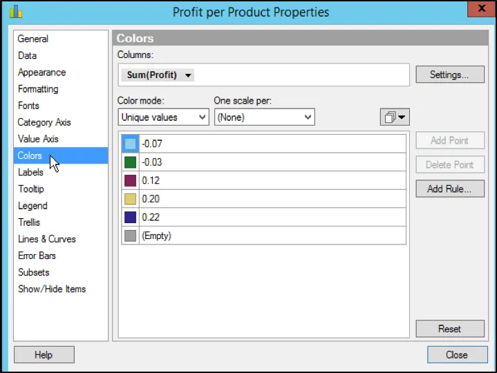
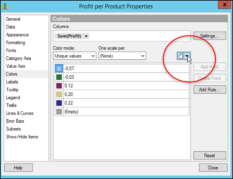
Step 2: Click here as shown…
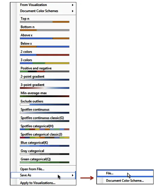
Step 3: Select “Save As” and then “Document Color Scheme”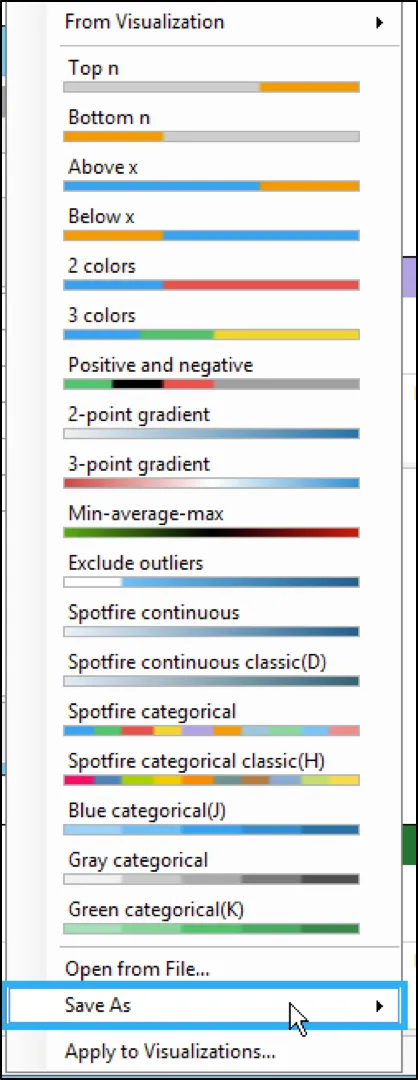 Step 4: Give the new color scheme a name. In this example, we will name it “Color Blind #5” because there are 5 colors in the new color scheme. Click the “OK” button.
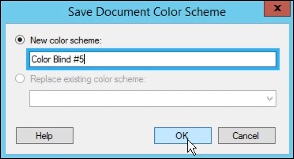
Step 5: Observe that a new document color scheme has been added. You can now use this new color scheme in any visualization where it makes sense to use it. Step 6: You can also choose to save the new color scheme as a “File” so that it can be shared on a common server or even emailed to other Spotfire users so that they can take advantage of your work as well. Simply choose “Save As File”, instead of “New Document Color Scheme”. Give the file a name and then load that color scheme file whenever you wish to use it.
Interested in checking out all of the customizable features in Spotfire? Give a free trial a shot, and find more information here.