
Modeling Virus Transmission on an Airplane
Blog: Method & Style (Bruce Silver)
As I write this, everyone is freaking out over COVID-19. We know it is a highly contagious and dangerous disease, with particular risk to groups in a confined space such as an airplane or cruise ship. Researchers are scrambling to model the contagion risk, but detailed data is almost nonexistent. With a good model, you could create a decision service that would output the likelihood of a passenger contracting the disease if on a flight with an infected patient. A key factor is proximity to the infected individual. As an example of what goes into such a model, in this post we’ll look at how machine learning can be applied to limited data we have.
As a proxy for COVID-19 data, we do have one example of transmission of SARS to air passengers on a flight from Hong Kong to Beijing in 2003 (Olsen SJ, Chang HL, Cheung TY, et al. Transmission of severe acute respiratory syndrome on aircraft. N Engl J Med 2003; 349:2416–22). It looks like this:
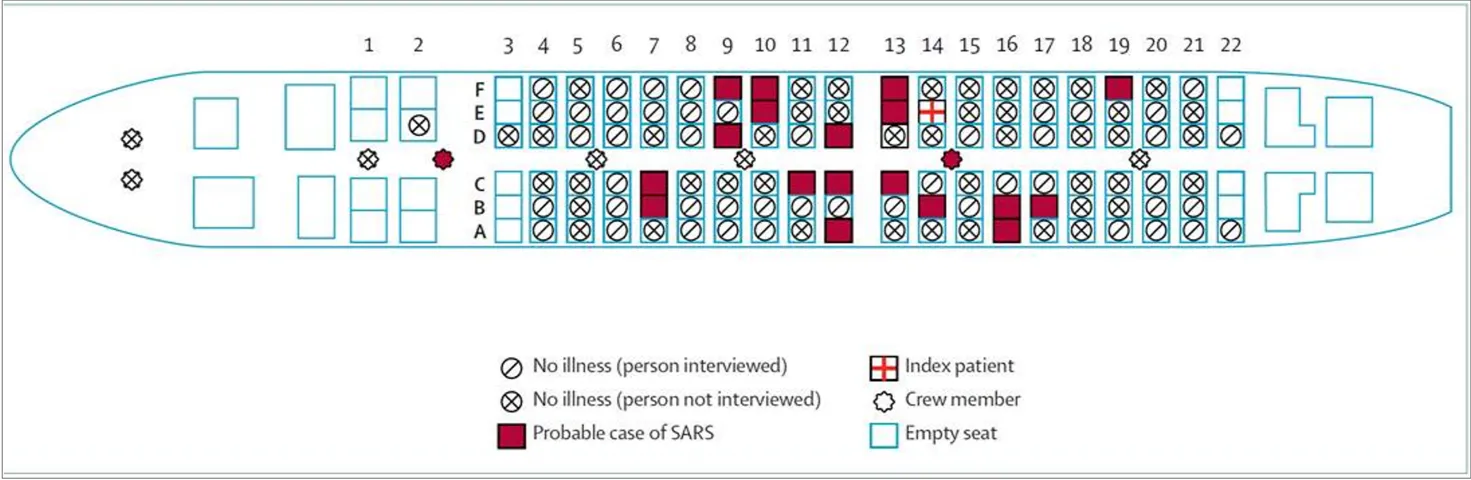
The infected individual (“Index patient”) is seated in row 14. From inspection it appears the risk of infection depends on the distance in rows from the Index patient, skewed toward rows in front of the patient. There does not appear to be a lateral component to the risk. Ignoring empty seats, and assuming “No illness” whether the passenger was interviewed or not, this diagram implies the risk of infection vs distance in rows from the Index patient. Smoothing the data slightly, we get the table below:
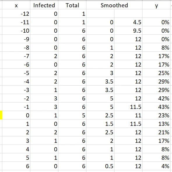
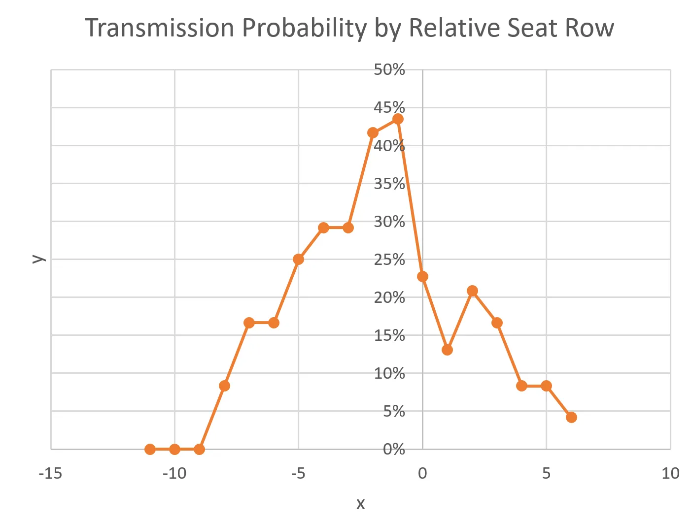
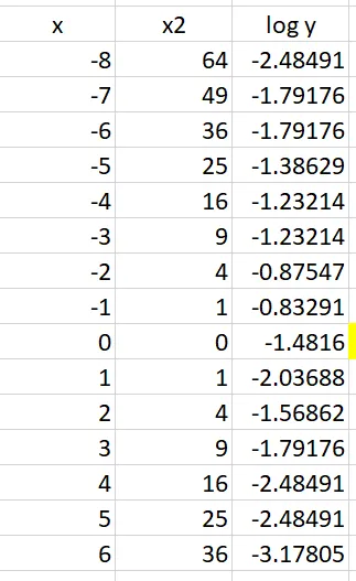
Here x is the row number relative to the Index patient, and y is the observed risk of transmission for a passenger in row x. Graphing this data reveals roughly a bell-shaped curve with a peak around x = -1 or -2:
To model this we will assume the familiar bell curve for a normal distribution, called a gaussian. The formula for a gaussian is
y = A * exp-(½*(x - m)²/s²)
where A, the amplitude, is the height of the curve; m, the mean, is the value of x at the center of the curve; and s, the standard deviation, measures the width of the curve.
We want to find the values of A, m, and s that best fit the observed data. To do that we use a machine learning algorithm called linear regression, which finds the best straight-line fit to a dataset. Here the data is clearly not linear, but we will transform the dataset so that it is.
First we take the log of y:
log y = log A - ½*(x-m)²/s²

       = (log A – ½*m²/s²) + m/s² * x – ½/s² *x²
You could say this equation is still not a linear function of x, but suppose we define a new variable x2 equal to the square of x. Now we have a linear equation for log y as a function of x and x2:
log y = p0 + p1*x + p2*x2
Here p0, p1, and p2 are the coefficients determined by linear regression. We can convert those back to A, m, and s using the relationships:
p0 = (log A – ½*m²/s²)
p1 = m/s²
p2 = – ½/s²
Effectively we have transformed a curve in 2-dimensional space into a straight line in 3-dimensional space, a common technique used in machine learning models. If that is a little hard to bend your brain around, don’t worry about it.
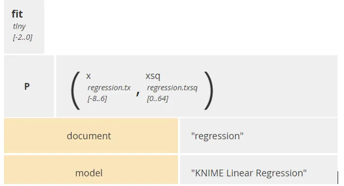
I used Knime to find the linear regression values for p0, p1, and p2, and create a PMML model for it. Knime is a free business-friendly tool for creating machine learning models as a graphical workflow. It can also save models in PMML format that can be executed by Trisotech Decision Modeler or Workflow Modeler. Knime itself can also execute the model, post-process and plot the results, but the post-processing and plotting are not captured in PMML.
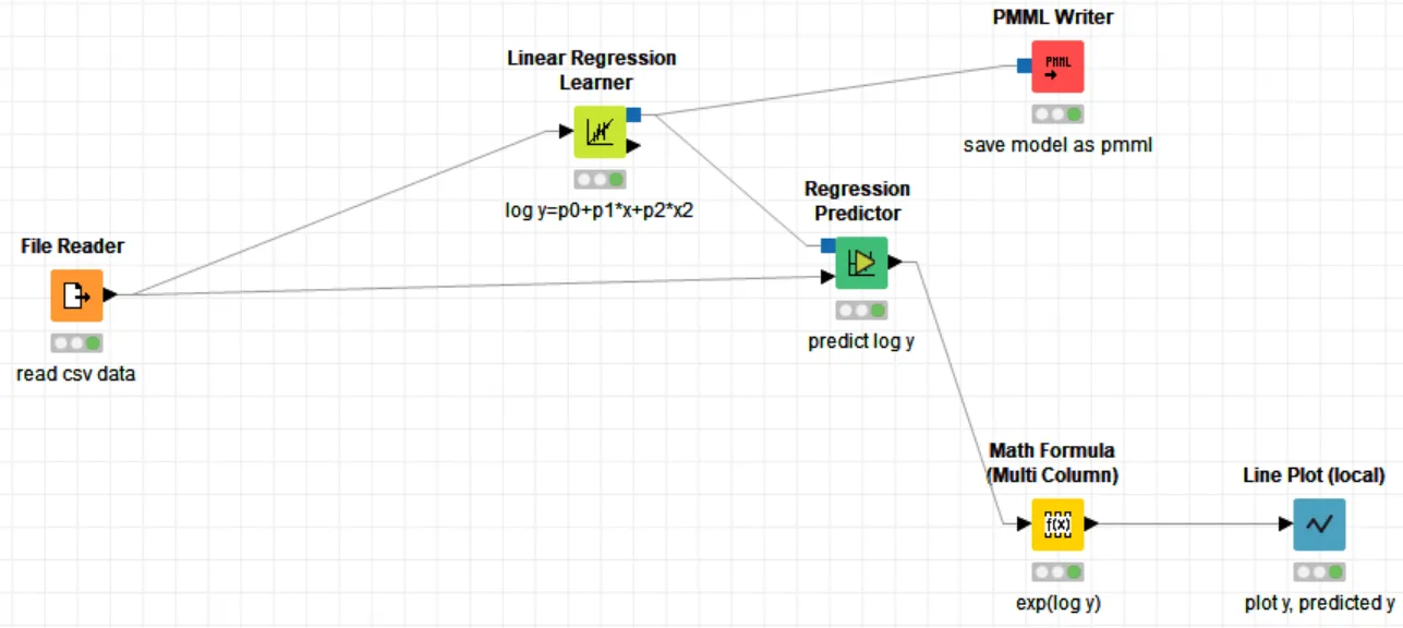
We feed the workflow with a CSV table of x, x2, and log y and it returns p0, p1, and p2.
The linear regression returns p0 = -1.272, p1= -.126, p2= -0.032, which is equivalent (in the original formula for y) to
A=0.3174, m=-1.97, s=3.95.
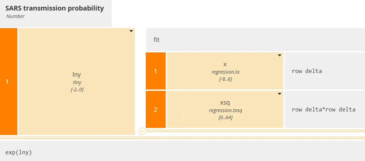
Now we can use DMN to execute the PMML, returning log(y) given the relative row number x, and then calculating the probability y = exp(log(y)). We take the generated PMML model and execute it as a BKM.
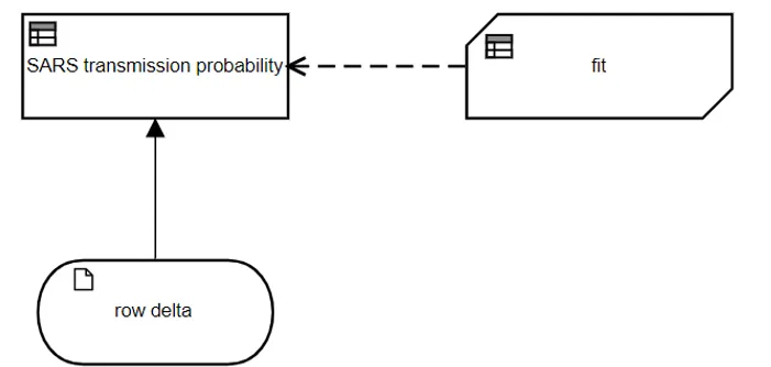
The BKM fit invokes the PMML regression model. Its parameters x, the relative seat row, and x2, the square of x, are passed by the invocation SARS transmission probability. The BKM returns the log of the transmission probability y, so the final result box converts that to y.
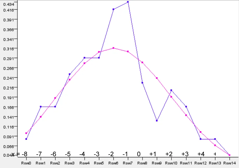
In the graph below, the observed data is shown in blue, and the fitted gaussian is pink. The gaussian underestimates the risk for passengers 1 to 3 rows in front of the Index patient and overestimates it for passengers 0 to 2 rows behind, but the fit is reasonable given the limited data available. It says that the peak transmission risk is in the range 30-40% in the 1-2 rows in front of the Index patient, and the standard deviation of the gaussian is around 4 rows, i.e., from 6 rows in front of the Index patient to 2 rows in back.
Of course, for a simple regression like this, we don’t need to invoke a PMML model. We could just use a literal expression with the fitted coefficient values:
y = exp(-1.272 - 0.126*x - 0.032*x²)
This will give the same result. I show the PMML method because it illustrates how much more complex machine learning models can be applied to the problem and invoked as a decision service.
Officials are scrambling now to try to collect similar data for COVID-19, made more difficult by political and commercial risks for the government and the airlines. No doubt eventually we will have the data. For now, I’m sitting in the back of the plane.
The post Modeling Virus Transmission on an Airplane appeared first on Method and Style.