Making sense of complexity: A reframe for SCAN
Blog: Tom Graves / Tetradian
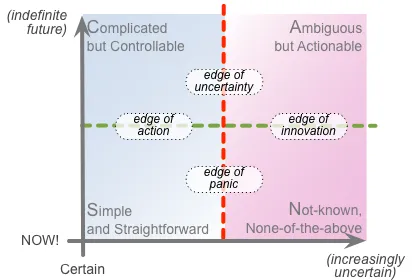
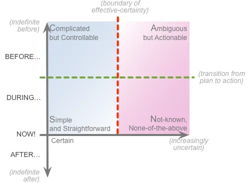
What’s a simple way to make sense of complexity? For me, the go-to tool for this is SCAN – a visual-checklist to map out uncertainty and complexity relative to a given moment or given action:

SCAN has been around for almost a decade now, and has been well-proven in practice. It’s also highly adaptable, with dozens of crossmaps, as described in more than a hundred posts here, for themes such as skills-development, knowledge-management, lifecycle-management, strategy-implementation and many more.
Recently, though, it’s become clear that the SCAN frame is in need of a reframe. Don’t worry, it’s nothing major, nothing that would invalidate anything that’s gone before: in fact it’s only a change to some of the labels, to support a slightly different way to describe things. Yet for some folks, those small changes should make the frame a lot easier to use, and remove some of the more common sources of confusion that I’ve seen arise over the years.
As in the graphic above, the term ‘SCAN’ is an acronym for the four main regions in the frame: Simple, Complicated, Ambiguous, Not-known. Yet the real essence of the frame is its two axes, and key transitions on those axes.
Horizontally, there’s an axis of uncertainty, from absolute-certainty on the left to infinitely-uncertain on the right. At some point along that axis, there’ll be a distinct transition – the boundary of effective certainty (shown as a dashed red line on the graphic above). To the left of that transition are contexts where, if we do the same thing, we can expect to get the same result; but to the right, if we do the same thing, we can, may or will get a different result. But where that transition sits on the axis depends on the context: who’s doing the work, where and when it’s happening, and so on. In other words, the edge of uncertainty is itself uncertain.
Vertically, there’s an axis of time, increasing as we move downwards on the page. The key transition is an arbitrarily-chosen ‘Now’, which we use as our reference-point for the frame – the crossover-point for the horizontal-axis. Relative to that ‘Now’, anything below has become the unchangeable past; relative to that ‘Now’, anything above is still a possibly-changeable future. Another important transition on this axis (shown as a dashed green line on the graphic above) is the moment where we shift from plan to action, relative to that ‘Now’ – though again, where that transition sits on the axis depends on the context.
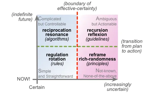
Given those two axes, the fixed transition of ‘Now’, and those two variable transitions, we can map out all manner of useful themes in relation to complexity, such as which tactics or patterns to apply in planning, in action, for certainty or for uncertainty:
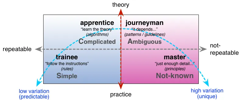
…or skill-levels needed for different contexts, and where these too will best apply:
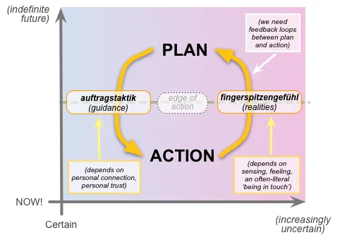
…or feedback-loops for real-time situational-awareness and the like:
So far, so good. It works.
Mostly…
But only ‘Mostly…’ – because one thing that’s become evident is that that upper label of ‘(indefinite future)‘ on the vertical-axis confuses the heck out of a lot of people… The label is technically correct, in that everything on that time-axis is relative to that ‘Now’ – and hence, yes, the ‘Now’ is more in the future to the extent that any given point is upward from the ‘Now’ on that frame. Yet it’s clear that that’s completely back-to-front from how most people think – hence, yeah, I need to fix it.
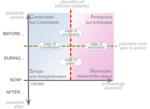
Less of a show-stopper, yet still important, was that many people didn’t grasp just how fundamental those transitions are, across the boundary-of-effective-certainty, and perhaps even more across the shift from abstract plan to real-world action. The ‘edge’-labels on that first graphic do perhaps help to make that point, but I need to amend at least one of those labels to help hammer the point home.
Which leads to this reframe for SCAN. The four changes are:
- the vertical-axis ‘upward’-label is changed from ‘(indefinite future)’ to ‘(indefinite before)‘
- the vertical-axis ‘downward’-label is made explicit, and set as ‘(indefinite after)‘
- the vertical-axis regions are relabelled ‘Before‘, ‘During‘ and ‘After‘
- the edge-label between Simple and Complicated changes from ‘edge of action’ to ‘edge of commitment‘
So the basic frame now looks like this:
And with the edges-labels added, as per the first graphic in this post:
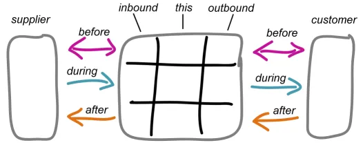
The ‘before / during / after’ framing for SCAN now also aligns with the process-sequence for interactions between services, as described in the Enterprise Canvas model:
We can also map the ‘before / during / after’ framing to the later project-oriented ‘Plan’, ‘Action’ and ‘Review’ stages of the CSPAR changemapping-lifecycle:
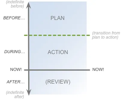
(In effect, the previous two CSPAR stages, ‘Context’ and ‘Scope’, are just further before the Plan stage in this crossmap…)
And that change of label for the transition from Plan to Action – ‘edge of commitment’, rather than just ‘edge of action’ – is important, because there really is a fundamental shift that takes place there. First, we literally change the rules at that point: we’re no longer running under the rules for planning, but the rules of the work-instructions and suchlike for the respective action-task. Next, there’s a sense of commitment, of ‘no going back’ – or rather, if we do go back, we’re no longer doing the task itself. And also, if perhaps more subtle, the closer we get to the moment of the ‘Now!’, the more individual or personal it becomes: it’s this task that I am doing, and no-one else. The task may happen in parallel with others’ tasks, but any coordination between is a distinct task in its own right, often a somewhat external orchestration – such as in a literal sense with the old work-songs to guide simultaneous action on a shared task of hauling on a rope or rowing a boat.
(The other transition, over the edge of the ‘Now!’, is even more final: what’s happened is what has happened, in the past now, an all-too-literal ‘no going back’. What we can do is to learn from what has happened, so that we can do it better next time – hence the importance of that post-action Review.)
Anyway, that’s the current reframe for SCAN: a change to the time-axis labels, and a clarification for one of the ‘edges’-labels. That’s it. As I said before, it’s not a big deal: it doesn’t invalidate any of the previous graphics or suchlike – in fact I’ll probably continue using some of them for now, whilst I work my way through the large stack of existing graphics that I’ll need to update.
In essence, the reframe just makes SCAN that bit easier to understand – or I hope it does, anyway! Any comments, perhaps?