
How Visual Analytics Helps Us Uncover Challenges and Opportunities in Sustainable Energy
Blog: The Tibco Blog
This year’s TIBCO Analytics Forum (TAF) Hackathon highlighted sustainability in energy production. The eight-hour, self-paced Hackathon challenged all participants to use TIBCO Spotfire to create innovative, informative data visualizations that bring new insight to the issue of renewable energy and sustainability.
Spotfire Hackathon Challenges
The original limit of 150 hackers had to be expanded to 250 to accommodate the overwhelming demand of this year’s Hackathon challenge. The hackathon consisted of five challenge areas:
- Energy transition and the current state of power plant distribution
- Cooling technologies and their water demand
- Calculating changes in drought regions and severity
- Analyzing relationships between energy fuel types, water usage, and drought
- Water usage for renewables versus thermoelectric power
Challenge 1: Visualize Power Plant Distribution and Energy Transition
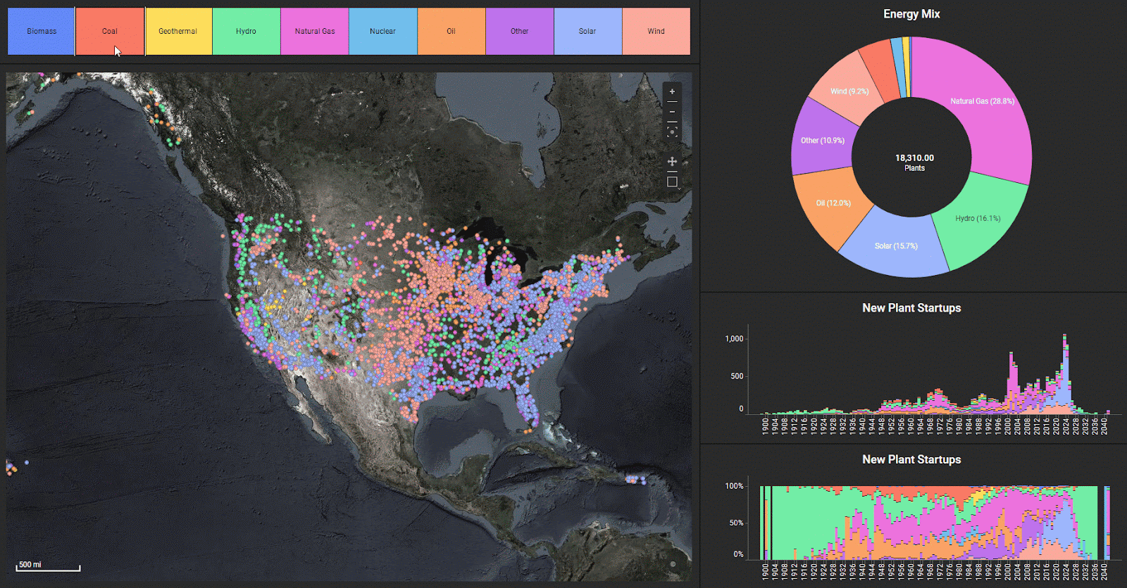
Spotfire Mod “donut chart” reveals a current energy mix
This first challenge instructed participants to visualize energy transition over time, geographic distribution, and energy mix. Here we see coal (red) dominant from the 1940-1960s. Natural gas (pink) then begins to take over as the dominant fuel source. In recent decades, however, wind (light pink) and solar (light blue) plants make up significant new power capacity in the United States, as the Spotfire Mod donut chart reveals.
Challenge 2: Visualize Cooling Technologies and Water Usage
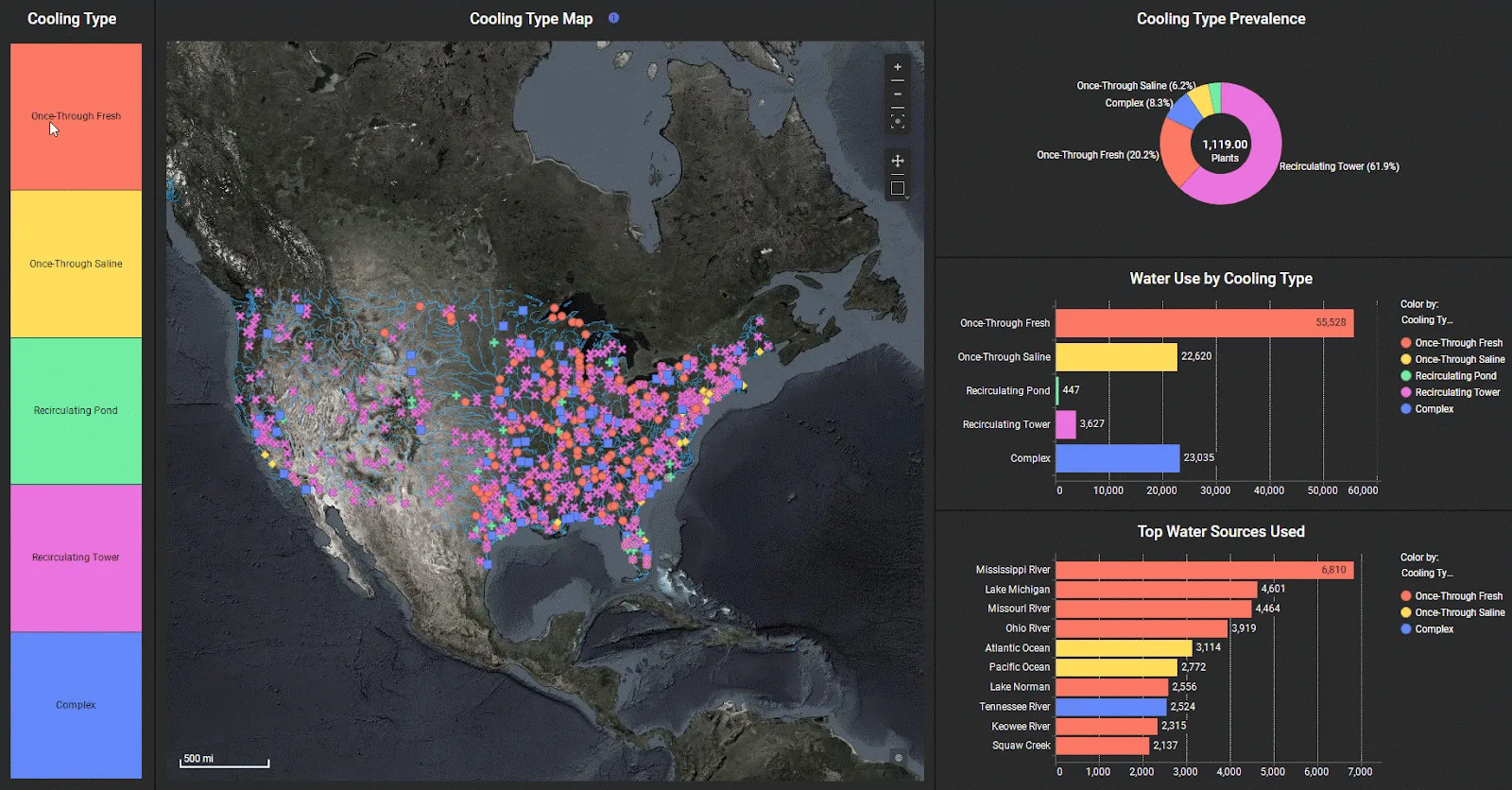
Spotfire visualizations of water usage for energy production
Cooling technologies for thermoelectric plants often rely on a water source. That water source can be “once-through,” where water is withdrawn from the source and then returned. Or, it can be “recirculating,” where water is withdrawn from the source and reused. The visuals demonstrate that once-through cooling technologies use the most water. Most of this is freshwater (red), although saltwater (yellow) is also used.
This visualization also shows the top 10 water sources used for energy generation, with the Mississippi River taking the top spot at over 6.8 billion gallons of water used daily. Lake Michigan and the Missouri River follow close behind, with about 4.5 billion gallons used daily.
Challenge 3: Visualize Drought Evolution
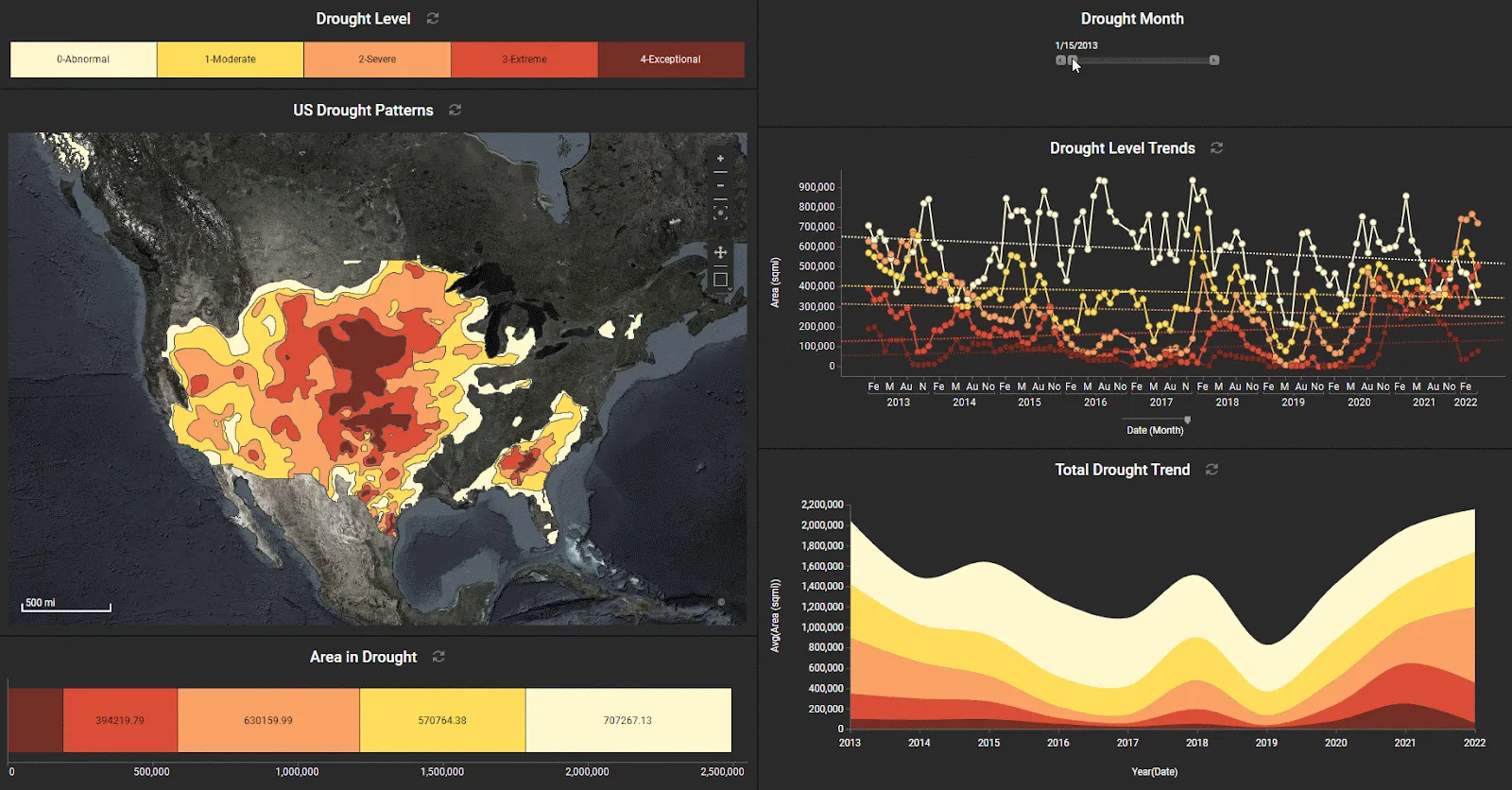
Spotfire visualizations reveal an increase in “exceptional drought”
The third challenge focused on drought. Using a selective filter scheme, the reader can progress through the monthly drought conditions and see areas where drought is improving or worsening. The bottom right area chart is created with Spotfire Mod. It shows a slight dip in drought during the middle of the past decade but a sharp rise in recent years.
Challenge 4: Analyzing the Water-Energy Nexus
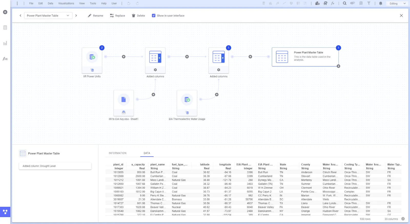
Using the Spotfire Data Canvas for advanced data wrangling
The fourth challenge required the Spotfire Data Canvas for some advanced data wrangling operations. Participants needed to first filter all power units to only display operational units, then use a pivot transformation to collapse the data from power units into unique power plants with summed capacities, fuel types, and locations. This dataset is from Industrial Information Resources (IIR).
Once unique power plants were established through the filter and pivot operations, they could then be combined with the “IIR to EIA Key” to map IIR plant codes to the U.S. Energy Information Administration (EIA) plant codes, as shown below.
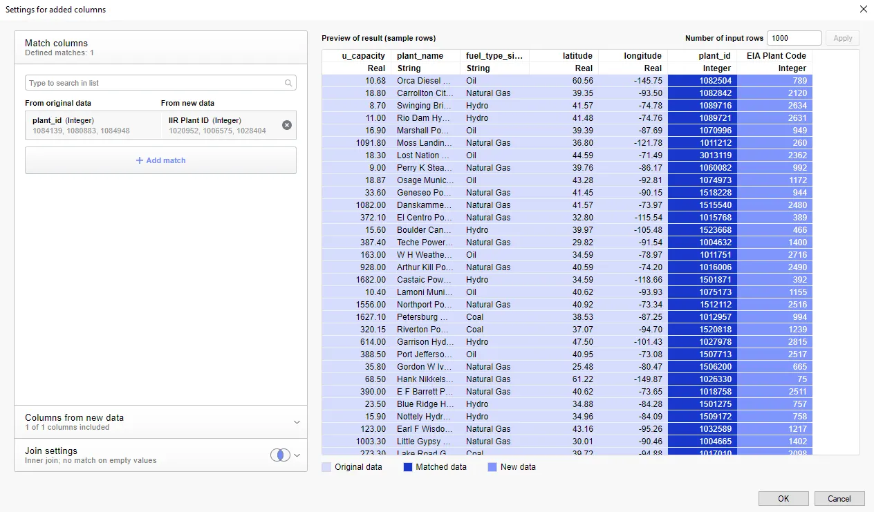
Mapping IIR plant codes to EIA plant codes
With a mapping now present between the IIR plant codes and EIA plant codes, the thermoelectric power plant operational data can be joined. Lastly, the Points in Polygons geofencing data function was used to geofence the plants within drought regions. This now unified data table allows row-by-row drill downs across power plants, fuel types, cooling technologies, water use, drought level, and power generated.
Below you can see the results as filters are applied to the fuel types and drought levels. This is insightful because nuclear plants often use the most water but also generate the most electricity.
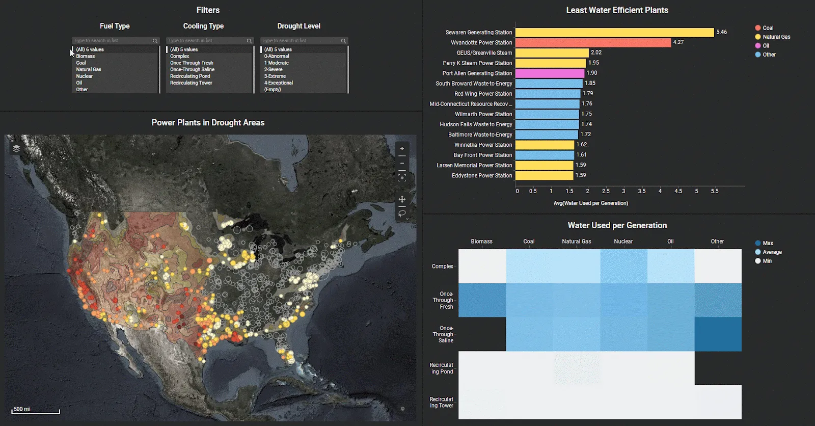
Revealing water usage by energy plant type
Challenge 5: Water Consumption Factors by All Fuel Types
Finally, hackers were challenged to explore water consumption factors by all fuel types and then present their findings in a visually impactful manner. We see that renewable sources like solar photovoltaic and wind use almost no water, while nuclear, natural gas, and concentrated solar use the most water. Note that hydropower was excluded from this analysis because it uses orders of magnitude more water due to how it generates power.
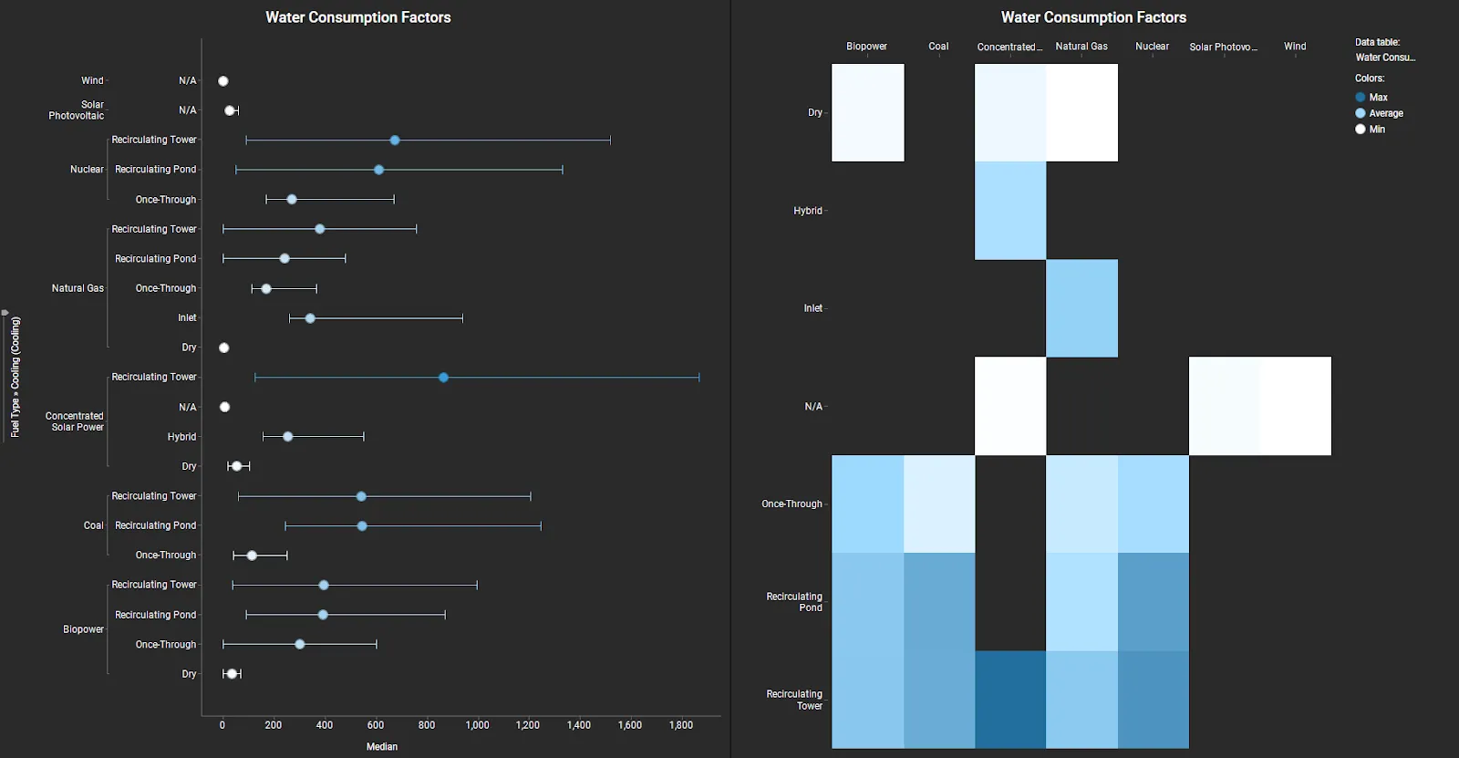
Water consumption factors by all fuel types
And the Hackathon Winners Are…
The Hackathon participants were remarkably innovative in using visual analytics to drive insights. Hackathon winners all showed a particularly remarkable aptitude for data exploration and problem-solving, then conveyed their insights into engaging visualizations. Want to see their findings?
Click here to see who won the Hackathon and review their winning entries.
The post How Visual Analytics Helps Us Uncover Challenges and Opportunities in Sustainable Energy first appeared on The TIBCO Blog.