How to Support Varying Screen Display Size Using a Single Spotfire .DXP file
Blog: The Tibco Blog
Problem Description:
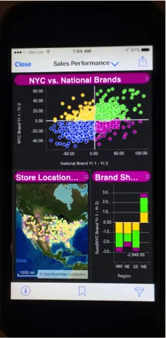
When Spotfire dashboards are published and consumed, they are frequently displayed on a variety of devices and screen display sizes. Difficulties arise when end users attempt to view the same dashboard on these variable display sizes. As shown below, a dashboard optimized for a 13-inch computer display does not display in an optimal way when viewed on an iPhone, for example. The dashboard is squeezed into a display space that is much too small for the visuals. The dashboard becomes ineffective.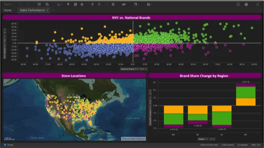
The purpose of this conversation is to outline a straightforward method to support multiple display sizes and devices using one, and only one, Spotfire .DXP file. In other words, it would be really nice if the dashboard could display in an optimal manner on the device being used at the time.
Solution:
To solve the problem described above, we will take advantage of the power of Spotfire Bookmarks to remember the page layout and visualizations being used at any given time. The basic solution involves setting up the dashboard for optimal display on any given device we anticipate being used. We then save a bookmark for that page layout and then give the end user a method to select the device they are using at the time.
Keep reading… I think you will be amazed at how well this works and the flexibility you can offer when it comes to displays and optimal viewing.
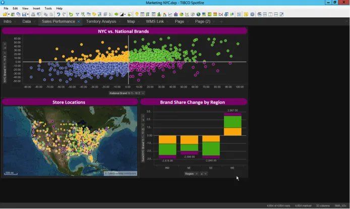
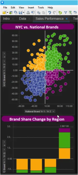
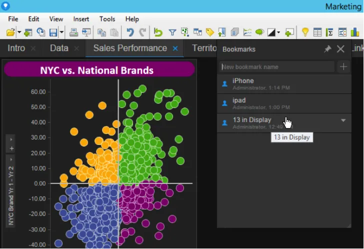
1: In this example, we enable our dashboard to be viewed optimally on a 13-inch computer screen, an iPad, or on a mobile phone screen (iPhone 6).
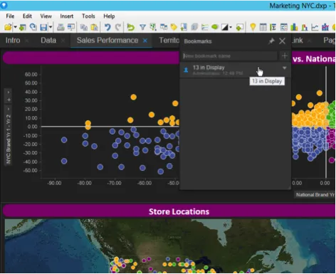
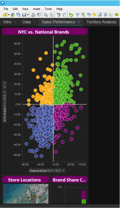
I begin by creating the initial dashboard on my computer that has a 13-inch display. After the dashboard is created I save a bookmark and label it “13 inch Display”.
A: Create dashboard.
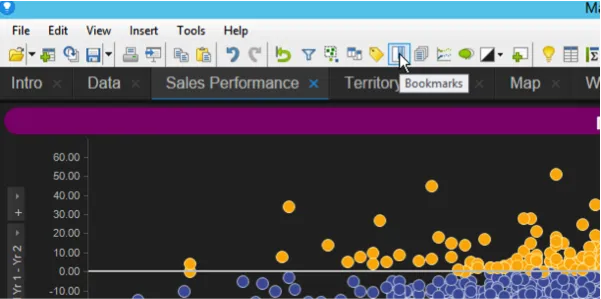
B: Click the “Bookmark” icon.
C: Create and name the bookmark.
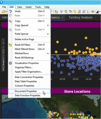
2: Reset the screen display size to be “iPad Landscape”.
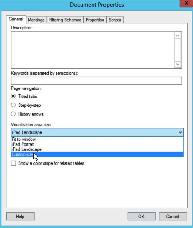
A: Select “Document Properties” from the “Edit” menu.

B: Select “iPad Landscape” from the “Visualization area size” menu.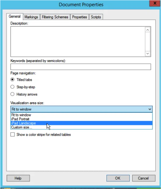
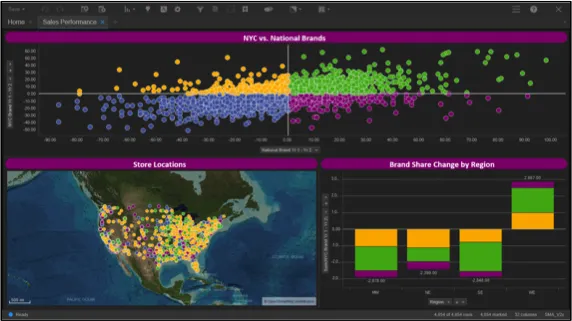
C: Adjust the visualizations and fit on the screen in the manner you wish them to display when being viewed on an iPad. Please note that with the screen size set to iPad landscape, Spotfire reset the display to show the dashboard as if it was being viewed on an iPad.
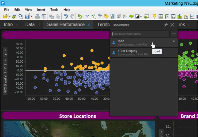
D: Save another bookmark and named it “iPad”.
3: Reset the screen display size to be sized for an iPhone at 360 x 1300 pixels
A: Select “Document Properties” from the “Edit” menu.
B: Select “Custom Size” from the “Visualization area size” menu.
C: Enter a screen size of 360 x 1300 pixels as shown below.
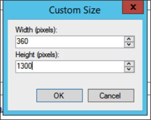
D: Once you do this, the display will be reset to match the dimensions you just entered, but the dashboard will be kind of messed up. You can now rearrange the visuals in a vertical manner to provide an optimal display experience for iPhone users. Note that in the “Optimal Vertical Display” shown below, you can scroll vertically to view all visuals as they are arranged in a vertical stack. In the iPhone environment, you would swipe down to view each visual in order.
E: Save another bookmark and name it “iPhone”.
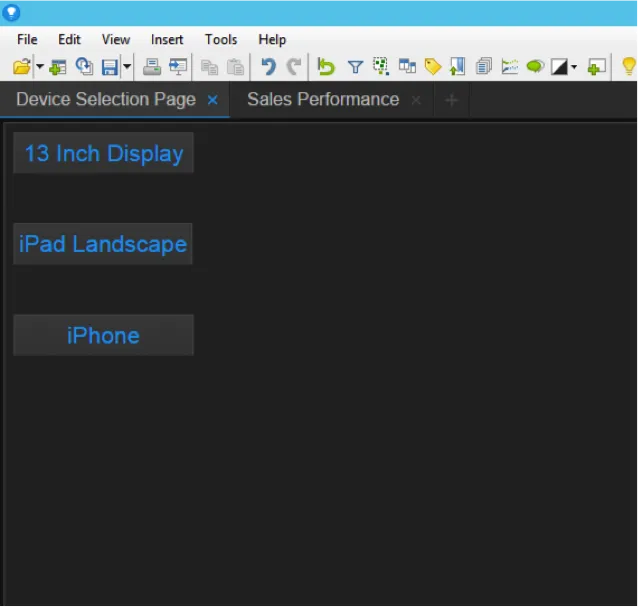
4: The final step is to create a menu page where users can initially select the device type or size they are using. In the example below, each button is tied to one of the bookmarks we created. When a user clicks a button the display is automatically reset and optimized for the given screen size and the user will be taken automatically to that optimized dashboard.
Now that we have created a way for the end user to select the display setting appropriate for any situation we desire, the dashboard we created can be viewed in an optimal manner, simultaneously on any of the displays we set up.
An effective way to support variable display screen sizes with one and only one Spotfire .DXP file is to take advantage of bookmarks. The ability of bookmarks to save display settings and page layout enables any Spotfire user to create support for any display size they wish to support. To learn more about TIBCO Spotfire, or to try it on your own for free, click here.