How to Create a Gantt Chart Visualization
Blog: The Tibco Blog
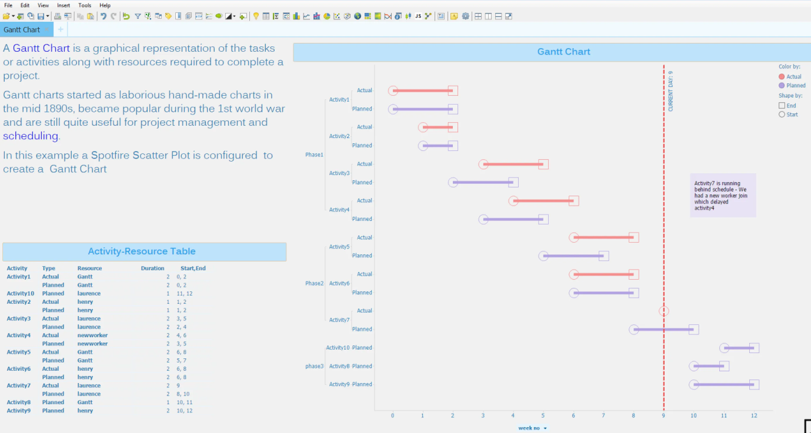
A Gantt chart is a graphical representation of the tasks or activities and resources required to complete a job or project. It is used to show ranges of start and end dates of activities or tasks and the relationships between them so as to pinpoint bottlenecks and assign priorities. Gantt charts started as laborious hand-made charts in the mid 1890s, popular during World War I and still quite useful today for project management and scheduling. Depending on what you want to visualize in the Gantt chart, and what the data looks like, you may be able to create the chart right away, or some intermediate steps may be required. Let’s start with a basic example.
Data Preparation
Spotfire has wide range of functionality to help get data into a format appropriate for analysis. In this example we will use a data table, which has information about various activities’ start time, end time, duration, and resources responsible for completing the activity. The entire project completes in three phases, and each phase requires the previous phase to be completed.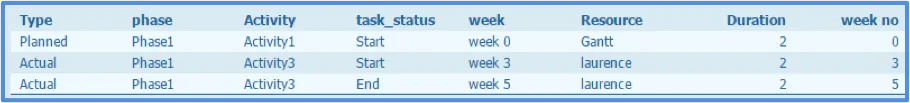
Loading Data
You can directly open a CSV file both from cloud as well as from Spotfire Analyst. Spotfire allows to you to bring in data from multiple sources.
Create a Gantt chart in Spotfire in 4 easy steps
Step 1: Insert a scatter plot and change the X-axis to ‘week no’ or any date column you want to use.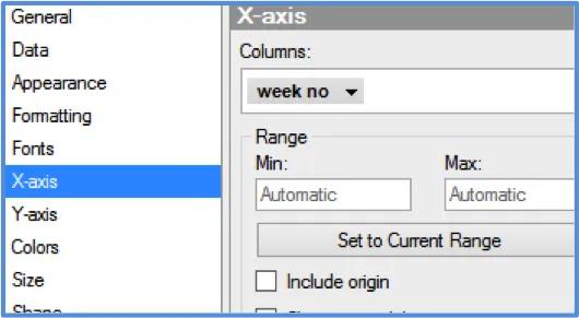
Step 2: Change Y-axis to ‘phase’ as first level of hierarchy, next ‘activity’, and third ‘type’. Make sure you check reverse scale. Spotfire allows you to create a hierarchy in multiple ways.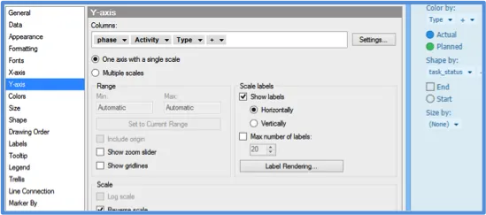
Step 3: Select ‘type’ as color by and ‘task_status’ as shape. This will help you identify when a planned or actual activity started and when it finished.
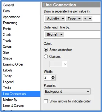
Step 4: Use line connection to draw a separate line for each activity and type. Each activity has a start and end row in the data, and that’s how the lines are drawn from start to end.
 You have your Gantt chart ready. You can add a line to indicate the current date and even add custom themes to make it look pretty.
For more information on Gantt charts, click here. To try Spotfire for free, visit this page.