Four Game Changers in Enterprise Reporting
Blog: The Tibco Blog
The first electronic business reports required a highly skilled technician to physically patch wires into a board. The output was then printed on paper. It took months to get a new report written and even longer to provide data consumers with answers.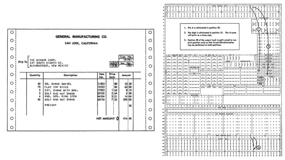
The world of enterprise reporting has moved on tremendously from the days of tearing off the perforated edges of continuous feed paper! Here are the four major game changers.
Game changer 1: Not all data is flat
Since the 1970s when SQL languages were created the dominating data model was always columns and rows. These were easy to summarize for reports. In the early 2010s, an explosion of new databases was born, led by NoSQL databases like MongoDB and non-flat storage options like JSON. Reporting had to learn to deal with new data models—if SQL is about rows and columns, noSQL is about flexible data structures. Can your reporting tools handle those new data structures?
Game changer 2: Ditching the printer for interactivity
When reporting first became “a thing” people didn’t sit in front of a monitor—they shuffled papers around their desks and “Bring me those numbers” was a physical task. As soon as business users started seeing their reports on screen they started to ask themselves, “Why can’t I sort this by date?”—so reports printed to PDF are becoming a thing of the past, even for the most basic reporting tasks, some level of interactivity is required.
Game changer 3: Near real time
Reports used to be an “end of the month” thing—a push from IT vs a pull from business. Again, this has shifted, and at the heart of this shift are APIs. These days anything can be consumed via an API, which means expectations from users have evolved from a monthly cadence to a whenever-I-need-it cadence. This puts a bigger strain on reporting systems and the databases they connect to, leading to a rise in the idea of treating reporting like any other repeatable DevOps process.
Game changer 4: A sea of visualization types
When reporting was printed on paper, visualizations were extremely limited. If it didn’t fit into a bar, pie, or line chart then it didn’t get visualized. This has changed a lot too—with the advent of extensible visualization libraries, like D3.js, data is no longer bound to basic visualization types. Modern reporting tools should be extensible to allow for new visualization types, for example this solar correlation map.
Want to learn more about these changes in enterprise reporting and how they apply to your current reporting systems? Download O’Reilly Media’s new book: “Is Reporting Dead? The Evolution of a Classic Information Delivery Strategy”, written by Teodor Danciu, Founder & Chief Architect of the most popular reporting tool on the planet, JasperReports.