Data Plus Soul Equals Story
Blog: NASSCOM Official Blog
All of us sometime in our careers have worked on raw data to create narratives that have supported someone else to make decisions; after all, raw data by itself does not tell much. Rows and rows of data by itself is just another set of absolute number, percentages which need to be deciphered to form a story which is compelling and create a narrative that people remember.
Most of us respond with fear or uncertainty when we hear the word statistics, and it is our ability to convert those statistics to something more meaningful, which makes the same statistical information easy to understand and interpret. One of the most common things we hear about in these times is HR analytics. However, we hardly hear anyone talking about the “last mile” of HR analytics, which is Data Storytelling: the ability to make the same data attractive so that people convert it into actions.
After all, haven’t we been told stories since time immemorial? Stories dating back from hundreds and thousands of years are what we have all been told and that’s how information has passed through centuries.
“The most powerful person in the world is the storyteller. The storyteller sets the visions, value, and agenda of an entire generation that is to come.” – Steve Jobs
Data storytelling is an art to convert data into stories that are easy to understand, compelling, and actionable; stories that can help make great decisions. It is absolutely worthless if you cannot communicate the right story to the right people in the right way. Data storytelling is a structured approach to convey data insights and involves four key ingredients:
These are:
-
Data itself
-
Visuals which are easy to understand and attractive
-
Narrative that people will remember
-
Target Audience so we convey the right message
Stephen Few said, “Numbers have an important story to tell. They rely on you to give them a clear and convincing voice.”
So, let’s see how we can give a convincing voice to our numbers.
Data
As mentioned above, most people are scared of the word statistics and fear to look at numbers. However, everyone wants to know what any research, survey, or analysis conveyed. So, the first step in telling a story is finding data that is true, correct, and can back-up the story you want to tell. Data preparation and analysis can be time-consuming but a careful analysis of data ensures we can find a lot of information in it which is useful. These findings by themselves can be boring and lengthy. Decision-makers may not have the time to get into boring numbers if the communication is not succinct, enabling, and appealing.
Visuals
Presenting data that is succinct, enabling, appealing, and has the ability to attract the audience is the second step towards making great stories. Visuals need to be combined with the data to ensure the right communication is done. For example, it is known that bar charts are better at communicating data than pie charts in most cases. Correct Data visualization ensures that unnecessary, confusing data is not been spoken about.
The other part of visualization is colours. People are sensitive about the colours associated with data visuals – so, one must be careful when choosing colours which are to be used while presenting data.
Example: If you are talking about softer, emotional issues, you must not use Red colour. Or, we must not have more than seven colours in the visuals at any time – it confuses the audience.
When visuals are applied to data, they can enlighten the audience to insights that they wouldn’t see without charts or graphs.
Narrative
“People hear statistics but they feel stories” – Brent Dykes
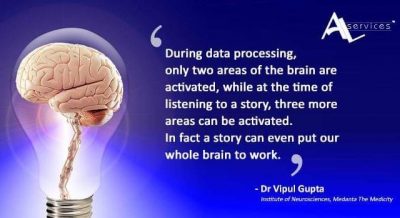
Creating the right narrative is what makes the story relatable and memorable. Stories play a vibrant role in our daily lives—from the entertainment, we consume to the experiences we share with others to what we conjure up in our dreams. So, getting the narrative right is very important to get the attention of the audience. Neuroscientists have confirmed that decisions are often based on emotion, not logic. So, one must spend that extra time to create stories that are memorable, persuasive, and engaging. Narratives, if not done correctly, can lie or mislead, and if done well, can become great stories and enablers.
The right combination of data, visuals, and narrative will ensure you are able to explain, engage, and enlighten your audience.
Audience
Last, most important and often ignored aspect is to know your audience when delivering stories. One must recognize the needs, challenges, and priorities of the audience to create the narrative that will make the most impact. Knowing your audience will help you create a narrative that tugs at the right place, visuals that are most appealing, and data that fulfill their most basic needs.
What we both teach at institutes as professors is different from what we deliver as learning programs within organizations, even though the topic could be the same because the audience is different hence the narrative and the visualization changes.
Summary
Stories have always been practical tools to transmit human experience, and stories that incorporate data and analytics are more convincing than those based on anecdotes or personal experience only. Getting Data Storytelling right builds reputation, and most change management experts will agree, it helps in getting stakeholder buy-in and influencing key decision-making. Data, therefore, has to be in the form of narrative, which provides insights and meaning to the audience in the form of a memorable story that makes an emotional connection.
Narrative + Meaning = Story
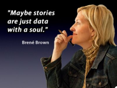
Data + Soul = Story
Data + Soul = Narrative + Meaning
Authors:
Dr. Amit Nagpal is President, Bloggers Alliance, and is Faculty of Digital&Social Media at BIMTECH and other institutes
Shruti Swaroop is an Executive Coach and Inclusion Consultant, Founder – EMBRACE
The post Data Plus Soul Equals Story appeared first on NASSCOM Community |The Official Community of Indian IT Industry.
Leave a Comment
You must be logged in to post a comment.


