
COVID-19: A Visual Data Science Analysis and Review
Blog: The Tibco Blog
If you have Spotfire, you can go HERE to visualize this data in real time as well as stay abreast of the most current data. To download Spotfire, do so here.
Contact: Michael O’Connell, @MichOConnell
Introduction
The combination of visual analytics and data science enables people with little knowledge of statistics, to understand complex scenarios and draw inference about the future, from current events.
The COVID-19 virus has some behavioral attributes and survival strategies that make it difficult to anticipate short and long term infection scenarios. In particular, the exponential doubling can turn an initial spark infection into a significant outbreak in a matter of weeks. For example, the current doubling rate in the UK, Spain, The Netherlands, Switzerland, Italy, Germany and France is in the range of 2-5 day.
Note that errors around any predictions of future cases are substantial – with exponential parameters comes exponential prediction errors! It is only by modeling, visualizing and predicting emerging infections, that everyone can understand the pandemic in their own region, assess the effects of preventive measures, and apply best protective practices in their local communities. And to understand our personal risk!
This analysis summarizes current modeling, simulation and analytics work around the WW COVID-19 outbreak from a data science and visual analytics perspective. It also examines best practices and effects of preventive measures across different regions as ways to “flatten the curve” and enable the outbreaks to be managed with available healthcare resources.
The analyses are presented using Spotfire visual analytics in a hosted environment. The analyses refresh hourly, depending on availability of data sources. Spotfire apps and code will be made available for download. Links to various trusted data sources are provided. Collaboration is encouraged and Spotfire will be available for use by those who don’t have it. TIBCO customers who are struggling with data and analytics issues around COVID-19 effects can contact the authors for more information and assistance.
Outbreak Status and Updates
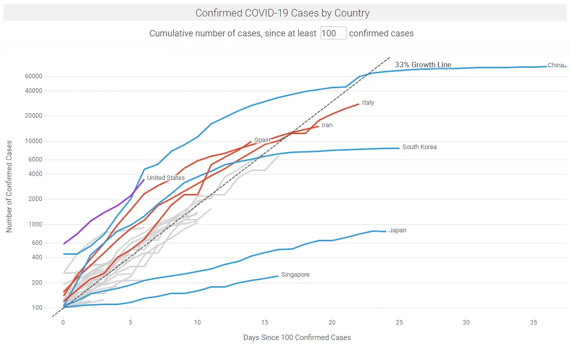
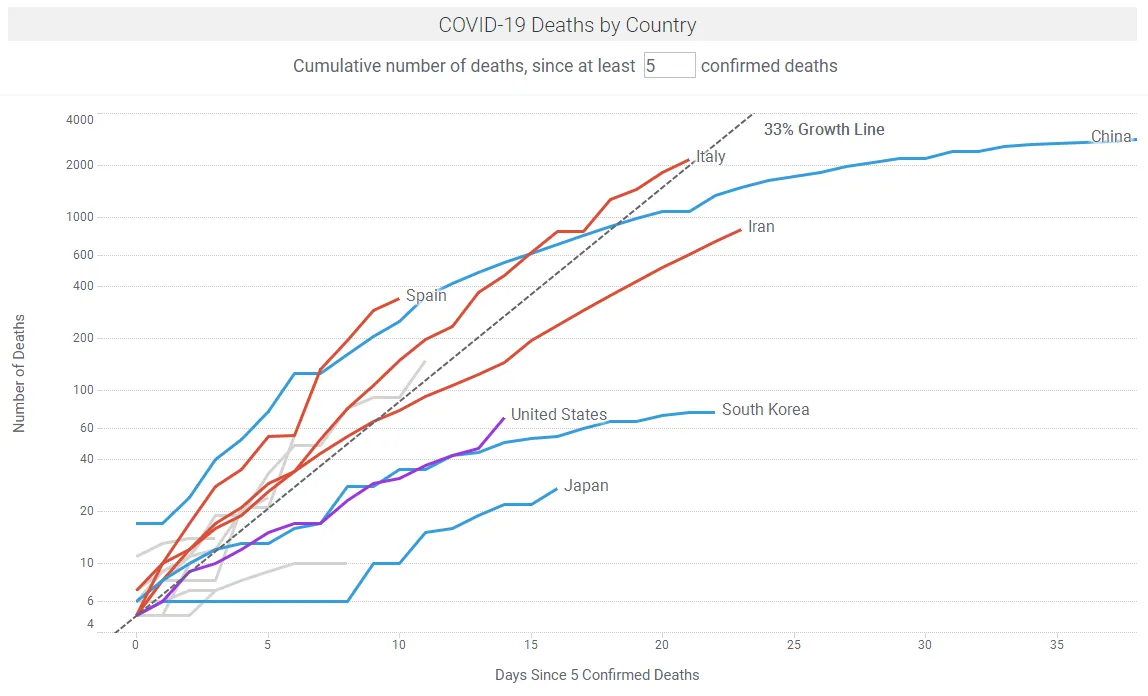
There are many sites providing regular updates on the outbreak, notably Johns Hopkins University and Our World in Data. Figures 1a shows COVID-19 case trajectories by country. Figure 1b shows COVID-19 fatality trajectories by country. In the Spotfire app linked below, the data updates hourly or by a refresh button click.
Modeling the Outbreaks and the Effects of Interventions
Epidemiologists model infectious diseases in compartment models; for example, the SEIR model where people transition from susceptible (S) to exposed (E) to infected (I) to removed (R), with S+E+I+R = N, where and R can be recovered or died, and N is the total population size.
The reproduction number (R0) is the average number of people infected from a person with an infection. This is a crucial parameter in describing an epidemic. If the effective reproduction number Re = R0*(S/N) is bigger than 1, the disease spreads. Conversely if the time-varying reproduction number Rt can be reduced over time, the disease can be contained.
In this TED Interview, Adam Kucharski describes the reproduction number R0 as the product of D*O*T*S, where :
D = duration (number of days someone is infectious)
O = opportunities for transmission (number of person-person greetings / day)
T = probability of transmission
S = susceptibility (proportion of population susceptible)
The objective of any public health response during a pandemic, is to slow or stop the spread of the virus by employing mitigation strategies that reduce Rt by:
- Testing and isolating infected people
- Reducing opportunities for transmission (e.g. via social distancing, school closures)
- Changing the duration of infectiousness (e.g., through antiviral use)
- Reducing the number of susceptible individuals (e.g., by vaccination)
For COVID-19, without intervention (per Kucharski, TED Interview):
D (number of days someone is infectious) is approx. 1-2 weeks, before isolation. This includes ~5-6 days incubation until symptoms, and often an additional ~2-5 days before isolation. Flu is slightly shorter e.g. ~3 days. STDs can be several months.
O (number of person-person greetings/day) is modeled as ~5-10 people/day (person-person greetings) under usual behavior
T (probability of the virus being transmitted in an interaction) is approx. 1/3. This is high compared to Flu and SARS.
S (proportion of population susceptible) is high i.e. 95-100%. Per Kucharski (TED Interview), based on early Wuhan data, ~95% of the initial population were still susceptible up to the end of January.
Kucharski describes R0 = 2 to 3 in uncontrolled outbreaks for COVID-19, compared with Flu where R0 = ~1.2.
The initial focus of public health experts with COVID-19 has been on suppression i.e. reducing R0 to below 1 by isolating infected people, reducing case numbers and maintaining this situation until a vaccine is available. This worked well for SARS but not for COVID-19 because many infected people are asymptomatic and go undetected. Korea’s aggressive testing has helped identify young asymptomatic people; these have been isolated to prevent infection of others. Singapore has been able to identify networks of infections all the way to common taxis taken, and to isolate infected individuals.
The current focus is on mitigation i.e. reducing R0 to slow spreading, but not to below 1.
- Opportunity parameter: to get Rt below 1, Kucharski (TED Interview) describes the need for everybody in the population to cut interactions by one-half to two-thirds. This can be achieved by initiatives such as working from home (WFH), school closures, reducing social dinners etc.
- As a simple analogy, there is a 84% chance of rolling at least one 6 in 10 rolls of a die. This reduces to 31% in 2 rolls (1 – (⅚)^n). So you can reasonably expect to cut your odds by one-half to two-thirds by reducing usual social meetings from say 10 meetings to 2 meetings per day.
- Measures such as hand-washing, reducing contacts with others and cleaning surfaces can reduce the Transmission probability.
One challenging aspect of COVID-19 is its long incubation period, where infectious people may be asymptomatic and can still infect others. Figure 2 shows the transmission timeline for COVID-19. The ~5-6 day delay between infection and symptoms is a particularly nasty behavioral strategy that the virus has evolved to further its infectiousness.
In a study on 181 confirmed cases, COVID-19 had an estimated incubation period of approx. 5.1 days (95% confidence interval is 4.5 to 5.8 days) (Lauer et al., March 10). This analysis shows 97.5% of those who develop symptoms will do so in 11.5 days (95% confidence interval is 8.2 to 15.6 days).
Another problem with COVID-19 is its fatality rate. The Case fatality rate (CFR) measures the risk that someone who develops symptoms will eventually die from the infection. For COVID-19, Kucharski (TED Interview) says this about the CFR: “I’d say on best available data, when we adjust for unreported cases and the various delays involved, we’re probably looking at a fatality risk of probably between maybe 0.5 and 2 percent for people with symptoms.” By comparison, the CFR for Flu is ~0.1%. Kucharski summarizes by stating that COVID-19 is ~10X+ more deadly than Flu. This is inline with other experts and studies e.g. Pail Atwater (Johns Hopkins) stated that “CFR is clearly going to be less than 2%, but at the moment we just don’t know what that number is”.
A recent paper by Wu et al. estimates the CFR of COVID-19 in Wuhan at 1.4% (0.9–2.1%). This is a big dataset as Wuhan was the epicenter for the initial outbreak. They note that this is substantially lower than the corresponding naïve confirmed case fatality risk of 2,169/48,557 = 4.5%; and the approximator of deaths/(deaths + recoveries): 2,169/(2,169 + 17,572) = 11%, as of 29 February 2020. The risk of symptomatic infection increased with age, with those above 59 years were 5.1 (4.2–6.1) times more likely to die after developing symptoms, compared to those aged 30–59.
Early estimates of CFR in epidemics is typically high as focus is on the sickest of the sick. The early CDC estimates were 3.5% in China; and across 82 countries 4.2% and a cruise chip 0.6%. They suggested a wide range of 0.25%-3.0%.
It is tricky to calculate the CFR. The best way to calculate CFR would be to track a large group of people from the point when they develop symptoms until they later die or recover, and to then calculate the proportion of all these cases who had died. This is not possible in the real world. It is incorrect to just divide the total number of deaths by total number of cases as this does not account for unreported cases or the delay from illness to death.
It is widely recognized that there are many unreported cases eg due to unavailable test kits. In the US analysis below, Bedford estimates and approx 10X under-reporting of cases on March 13. Re. the time delay, consider 20 new people admitted to a hospital with confirmed COVID-19 infection on a given day — that doesn’t mean the CFR is zero!. We need to wait to see what happens to them. Conversely any deaths that occur are people who showed symptoms some weeks before.
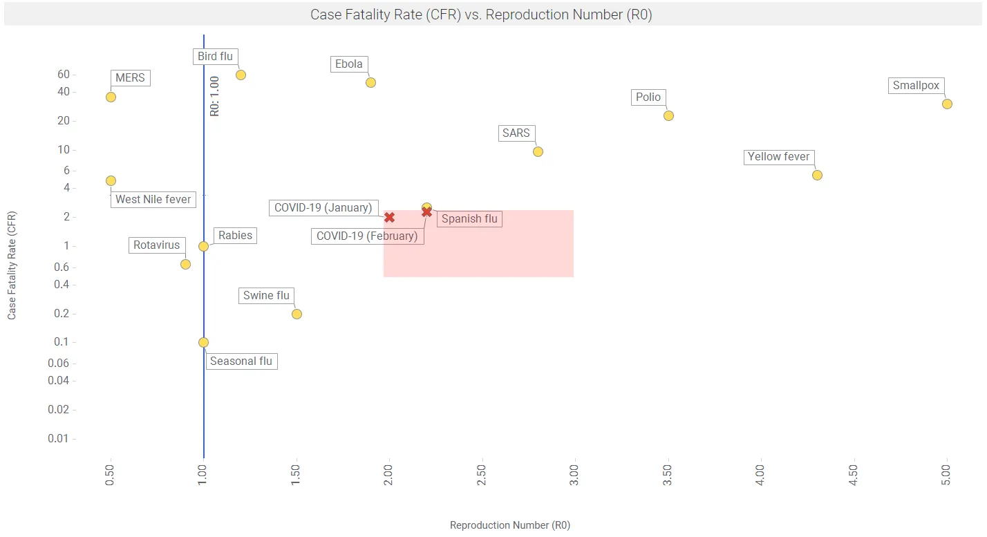
Figure 3 shows reproductive number (R0) vs case fatality rate (CFR) for a number of viruses. Data are from the MicrobeScope section of the Infomation is Beautiful website.
Further, Riou et al. found that the CFR in Hubei in January-February 2020 was 1.6% on average; and elevated to ~5% in age 60-70, to ~10% in people aged 70-80, and to ~15+% for people older than 80. So a key mitigation strategy to reduce deaths is to reduce interactions with the elderly.
Changing R0 over time
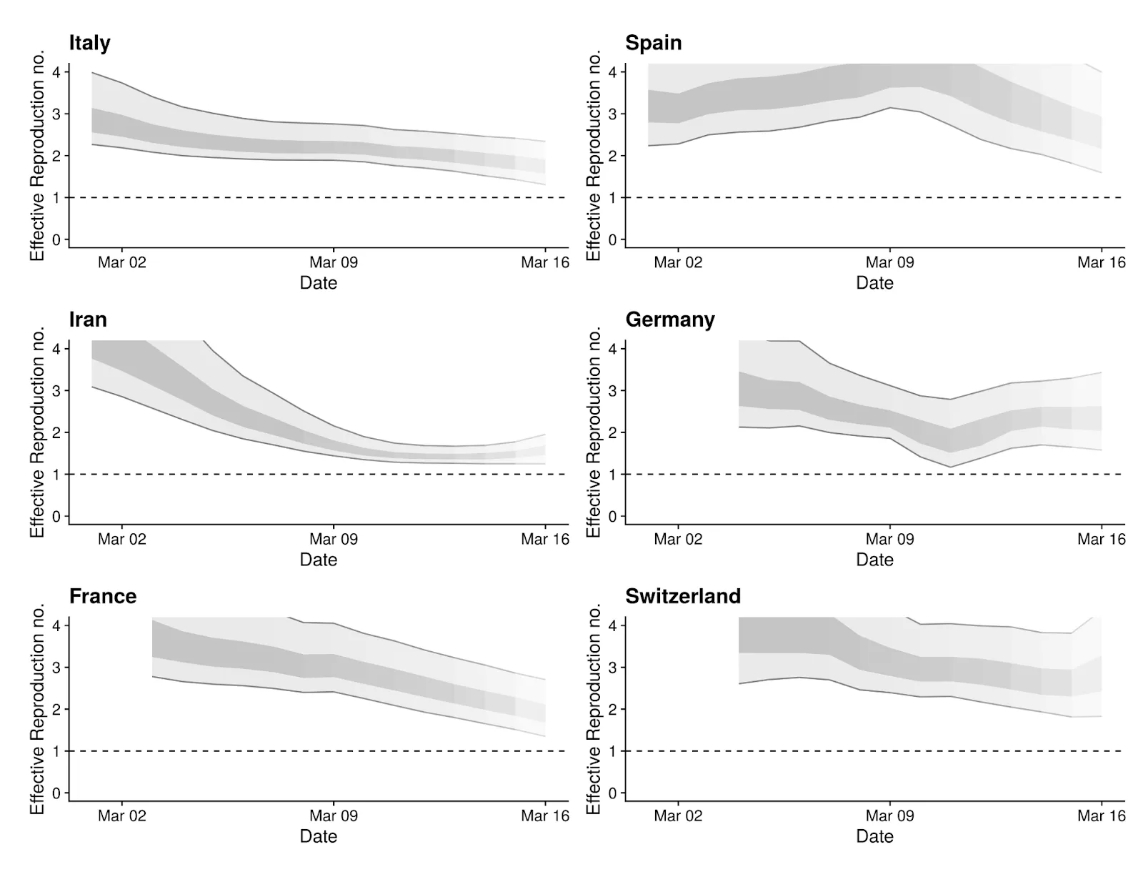
The Re estimates can change over time as the various intervention methods are implemented in local regions. The Centre for Mathematical Modeling of Infectious Diseases in the UK is doing some innovative work in this area, using the R language and the package EpiEstim on CRAN. Figure 4 shows recent results for the 6 regions with the most cases, as of March 16.
Flattening the Curve: Compartment models and Epidemic curves
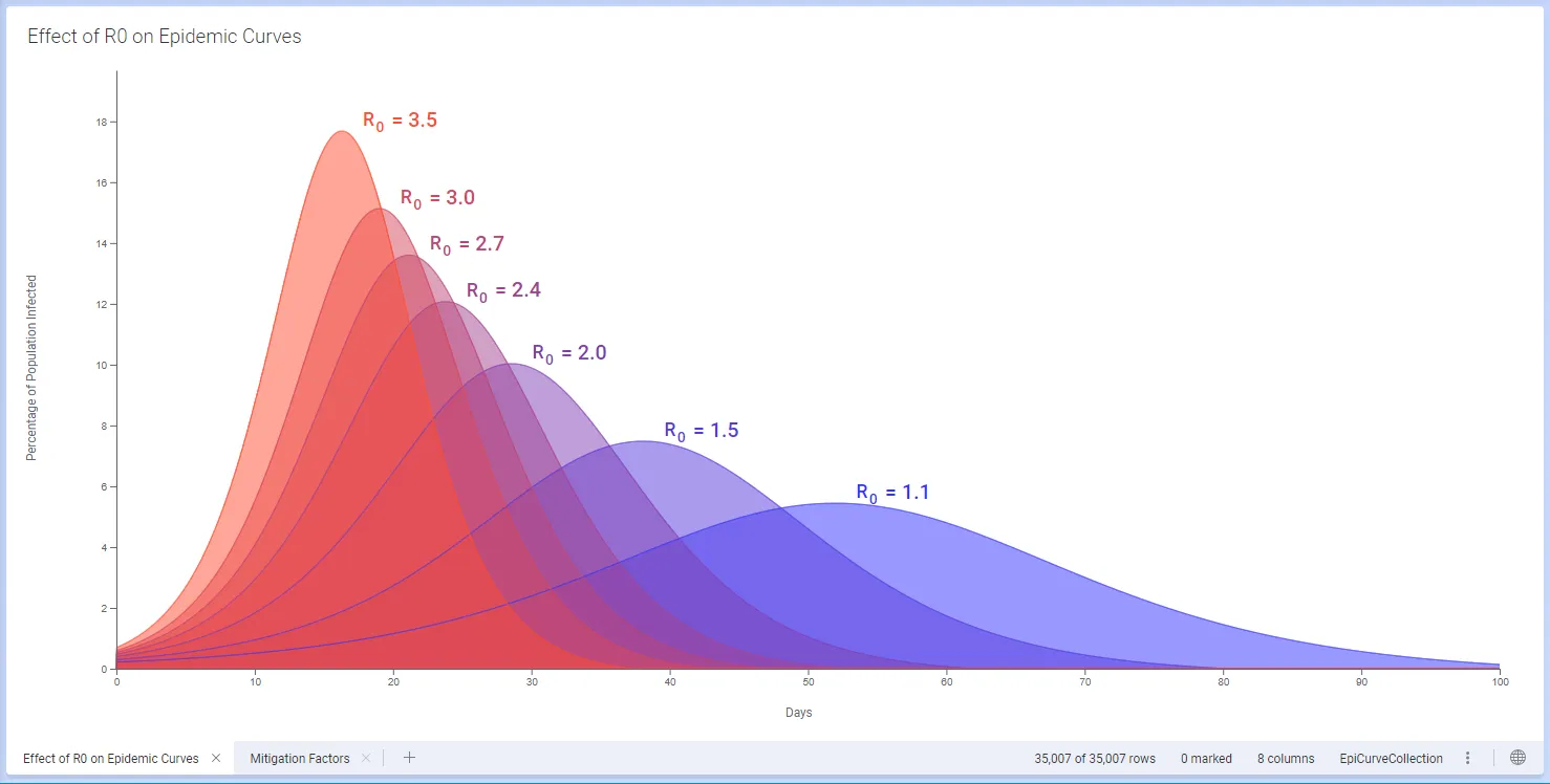
We use a simple 3-compartment SIR numeric model, with Susceptible, Infected and Recovered sub-populations (e.g. Jones 2008), in Spotfire. The relative sizes of these sub-populations changes over time, and is affected by factors such as the rate and duration of contact between individuals, mobility, and the natural rate of recovery from the disease. The overall progress of an epidemic is described by the reproduction number R0, which is a function of these factors.
Interventions such as case isolation, household quarantines, restricting large events, closing social gathering spots, closing schools and universities, encouraging individuals to stay at home, pausing sporting and arts events etc, can each affect the rate of contact and hence R0. In turn, changes to these parameters affect how the epidemic progresses and in particular how steep or flat the epidemic curve will be (Ferguson et al., Imperial College, 16 March, 2020).
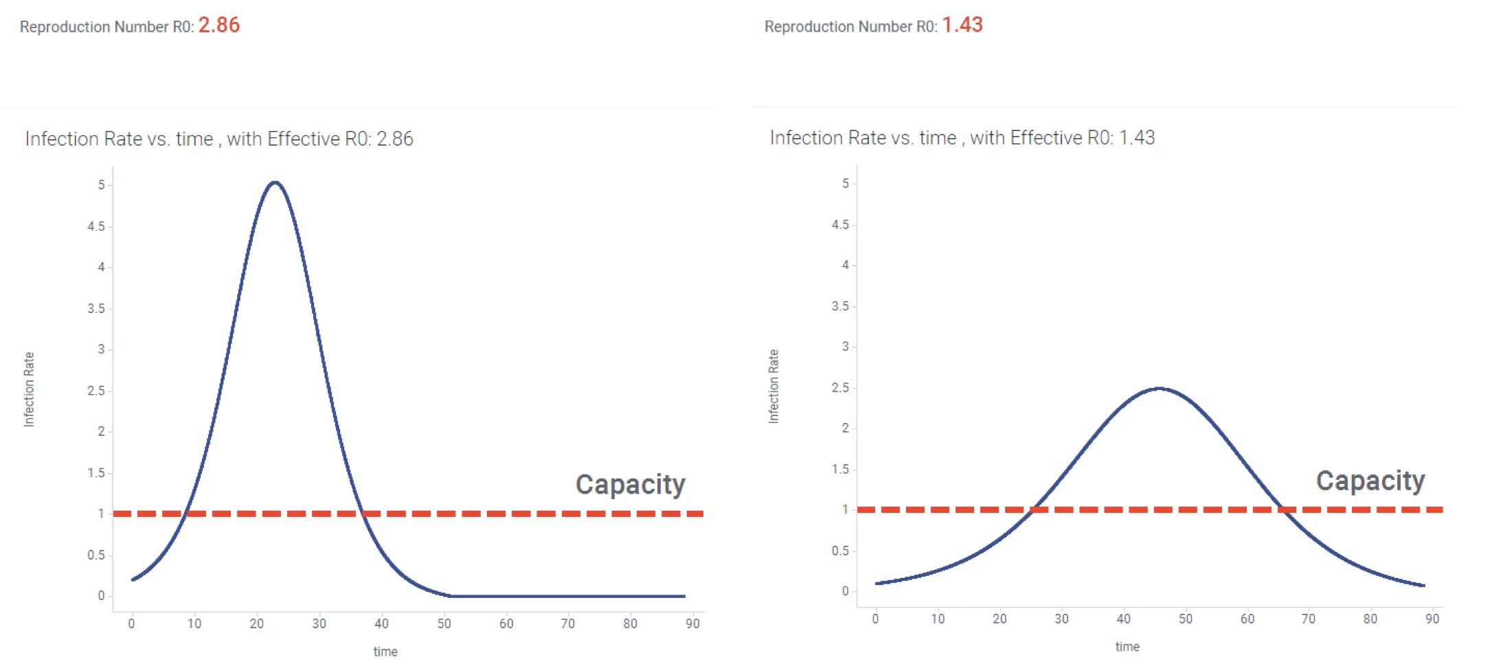
Having a numerical model in place lets us explore scenarios for mitigation of an outbreak. For example we might look at the evolution of the outbreak if we reduce exposure by 50%. In Figure 5 below, this strategy reduces R0 to a value below 1.5, and the resulting Epidemic curve has been flattened.
In this case, a realistic “baseline” scenario could include an effective R0 greater than 2 (left hand graph). The resulting tall steep epidemic curve might result in a large number of patients needing hospitalization all at once, over-running available healthcare facilities (indicated by red dotted line). The scenario with reduced exposure results in lowering R0 and an epidemic curve that is closer to the hospital capacity.
We’ve now seen how the reproductive number can change over time, and how this translates into a flattened epidemic curve. There is much historical evidence on how this works.
Going all the way back to the Spanish flu epidemic of 1918, Hatchett et al. (2007) describe how initial cases arrived in Philadelphia on September 17, 1918, but authorities played down the significance and allowed public gatherings to continue. Social distancing interventions were first introduced on October 3; but this was not soon enough and a large number of deaths resulted. By contrast, the first case showed up in St Louis on October 5, social distancing measures were put in place on October 7, and a much milder outbreak occurred.
Ferguson et al. (March 16, 2020) describe a number of effective non-pharmaceutical interventions (NPIs) as outlined in Table 1.
| Label | Policy | Description |
| CI | Case isolation in the home | Symptomatic cases stay at home for 7 days, reducing nonhousehold contacts by 75% for this period. Household contacts remain unchanged. Assume 70% of household comply with the policy |
| HQ | Voluntary home quarantine | Voluntary home quarantine Following identification of a symptomatic case in the household, all household members remain at home for 14 days. Household contact rates double during this quarantine period, contacts in the community reduce by 75%. Assume 50% of household comply with the policy. |
| SDO | Social distancing of those over 70 years of age | Reduce contacts by 50% in workplaces, increase household contacts by 25% and reduce other contacts by 75%. Assume 75% compliance with policy. |
| SD | Social distancing of entire population | All households reduce contact outside household, school or workplace by 75%. School contact rates unchanged, workplace contact rates reduced by 25%. Household contact rates assumed to increase by 25%. |
| PC | Closure of schools and universities | Closure of schools and universities Closure of all schools, 25% of universities remain open. Household contact rates for student families increase by 50% during closure. Contacts in the community increase by 25% during closure. |
Table 1. Summary of NPI Interventions. Based on Ferguson et al. March 16
They predict that for R0 = 2.4, i.e. with a “do nothing approach”, that 81% of the Great Britain and US populations would be infected over the course of the epidemic. They then show the effects of the interventions in Table 1 applied to this R0=2.4 scenario, in terms of critical care beds required. The resulting estimated effects are shown in Table 2.
| Non-Pharmaceutical Intervention (NPI) | Maximum critical care beds required |
| Do nothing | 280 |
| Closing schools and universities | 240 |
| Case isolation | 180 |
| Case isolation and household quarantine | 130 |
| Case isolation, home quarantine, social distancing of >70s | 90 |
Table 2. Predicted Effects of NPI Interventions on maximum critical care beds required (per 100,000 population). Based on Ferguson et al. March 16. NPI measures are described in Table 1.
Ferguson et al. suggest that the interventions remain in place for as much of the epidemic period as possible (they show April to July, 2020). They note that “Introducing such interventions too early risks allowing transmission to return once they are lifted (if insufficient herd immunity has developed); it is therefore necessary to balance the timing of introduction with the scale of disruption imposed and the likely period over which the interventions can be maintained.”
With COVID-19, some infected regions have moved swiftly to implement protective and containment measures. The Hubei province in China locked down cities eg Wuhan, and residents were not allowed to leave their homes. Kucharski et al. (March 11, 2020) developed a stochastic model estimating effects of protective measures on reproduction number in this case. They found that the median daily reproduction number (Rt) in Wuhan declined from 2·35 (95% CI 1·15–4·77) 1 week before travel restrictions were introduced on Jan 23, 2020, to 1·05 (0·41–2·39) 1 week after.
South Korea implemented rapid and extensive diagnostic testing – 250,000 tests, including drive-through tests and capacity for 15,000 tests/day. As a result of such testing and isolation of infected people, the number of cases has slowed significantly. Figure 7. shows the flattening being achieved in South Korea.
Other authorities are implementing protective measures like shutting down schools and limiting social gatherings so as to starve the virus of additional human targets.
Bottom line, in unmitigated exponential growth, health systems can be quickly overburdened. These protective measures are designed to save precious hospital resources eg ICU beds to serve the patients in serious condition. Given that an ICU bed may be taken for 2 weeks, the protective measures need to be aggressive.
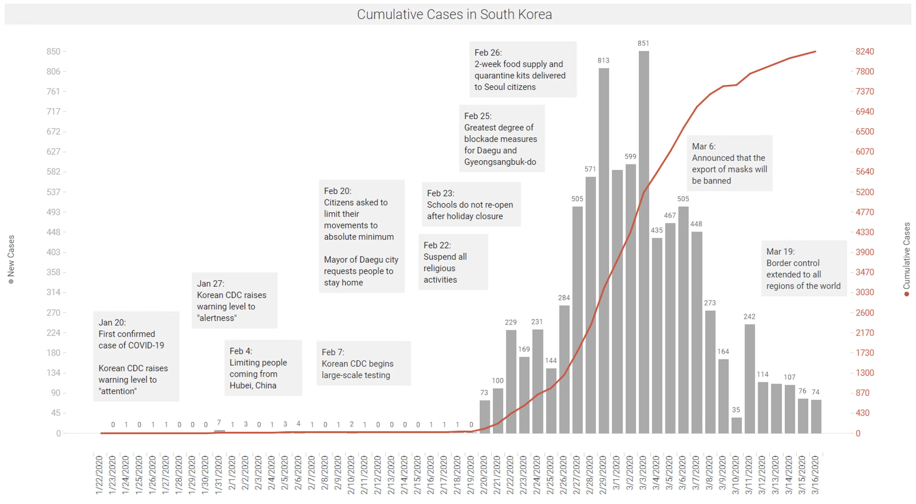
Data: KCDC | Spotfire app available here.
Other countries and regions have not been so fortunate. As of March 18, while the current doubling rate in China has slowed to 31 days and South Korea to 12 days; the global doubling rate is now 9 days; as many European countries now have doubling rates of 2-5 days (https://ourworldindata.org/coronavirus).
Backhaus (March 13, 2020) compared the outbreaks in South Korea and Italy. The distributions of cases and base population in these two populations are shown in Figure 8. In summary, the broad testing done in South Korea picked up a key asymptomatic group, age 20-29. Lower testing in Italy did not identify these infected people, and it looks like asymptomatic infection of older people occurred as a result. This is problematic given the high fatality rate in the elderly.
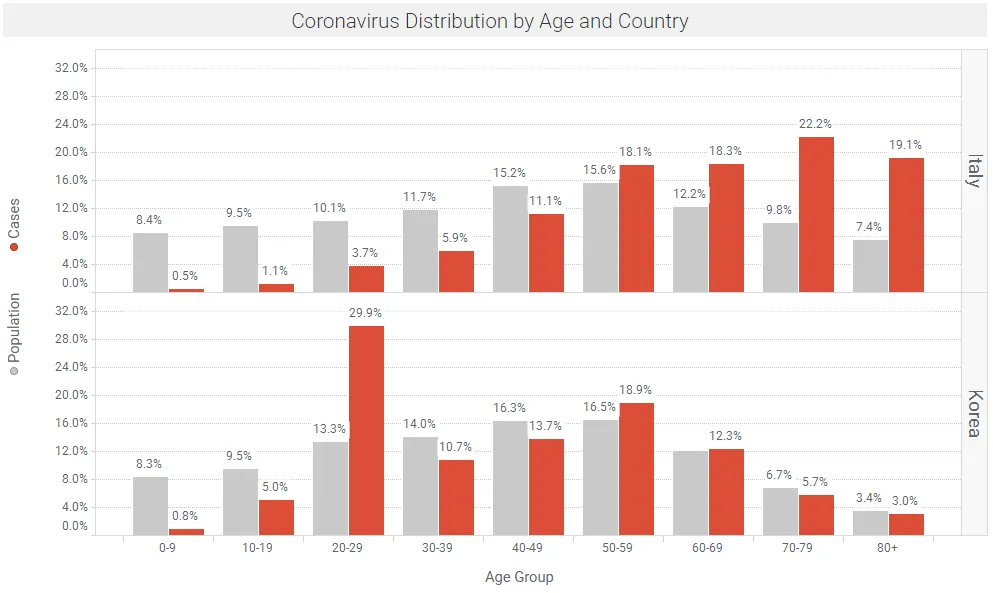
Data: Backhaus March 13, 2020 | Spotfire app available here.
Outbreaks in the United States
The exponential growth in the number of confirmed cases, and the incubation delay between infection and symptoms, makes it difficult to estimate the total number of cases. Trevor Bedford (@trvb) has some practical approaches that appear to fit the available data that have developed in the US (starting in WA state), using models for spatial spread developed by Hallatschek and Fisher.
Trevor’s current best guess is that approx. 20 initial sparks (infections) have caught between Jan 15 and Feb 15, and these will likely have resulted in growing outbreaks that will each produce ~1000 infections; so a rough estimate of the total cases in the US as of March 13 is likely ~10,000 – 40,000. This agrees reasonably well with the reported ~2000 cases reported by 3/13, with ~10X under-detection due to lack of available test kits. See tweet threads from Trevor Bedford (@trvb), March 13.
Without intervention measures, exponential doubling of cases is occurring every 3-4 days. Unabated, the number of cases in the US would increase by 32X in 15 days; and 128X in 21 days. If there were 20,000 cases on March 13, this would lead to ~640,000 cases in 15 days (March 28) and ~2.5M cases in 21 days (April 3). With this in mind, drastic measures are being taken by local authorities. For example, officials in six San Francisco Bay Area counties issued a sweeping shelter-in-place mandate on March 16 affecting nearly 7 million people, ordering residents to stay at home and go outside only for food, medicine and outings that are absolutely essential.
US states with the most number of cases as of March 17 are shown in Figure 9.
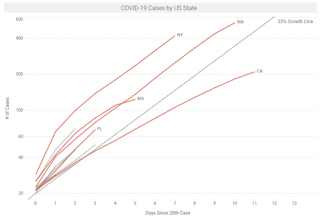
Data: Wikipedia | Spotfire app available here
We are currently working on estimating Rt at a state level, over time, across the US. While data are thin in places, early results are encouraging, showing a downward trend in Rt over time in some states. Figure 10 below shows some early results of this Rt modeling using the package EpiEstim on CRAN. This package can be added to Spotfire using the TERR Tools menu.
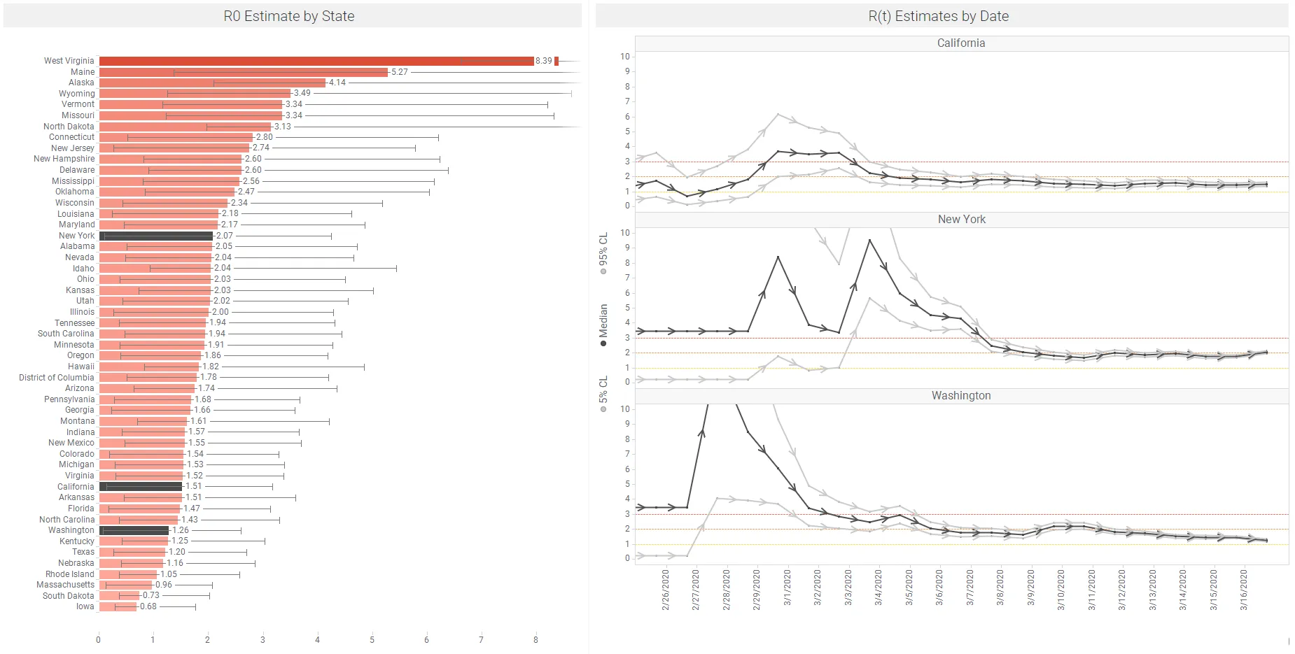
Data: Wikipedia | Spotfire app available here – this includes regular refresh of the data on Figure 10 above.
The link below shows an animation of this Rt modeling on US states. We will pick up this topic in our next blog, and track this across US states and counties as data are refreshed. This analysis will explore the effects of non pharmaceutical interventions (NPIs) on Rt. Note that Rt values can change quickly in response to NPIs. As outlined above, Kucharski et al. (March 11, 2020) found that the median daily Rt in Wuhan declined from 2·35 1 week before travel restrictions were introduced on Jan 23, 2020, to 1.05, just 1 week after.
Summary and Community Actions
Reading Adam Kucharski and other experienced epidemiologists, this virus is clearly highly contagious and deadly. However, from a statistical perspective, with exponential growth parameters there are similarly exponential errors on predictions, and many different scenarios could eventuate. When our predictive models are this uncertain, it is no wonder that we are seeing a wide range of human reactions – from terror to indifference. And the community measures that are being implemented have been shown to be effective.
At one level we can think of communities and populations, where deaths in the thousands are certain, the economy is in turmoil and our life savings are under attack.
At the other end of the spectrum there is us and our individual friends and families. If I/we assume a 10% risk of infection and a 0.1% mortality rate, my/our personal death rate is 1 in 10,000. Or perhaps better said my/our chance of being just fine is 9,999/10,000.
I guess what I’m saying is from a personal perspective it’s fine to be afraid and take every measure to protect myself. But I’m not going to take these highly uncertain outcomes as events that are likely to happen.
In the current situation, I take comfort in the uncertainty. We are moving forward with hope and confidence in the analytics and predictions – and uncertainties of the predictions – that are summarized in this paper.
The interventions are being driven by our medical and epidemiology experts (e.g., CDC and WHO) and these are measures we know to work since the Spanish Flu of 1918. Its clear that we have to all chip in, in our everyday lives to enforce these:
Be aware of the path to infection: hand to face, etc.
– Stop things like handshakes
– Clean hands often
– Clean and disinfect surfaces
Practice social distancing
– Avoid gatherings
– Maintain distance between yourself and others
Think about older people and their high infection and mortality rates
– Cover coughs and sneezes
– If sick, stay home. If that is not possible wear a facemask
We are all in this together. Be kind. Watch out for others in your orbit. Educate others with the knowledge you have. Be generous to others in our lives who are struggling. Help keep the young ones away from the elderly and immuno-compromised. Good luck. We will be back with another visual data science update on COVID-19 soon!
Updates
This blog was updated on March 22 as follows:
- added more detail on Case Fatality Rate (CFR)
- adjusted Figure 3 with recent CFR data
- added Wu et al reference
- added Wilson et al reference
- added Riou et al reference
- added to section on Rt analysis in US
Future updates will likely appear in a new blog, including:
- CFR and case reporting
- testing and diagnostics accuracy
- Rt analysis across countries, states and counties
- modeling
- healthcare resource planning
Acknowledgments & References:
Thanks to the awesome TIBCO Data Science team who are working on these analyses using Spotfire (Visual Analytics; R, Python): Neil Kanungo, Peter Shaw, Prem Shah did the heavy lifting, and were well supported by Vinoth Manamala, Eric Hsu, David Katz, Andrew Berridge, Heleen Snelting, Mike Alperin, Colin Gray and Dan Rope.
References
- Abbott, S, Hellewell, J, Munday, JD, Young Chun, J, Thompson, RN, Bosse, NI, Chan, YWD, Russell, TW, Jarvis, CI. Temporal variation in transmission during the COVID-19 outbreak, online March 14, 2020
- Anderson RM, Heesterbeek H, Klinkenberg D, Hollingsworth TD. How will country-based mitigation measures influence the course of the COVID-19 epidemic? Lancet 2020, with appendices; published online March 6, 2020
- Backhaus, A. Coronavirus: Why it’s so deadly in Italy, March 13, 2020
- Churches, T. Analyzing COVID-19 outbreak data with R – part 1. published online February 7, 2020
- Community mitigation guidelines to prevent pandemic influenza. https://stacks.cdc.gov/view/cdc/45220 United States, 2017
- Ferguson NM, Laydon D, Nedjati-Gilani G, Imai N, Ainslie K, Baguelin B, Bhatia S, Boonyasiri A, Cucunubá Z, Cuomo-Dannenburg G, Dighe A, Dorigatti I, Fu H, Gaythorpe K, Green W, Hamlet A, Hinsley W, Okell LC, van Elsland S, Thompson T, Verity R, Volz E, Wang H, Wang Y, Walker PGT, Walters C, Winskill P, Whittaker C, Donnelly CA, Riley S, Ghani AC. Impact of non-pharmaceutical interventions (NPIs) to reduce COVID19 mortality and healthcare demand. Imperial College, 16 March 2020
- Hallatscheck and Fisher. Acceleration of evolutionary spread by long-range dispersal. November 18, 2014
- Jones, J. Notes on R0, Stanford University, 2007
- Jones, J. Models of Infectious Disease, Stanford Spring Workshop in Formal Demography, May 2008.
- Kucharski, Adam. The TED Interview, March 12, 2020
- Kucharski et al. Early dynamics of transmission and control of COVID-19: a mathematical modeling study, March 11, 2020
- Lauer et al. The Incubation Period of Coronavirus Disease 2019 (COVID-19) From Publicly Reported Confirmed Cases: Estimation and Application, Pubmed, March 10, 2020
- Interim pre-pandemic planning guidance : community strategy for pandemic influenza mitigation in the United States : early, targeted, layered use of nonpharmaceutical interventions. https://stacks.cdc.gov/view/cdc/11425, CDC, 2007
- Mecher, CE, and Lipsitch M. Public health interventions and epidemic intensity during the 1918 influenza pandemic PNAS. https://doi.org/10.1073/pnas.0610941104 May 1, 2007 104 (18) 7582-7587; first published April 6, 2007
- New York Times. US COVID-19 cases
- New York Times. Flattening the Coronavirus Curve, March 11, 2020
- Remuzzi A, Remuzzi, G. COVID-19 and Italy: what next?, March 12, 2020
- Ridenhour, B., Kowalik, J. and Shay, D. Unraveling R0: Considerations for Public Health Applications. Am J Public Health. Doi: 10.2105/AJPH.2013.301704. Published online February 2014
- Riou J, Hauser A, Counotte, MJ, Athaus CL, Adjusted Age-Specific Case Fatality Ratio during the COVID-19 Epidemic in Hubei, China, January and February 2020, 3 March 2020, Preprint.
- Stevens H, Washington Post. Why Outbreaks like coronavirus spread exponentially and how to “flatten the curve”. March 14, 2020
- Stanway, A. Real Time COVID-19 Tracking. Medium, March 14
- Wilson N, Kvalsvig A, Barnard LT, Baker MG. Case-Fatality Risk Estimates for COVID-19 Calculated by Using a Lag Time for Fatality. CDC EID Journal. Voliume 26, Number 6, June 2020.
- Wu JT, Leung K, Bushman M, Kishore N, Niehus R, de Salazar PM, Cowling BJ, Lipsitch M, Leung GM: Estimating clinical severity of COVID-19 from the transmission dynamics in Wuhan, China, Nature Medicine, March 19, 2020
Websites with data updates
- 1Point3Acres: COIV-19 in US and Canada
- Johns Hopkins: Coronavirus Resource Center
- KCDC: Daily cases update from Korea
- Our World in Data: Coronavirus Testing – Source Data
- Wikipedia: Case data for US States
- World Health Organization: Coronavirus situation reports
Twitter feeds
- Trevor Bedford : @trvrb
- Nextstrain : @Nextstrain
- Hannah Ritchie : @_HannahRitchie
- Eric Topol : @EricTopol
- Adam Kucharski : @AdamJKucharski
- Sam Abbott : @seabbs