Clustering Made Simple with Spotfire
Blog: The Tibco Blog
Data clustering is the process of grouping items together based on similarities between the items of a group. Clustering can be used for data compression, data mining, pattern recognition, and machine learning. Examples of applications include clustering consumers into market segments, classifying manufactured units by their failure signatures, identifying crime hot spots, and identifying regions with similar geographical characteristics. Once clusters are defined, the next step may be to build a predictive model.
TIBCO Spotfire makes it easy to perform clustering with these two popular out of box user-friendly solutions:
1. K-means Clustering
2. Hierarchical Clustering
K-means clustering
The k-means method is a popular and simple approach to perform clustering and Spotfire line charts help visualize data before performing calculations. In order to perform k-means clustering, you need to create a line chart visualization in which each line is an element you would like to represent (which can be Customer ID, Store ID, Region, Village, Well, Wafer and so on).
Next, the user can select multiple attributes on the Y-axis, which can be on the same scale or can use multiple scales. Select [Column Names] as X-axis so that Multiple Y attributes are represented as points on the line. It is important to note that null values will not be used in your clustering calculations. The Spotfire data panel allows you to view and even replace null values before performing clustering.
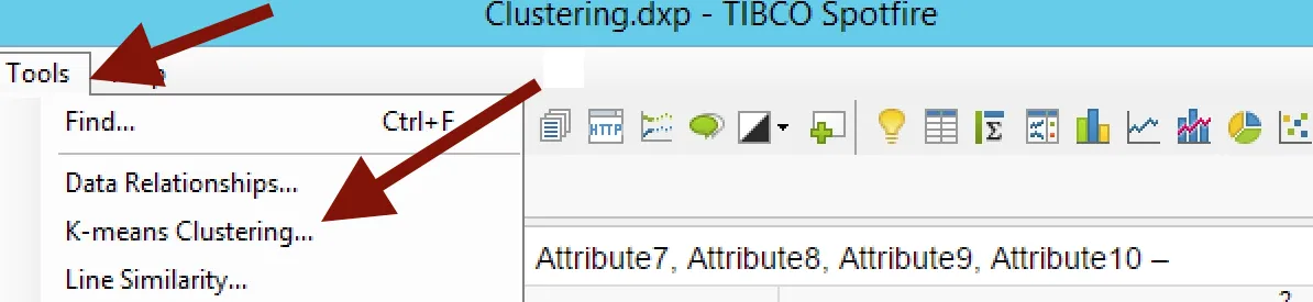
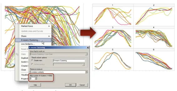
Once you have your line chart ready, select Tools > k-means clustering:
You can select the distance measure and number of clusters as input for calculation. It is also possible to update existing the calculation:
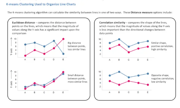
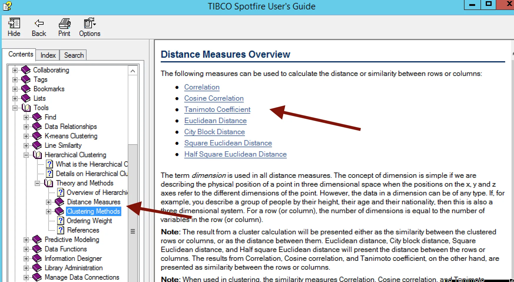
Here is quick explanation of the distance measure option:
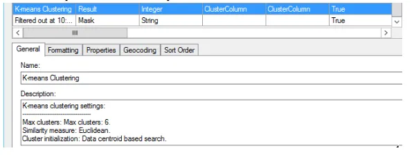
The result of this calculation is a categorical column, which automatically assigns each line to a cluster group and displays each cluster group in a separate trellis panel in the resulting clustered line chart. The clustered line chart visualization provides ease of interpretation. It is important to note that this new categorical column called “ K-means Clustering” can be updated.
Hierarchical clustering
Hierarchical clustering arranges items in a hierarchy with a treelike structure based on the distance or similarity between them. The graphical representation of the resulting hierarchy is a tree-structured graph called a dendrogram. In Spotfire, hierarchical clustering and dendrograms are strongly connected to heat map visualizations which provide visual insights into data and ease of interpretation.
The algorithm used for hierarchical clustering in Spotfire is a hierarchical agglomerative method. For row clustering, the cluster analysis begins with each row placed in a separate cluster. Then the distance between all possible combinations of two rows is calculated using a selected distance measure. The two most similar clusters are then grouped together and form a new cluster. In subsequent steps, the distance between the new cluster and all remaining clusters is recalculated using a selected clustering method. The number of clusters is thereby reduced by one in each iteration step. Eventually, all rows are grouped into one large cluster. The order of the rows in a dendrogram are defined by the selected ordering weight. The cluster analysis works the same way for column clustering.
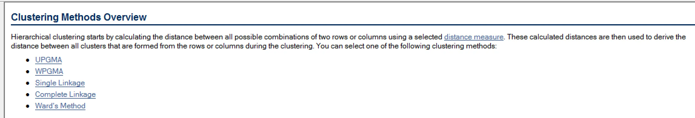
The Spotfire user guide provides details about distance measures and clustering methods that can be used for performing calculations.
The hierarchical clustering calculation results in a heat map visualization with the specified dendrograms. A cluster column is also added to the data table and made available in the filters panel.
Clustering with variable importance data function
This data function accepts an input table with numeric columns and uses k-means clustering to find groups of rows that belong to clusters. Next, a random forest model is built to find out which variables are most influential in determining the clusters. The two most influential variables are returned and can be plotted on a scatter plot. If a logarithmic transform is appropriate, this is applied prior to the clustering and variable importance calculation.
This data function is available on the TIBCO Community Exchange here. To try out these features and more in Spotfire for yourself, click here for a free trial.