
A Comprehensive List of the Best Data Visualization Charts for Your Business
Blog: The Tibco Blog
Data visualizations help all kinds of business users understand data quickly and effectively. There are so many different kinds of visualizations you can use in your analytics. So how do you know which visualizations are right for your business?
Typically the best visualizations are the ones that can easily share information with accuracy and without misinterpretation. TIBCO Spotfire® data visualizations utilize real-time information to tell an incredible data story. When you animate charts with historical information, you can easily see trends and patterns emerge over time—and more importantly, so can your stakeholders.
We’ll dive deep into our top five charts—be sure to view the full list at the bottom. If you love all things Spotfire®, check out our enablement hub in the new TIBCO Community to read in-depth tutorials and have your questions answered.
Bubble Chart
Bubble charts, also known as bubble plots or bubble graphs, communicate a third dimension to data—providing in-depth information to viewers by comparing three variables. Unlike other three-dimensional charts that represent data across three axes, a bubble chart is represented on two axes (x and y). The size of the bubble communicates the third vital piece of information. Color can also add a fourth element to the chart.
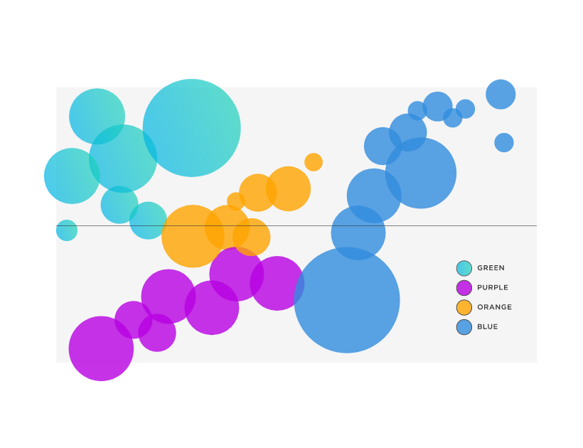
This chart is great when you want to:
- Study relationships between categories
- View the context of a situation
- Highlight patterns
- Understand how parameters change over time
Bubble charts are used frequently in business contexts, especially in one of today’s core financial processes: valuation and investments. For example, the cost of valuation can be studied against risk by using the axes to represent cost and value and the bubble sizes to represent risk.
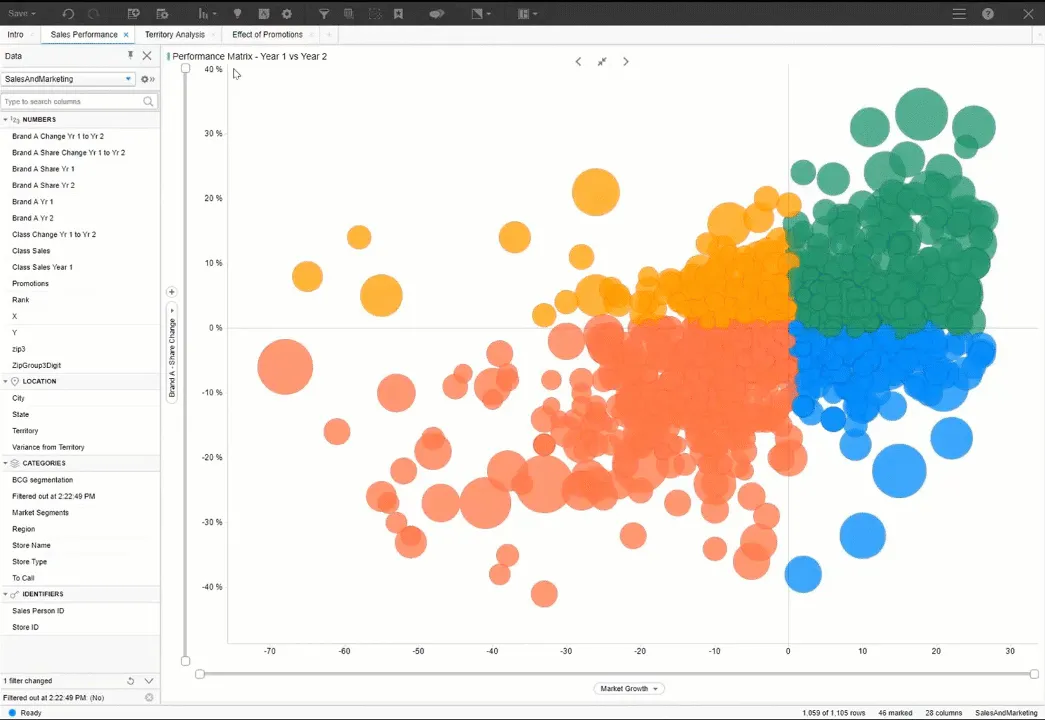
Want to see a Bubble Chart in action? Dr. Spotfire teaches you how to animate your Bubble Charts in Spotfire.
Donut Chart
Not all visualizations have to be complex to impress. A Donut Chart is simply a pie chart without the middle. Because the center is removed, the reader can focus on the length of the arc, not compare it with the total area like in a pie chart. Another visual benefit of a donut chart is that the space inside the donut can be used to represent data, labels, and titles to make reading the chart easy.
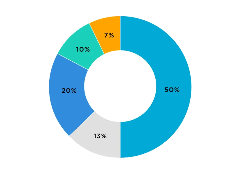
This chart can help you:
- Show the proportions of categorical data
- Showcase data easily
- Communicate historical trends
Donut charts do a great job of distilling key information. They are ideal for business reports where data needs to be visualized simultaneously to draw the best insights. For example, a donut chart of sales for a company in 2020 can be placed inside a donut chart of sales in 2021. This communicates more information than would be possible by placing two charts next to each other and their corresponding data table underneath.
Want to add a Donut Chart to your Spotfire visualizations? Check out the Donut Chart Spotfire Mod.
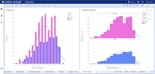
Histogram Chart
A Histogram Chart is a graph used to represent the frequency distribution of a few data points of one variable. Histograms often classify data into various “bins” or “range groups” and count how many data points belong to each of those bins.
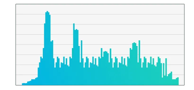
This chart is ideal to:
- Represent the distribution of sample data
- Compare the frequency distribution of two data sets
- Analyze data symmetry
Statisticians use histograms to understand sample data better. Histograms are often used to explore various statistical properties of data.
Histograms are easy to make in Spotfire—learn how at the TIBCO Community.
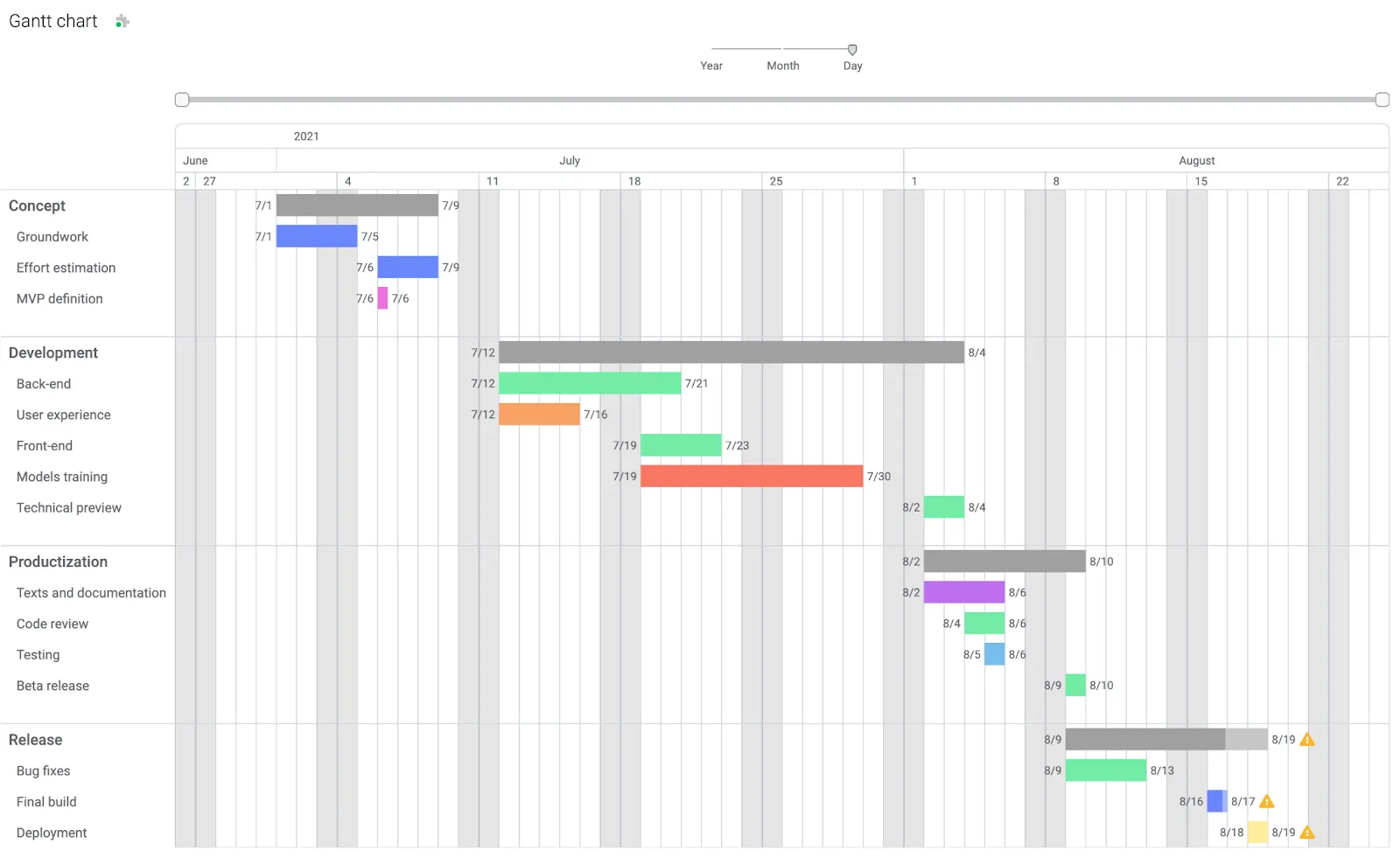
Gantt Chart
A Gantt Chart is a project management tool that shows task progression across a timeline—resembling a bar chart. On the left, there are tasks, and across the top, there is a timescale. Tasks are allotted a time frame, shown by a horizontal bar.
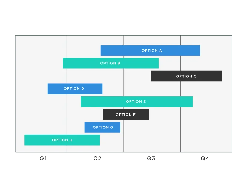
Use this chart to:
- Demonstrate the entire length of a project
- Showcase how long a task takes
- View who is assigned to what project
- Understand how tasks relate to each other
- Remove possible bottlenecks
- Discover which resources are used for each task
Gantt Charts are great for manufacturers to optimize resource allocation and remove bottlenecks from factory operations. They could see which machines need to be used at certain intervals in production and map out more efficient planning for workers.
Ready to use Gantt Charts in Spotfire? Download the Gantt Chart Spotfire Mod today.
Map Chart
With a map chart, you can visualize data relationships in specific geographical locations—crucial for comparing values and showing various categories across different regions. Examples of geographical regions could include postal codes, countries, or state regions.
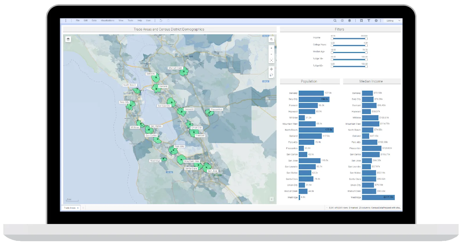
This chart can help you visualize:
- Illustrate the distribution of information
- Highlight relevant regions for matched items
- Show regional outcomes
Some great examples of map charts in action include identifying supply chain bottlenecks, disease spread, election outcomes, and functioning power plants based on region.
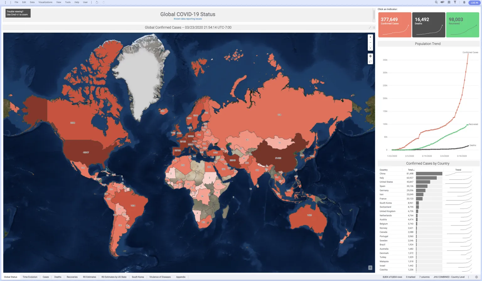
Need help creating a Map Chart in Spotfire? This short video has got you covered.
Top Data Visualization Charts
Here is a list of over 25 charts you can use to achieve the best data visualizations. You can use all these charts in your TIBCO Spotfire® dashboards! Remember, the best dashboards use a combination of visualizations to provide multiple viewpoints for all kinds of learners and viewers.
- Area Chart
- Bar Chart
- Bubble Chart
- Candlestick Chart
- Column Chart
- Combination Chart
- Donut Chart
- Funnel Chart
- Gantt Chart
- Gauge Chart
- Geographical Chart
- Histogram Chart
- Kagi Chart
- Logarithmic Chart
- Line Chart
- Map Chart
- Marimekko Chart
- Pie Chart
- Pareto Chart
- Pyramid Chart
- Radar Chart
- Scatter Chart
- Spline Chart
- Stacked Chart
- Treemap Chart
- Waterfall Chart
And if you’ve made it all the way here, you’re a true Spotfire fan. Here’s a free 30-day trial on us!
The post A Comprehensive List of the Best Data Visualization Charts for Your Business first appeared on The TIBCO Blog.