5 Ways Data Visualization Can Improve Your Decision-Making Process
Blog: Decision Modeling | Blue Polaris, formerly Decision Management Solutions
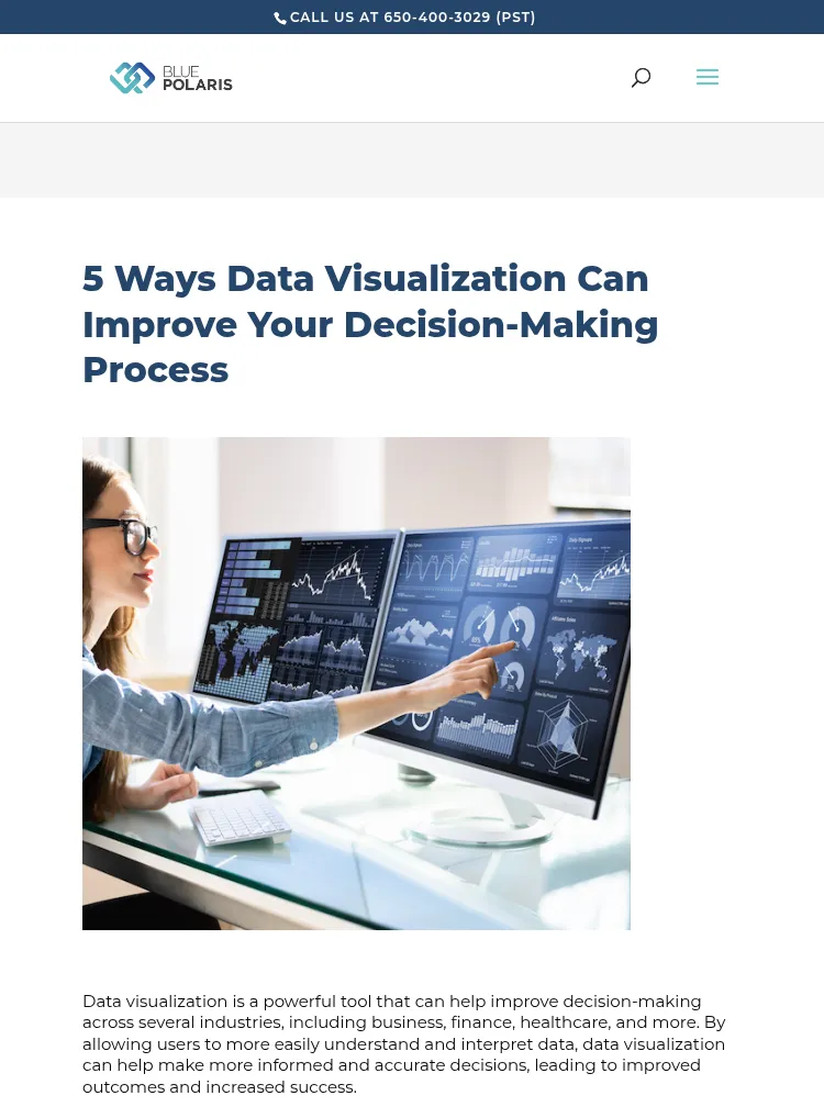
Data visualization is a powerful tool that can help improve decision-making across several industries, including business, finance, healthcare, and more. By allowing users to more easily understand and interpret data, data visualization can help make more informed and accurate decisions, leading to improved outcomes and increased success.
By transforming data into visually appealing and easy-to-understand graphics, data visualization allows decision-makers to comprehend large, complex datasets, detect patterns and trends, and communicate ideas effectively. In this article, we will explore five ways in which data visualization can enhance the decision-making process.
1. Identifying patterns and trends
Data visualization is a valuable technique for understanding and interpreting large sets of data. Using visual representations such as charts and graphs enables the identification of patterns and trends that may not be immediately apparent in raw data. This, in turn, improves the decision-making process by providing clear insights and understanding of the data.
2. Communicating complex information
By transforming complex information into visually appealing and easy-to-understand graphics, it becomes easier for stakeholders to comprehend and make sense of the information. This is particularly important in the decision-making processes that involve multiple parties. Furthermore, utilizing data visualization can enhance engagement by making the information more visually appealing, increasing the chances of buy-in for the decisions made.
3. Spotting outliers
Outliers and anomalies in data can be crucial in identifying potential issues or opportunities that may not be immediately apparent in raw data. By utilizing visual representation tools such as charts, graphs, and plots, it is possible to effectively detect these outliers. For instance, in the case of claims data, an outlier can signify an unexpected spike or drop in claims, which may indicate a problem with a specific service or a possible instance of fraud that requires attention.
4. Comparing data
Comparing current data to historical data can be a powerful tool for understanding how the data has evolved over time, and for identifying trends and patterns that may not have been immediately apparent. By analyzing the changes in the data, it is possible to gain valuable insights that can inform decision-making and help one to anticipate future developments. This can include identifying areas of improvement, identifying potential issues before they become critical, and identifying potential opportunities that might have been overlooked. Overall, the comparison of current and historical data can be a valuable tool for gaining a deeper understanding of the data and making more informed decisions.
5. Continuous improvement
Dashboards are a powerful tool for organizations, enabling real-time monitoring and analysis of data through an easy-to-interpret visual representation of key performance indicators (KPIs) and other relevant data points. This allows for the swift identification of problem areas and potential opportunities. By continuously monitoring the data, it is possible to reveal issues and opportunities that may not have been immediately apparent, providing valuable insights for decision-making.
Learn more about how data visualization can improve your day-to-day decision-making or contact us with questions about how we could help you with your process.