
3 Ways Spotfire is Unique Compared to Tableau
Blog: The Tibco Blog
The advent of hyperconverged analytics
TIBCO Spotfire® takes a unique approach to business intelligence (BI) in three ways. It’s designed to be immersive, smart, and real-time. I’ll explain each, beginning with immersive BI.

IMMERSIVE: PARTICIPATORY BI
Modern BI tools have two common interaction modes: immersive exploration and dashboards. A dashboard is a visualization designed for a well-understood business purpose. For example, a sales forecast dashboard shows answers to questions like: “Will I achieve my revenue targets this quarter?” “Which sales reps are performing the best?” “Which regions are performing the best?”
Analysts create BI dashboards for the people who need answers. The knowledge worker views the dashboards. Thinking follows a path divined by the dashboard author.
Knowledge workers use immersive BI, by contrast, for serendipitous exploration. Rather than being a recipient of someone else’s thinking, they think for themselves. The tool helps them immerse themselves in data, explore connections, and discover insights.
Dashboards share answers to well-understood problems. Sales forecasts, financial reports, marketing leads. Immersive BI helps knowledge workers explore. Drug discovery, oil exploration, competitive intelligence, customer engagement.
Spotfire dashboards are immersive and enable analysts to discover unexpected insights. It also shows an “algorithm behind a button.
Immersive BI is analogous to participatory art. The audience enters the artistic experience with the artist. Immersive BI invites knowledge workers to jump inside their data. Dashboards, by contrast, are like a painting: you can’t join the artist’s experience.
SMART: DATA SCIENCE-DRIVEN BI
The second area of differentiation is smart, or data-science-driven BI.
Every company is trying to get more value from data science and machine learning. Most firms can’t afford to hire dozens of data scientists. Data-science-driven BI puts predictive analytics, forecasts, and algorithms in a visual context. Spotfire makes it easy to embed data science algorithms in visualizations. Making data science insights available via a visual interface, makes it easy for anyone, not just data scientists, to gain access to these previously unavailable, but extremely valuable insights.
As Michelle Lacy, from Bayer Precision Agriculture, a TIBCO customer, puts it, “Spotfire helps us put the algorithm behind a button.”
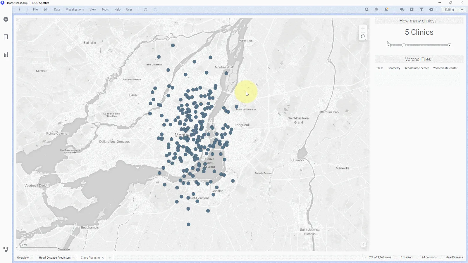
The example from Bayer above shows a data-science-driven dashboard at work. It’s a view of how a domain expert might hunt for the best location for a health clinic and be aided by the extra layer of data science insights. By lassoing an area, the visualization morphs, powered by an R model Michelle, at Bayer, is not a data scientist but is able to harness the insights from machine learning algorithms that were previously unavailable to her.
To make their decision, Bayer Precision Agriculture evaluated every BI tool, including Tableau and Power BI. To again quote Michelle, “nothing comes close” to how Spotfire puts Python and R behind a button.
REAL-TIME: STREAMING BI
Finally, there’s real-time. Spotfire embeds a streaming analytics engine inside, giving users of the dashboard access to real-time data and therefore real-time insights in the BI tool. Visualizations display data in motion as it changes. Industry analysts refer to this unique model as streaming BI. Streaming BI is becoming essential for digital transformation. Analysts can explore any connected person, place, or thing.
The visualizations below show real-time data from a Formula One wind-tunnel simulation. The location on a chosen track and sensor readings show the real-time state of the simulation.
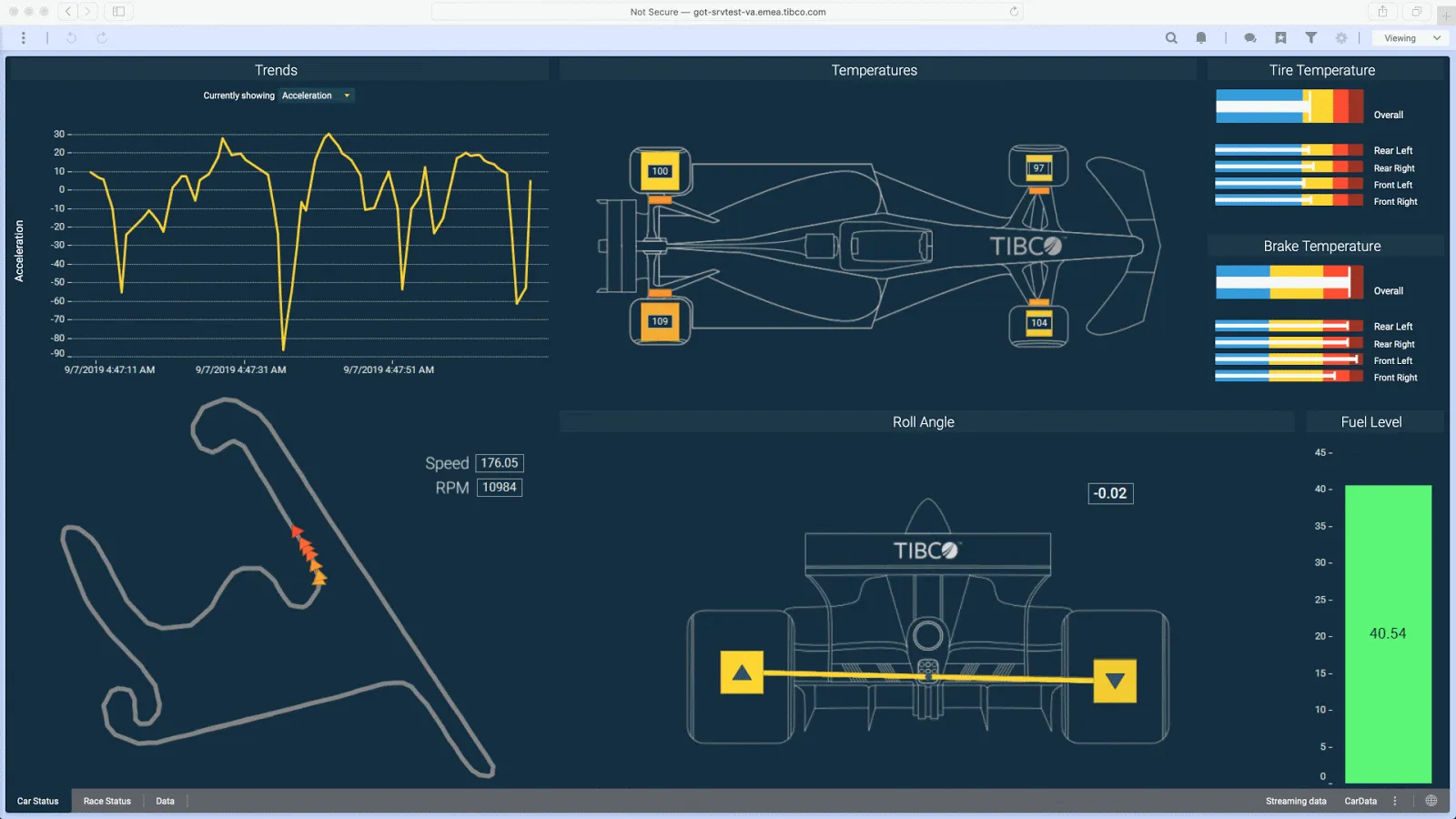
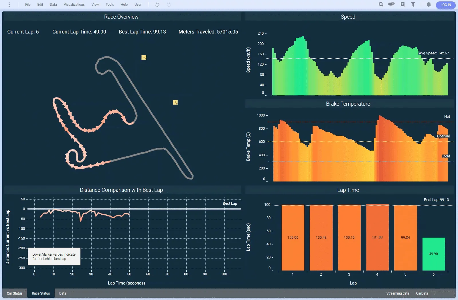
Real-time feedback in context with history is essential. Anything in red means this configuration is performing worse than our best lap. Anything in green is better.
You’re having an aha moment, aren’t you? At a glance, you might observe that although our current speed is good, our brakes are running hot. Is that what we want? Should we adjust the brakes for this track because that’s the best balance?
With real-time feedback, learning happens faster. This learning can be the difference between winning and losing.
Making data science insights available via a visual interface, makes it easy for anyone, not just data scientists, to gain access to these previously unavailable, but extremely valuable insights.
Click To Tweet
THE FUTURE OF ANALYTICS IS IMMERSIVE, SMART, AND REAL-TIME
Tableau and other dashboard-centric BI tools are fantastic tools. But for BI that’s immersive, data science-driven and real-time, Spotfire is the tool of choice.TIBCO Spotfire and the new TIBCO Cloud Data Streams software are available now in the TIBCO Connected Intelligence Cloud. Log into your TIBCO account and start exploring real-time data in minutes! Visit the Real-Time Analytics page to get your free 30-day trial started.