11 Best Home Page Tips From Analyzing 100 Startups
Blog: Blog | Process Street | Compliance Operations Platform

Home pages are the most viewed page on most websites and your best opportunity to connect with visitors as a brand. Get it wrong, and those views become bounce rate instead of customers.
To find out what actually works, we analyzed 100 leading startup home pages and distilled the results into 11 data-backed takeaways. The study compared two groups: 50 general startups and 50 developer-tools startups, ranked by total funding on Wellfound (formerly AngelList). The original research was conducted in 2017, and while the specific companies have evolved, the structural principles hold up remarkably well.
From word count and jargon usage to social proof and CTAs, here is what the top 100 startups reveal about building a high-converting home page, along with the key differences when you are targeting a technical audience.
The method, and a few caveats
Before we get into the takeaways, here is the method used to get this data. While there are some potential flaws, at least you will know where those may be and can give the appropriate caution.
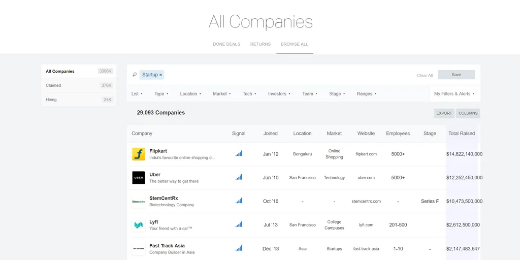
We analysed the top 100 startup home pages, organised by highest “Total Raised” value on Wellfound (formerly AngelList). 50 of these were companies with only the “Startup” tag, and 50 were those with both the “Startup” and “Developer Tools” tags.
By doing this we can get an idea of how home pages aimed at developers differ from those geared towards a more general audience, and how the approach to both varies. The lessons here could potentially be applied to similar niches (those targeting an audience with a higher level of assumed knowledge and ability in their field, and a specific need).
As for the caveats, there are a couple:
- 7 of these startups have been acquired or re-branded, and in this case we used the new or redirected homepage (since they were still aimed at a similar audience)
- Although 100 startups were analyzed, only 99 home pages actually made the cut. TenXer was acquired by Twitter, and so a home page for it (or anything resembling it) was unavailable
- Word count and reading grade were both found by running the home page copy through Hemingway
- Jargon was detected using Clarity Jargon Buster (now defunct), a tool that analyzed text for common jargon terms
- For some streaming and media companies (such as Crunchyroll) the home page contained a list of available media. In these cases, all of that media was included in the word count, since it was technically still on the page
- When counting pages which showed pricing we looked for specific prices rather than mentions of a free trial. If a company offered a free trial, but did not show what at least one of their paid plans cost, they were not counted
All percentages and data summaries have taken these flaws into account (when TenXer was involved, the total companies was reduced by one for lack of data), but it is still worth being aware of the full picture.
Click here to see the full data set.
With that out of the way, let us begin.
The study’s highlights
There is quite a lot to unpack here, and even more that we can learn by interpreting the data, so here is a brief summary of the highlights of the study:
- 93.94% had no specific pricing details
- The average number of CTAs was 5.57
- 92.93% had at least one CTA immediately visible
- 100% had branding immediately visible
- Jargon made up 5.75% of each page’s word count
- 70.71% had social proof of some kind
- 24.24% offered a demo
- 4.04% had a demo video
- 27.27% had a marketing video
- The average reading grade of their copy was 6.55
- The average word count was 609.83
Although these are the surface level takeaways, let us now dive into the specifics.
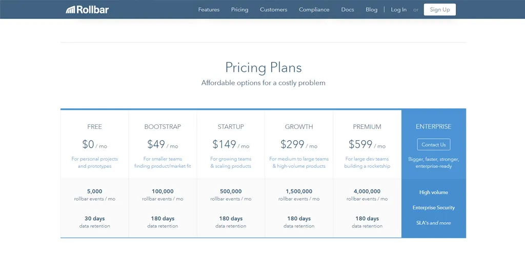
93.94% had no specific pricing details
The first of our findings was expected: it is rare to see a home page with any specific pricing elements. Usually, pricing plans are complex enough that you do not want to immediately bombard your customers with the details.
Still, 93.94% of home pages having no specific pricing plan is an overwhelming average. Although some of these included references to free trials, it is easy to see that the industry standard is to sell a potential customer on the product or service before bringing any kind of budget into the equation.
For the sake of being thorough, let us take a look at those that did include pricing plans on the home page, and whether there is any visible merit to it.
The companies with pricing elements on their home pages were:
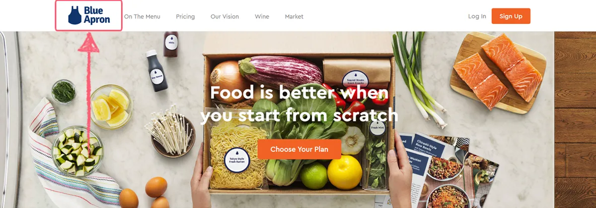
- Blue Apron
- Adobe Stock (formerly Fotolia)
- Hologram
- Rollbar
- Spotify
- Tonomi (acquired by Grid Dynamics, no longer operating independently)
Of those companies, three were tagged as “developer tools” and three were not, making it an even split. In other words, there is no difference between marketing to developers and a more general audience when it comes to showing pricing elements.
In terms of the value of doing this, the data is not entirely convincing. Every example which showed pricing elements relegated them to the bottom of their home page, further showing how the potential customer needs to be sold on your product before being introduced to the pricing.
While it is ultimately up to you, the data heavily suggests that any specific pricing (other than the odd mention of a free trial) should be kept to a dedicated pricing page.
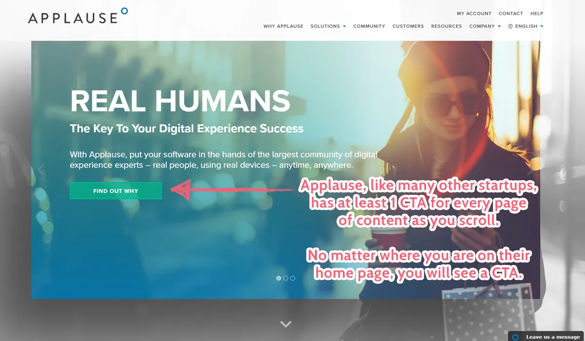
The average number of CTAs was 5.57
Call-to-actions (CTAs) are vital to getting your viewers to take action. Without highlighting a route to do something that will create value, you miss out on a golden opportunity to better secure your leads.
If you do not encourage your potential customers to take the next step to converting, you are relying even more heavily on your marketing and their own initiative to take action. Unfortunately, as we all know, it is easier to not do anything, and so such a choice will lead to far fewer sales.
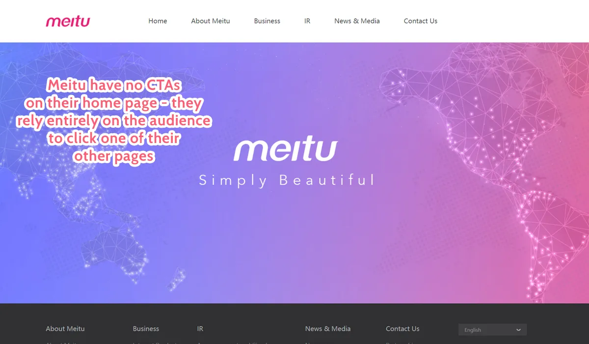
As such, it should come as no surprise that only three companies had no CTAs on their home page:
- Fast Track Asia, a media site
- Meitu, a collection of products built around image processing
- PredictionIO (now retired), an open source stack for developers and data scientists
Fast Track Asia is a media site, hence why it has links to content instead of specific CTAs, and PredictionIO was open source with no barrier to entry. Meitu, however, is rather puzzling, since they relied on your curiosity to click through to another page to even learn what the company does.
In general, the average number of CTAs for startup home pages was 5.57. These ranged from “Arrange a demo” to “Start your free trial” and everything in-between, but all involved telling the reader to do something.
Once again, the difference between developer tools startups and regular startups was minimal, with developer tools having 5.76 CTAs on average and regular startups having 5.38. This makes sense, since no matter what industry you are in, a home page will always be designed to promote a product, service, or something else which requires the viewer to take action.
In other words, aim for between five and six calls to action on your home page but make sure that they are strategically placed and spread out across the entire page.
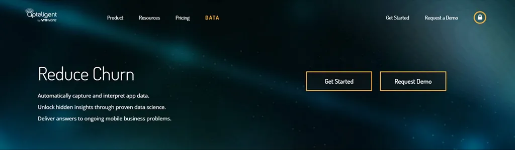
92.93% had at least one CTA immediately visible
Perhaps just as important as having any CTAs on your home page is the location of those elements. The first thing your potential customers should see is the most important thing to beginning their journey to signing up for your service.
As such, it comes as no surprise that 92.93% of the 100 startups we examined had at least one CTA immediately visible upon loading up the home page. This means that, without having to scroll, the viewer is immediately shown at least one instruction to take further action.
This only makes sense, since the sooner you can capture your audience’s attention and make them take the next step to converting, the less likely they are to become bored, distracted, or just plain lose interest and bounce.
While the figure itself is not surprising, this is the first element where we see a significant difference between regular and developer startups. When compared, 97.96% of developer tools had an immediately visible CTA compared to only 88% of regular startups.
In other words, immediately visible CTAs were present in almost 10% more of developer tools startups than those aimed at a wider audience.
There are many potential reasons for this, but the most likely is that the target market is much more specific. This means that there will typically be a greater intention to make a purchase when viewing the home page, and so it makes more sense to immediately dive into the first step of the sales cycle.
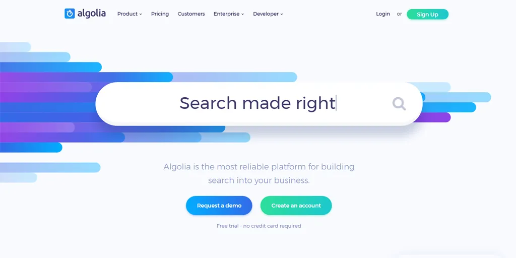
100% had branding immediately visible
As you would imagine, every single start-up examined had their branding immediately visible through either a logo or company name, more often than not in the top left-hand corner of the home page.
This makes sense, as it reinforces both the brand and product being offered to the customer. By getting them to become familiar with both your brand name and logo, you make it easier for them to remember you, and thus more likely that they will revisit your home page and convert.
There is really not much more to this point, so let us move on.
70.71% had social proof of some kind
Social proof in general makes it much easier to convince someone that you are worth paying attention to. It is the theory behind any kind of celebrity endorsement or sponsorship: the idea that “I know this person, and this person likes this product, so I will probably like this product.”
At the very least it is a great way to inspire a little more trust in your viewers, since you are effectively showing off your track record and how much your existing customers are enjoying (and benefiting from) what you have to offer.
It comes as a slight surprise then that only 70.71% of home pages contained any kind of social proof.
Almost 30% of startup home pages contained no quotes from satisfied customers, videos with industry leaders singing their praises, or even a collection of icons demonstrating the companies which use their services.
While this may seem like a massive oversight, it does shed some light on the difference between the typical home page of a startup compared to that of a developer tool, since:
- 81.63% of developer tools had social proof
- 60% of non-developer tools had social proof
The high number of developer tools with social proof was expected. It makes sense with such a specific target market to provide familiar names and companies who can validate the worth of your product before a customer even tries it out.
As for 40% of non-developer tool startups having no social proof, there is actually perfectly good reason for this. Between streaming services, media companies, clothing and shopping services, music portals, and restaurant finders, there are many sites which are not quite suited to social proof.
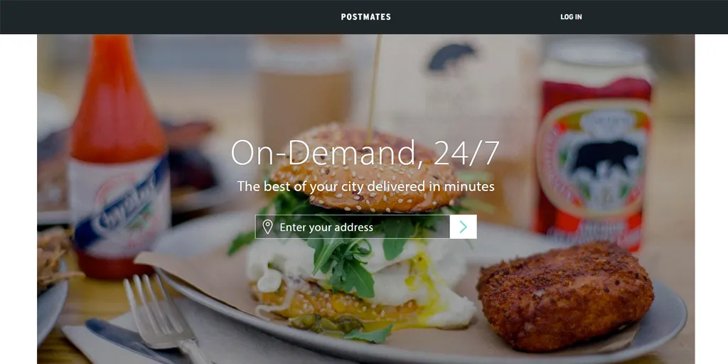
Be it because the service itself is based on promoting other services (such as Postmates, now part of Uber Eats) or because the space is better served by displaying the content on offer (such as Crunchyroll), some companies simply do not need social proof in order to convince their audience of their worth. Or, rather, the valuable space on their home page is better served by showing exactly what is on offer.
In general, if you are running a startup which serves as some kind of marketplace, streaming service, media collection, or something similar, note that you do not necessarily need to have social proof in order to hook your audience.
If you are marketing to developers, strongly consider including at least a quote or two.
24.24% offered a demo
Demos are far from the industry standard. Aside from being extremely time-and-resource-consuming, they are also incredibly impractical to carry out at scale. Unless you want to have an extensive sales team who do nothing but conduct demos every day, you cannot offer one to every potential customer.
Then there is the relevancy to consider.
As many of you will already know, a “demo” is most assuredly not the same as a “free trial.” It is not just allowing the customer to get their hands on your product and to try before they buy, but instead a guided tour of the various features. It is a high-touch sales method which is not entirely relevant to a massive subsection of products.
As such, it comes as little surprise that only 24.24% of the 100 startups we examined gave the option to arrange a demo from their home page.
While the low figure in itself was to be expected (the potential resource investment means that such a practice is not even possible for most companies), the disparity between startups aimed towards developers and those not was rather alarming, if a little telling of the niche.
- 36.73% of developer tool startups offered a demo
- 12% of startups in general did the same
As you can see, a staggering 24% more of developer tool startups offered their audience the chance to arrange a demo compared to startups in general. This is most probably due to the products being aimed at a more highly skilled niche (developers) who will not only use the product’s features more thoroughly, but who will likely have some kind of monetary investment on the line when they use it.
In other words, the developer tools are both more complex than, say, a music streaming service, and the users have more at stake should something go wrong or be set up incorrectly. Thus any potential customer will want to be especially sure that the product will meet their demands.
4.04% had a demo video
When we say that 4.04% of home pages had a demo video, we mean that these had a video which directly showed the product or service in use.
Such videos are useful for products which are difficult to describe or show the value of without using an in-app example. It allows your audience to see the value in the service you are providing, with specific information about how they can use it.
In other words, it is almost like a cross between marketing video and onboarding session.
With these videos being more suited to complicated products, we originally thought that developer tools would have more of them. However, not only were there fewer demo videos than anticipated, but the developer bias did not hold.
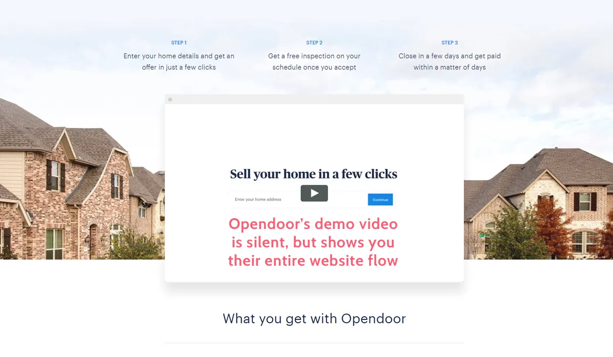
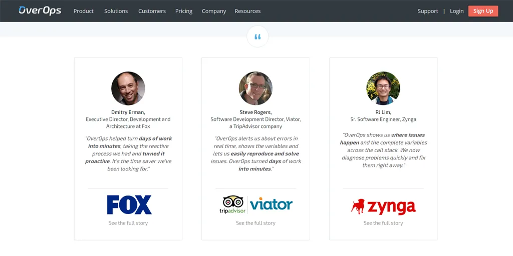
Only four startups in total featured a demo video, with a 50/50 split between developer tools and startups in general. The four that included a demo video were:
- Cask (acquired by Google in 2018), an open source application platform
- OverOps (acquired by Harness), a code analysis tool
- DraftKings, a fantasy sport game platform
- Opendoor, a home buying and selling service
Of these four companies, OverOps’ demo video was technically a gif (but still served the same purpose), Opendoor’s was a completely silent example of how to use the site, and the other two were a cross between marketing and demo videos.
In short, while it is vital to show your users how to get the most out of your product or service (as can be seen by the 24% who offer a demo), putting a demo video on the home page is not necessary. This could be a case of the space being better served by more marketing-driven material. Today, many companies achieve the same goal with interactive product tours, AI-powered chatbots, or embedded workflow demos that let visitors explore the product without watching a passive video.
27.27% had a marketing video
While barely any startups had a demo video on their home page, when it comes to marketing videos things were much more in line with our expectations. A much more significant 27.27% of companies used these.
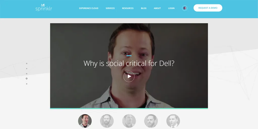
In this case, we deemed a “marketing” video to be almost any kind of embedded video which did not serve to show the app or service in action. Therefore, these videos were anything from customer testimonies to captioned footage to full animated introductions.
As for using marketing videos for developer tools startups, the difference is notable:
- 20.41% of developer tools startups had a marketing video
- 34% of non-developer tools had a marketing video
This does not seem all that logical at first. Videos are one of the easiest (and quickest) ways to demonstrate the basic idea behind a product or service. However, this could, once again, be due to the target audience itself.
Developers are a much more specific market, and so their needs and prior knowledge can be much more safely assumed. As such, a video is not necessarily the easiest way to describe what a product does, since there is a barrier (pressing play) to actually getting that information.

Instead, you can use more complex language to summarize your product in fewer words. Your audience will be more likely to understand industry-specific jargon.
Speaking of which…
The average reading grade of their copy was 6.61
As noted above, the average reading grade of the copy on each home page was 6.61. This makes sense. The simpler your language and format, the easier it will be for your audience to comprehend what you are trying to say.
It also falls beneath the general consensus that your copy should be below 10th grade reading level at most, and ideally below 7th grade.
As for the difference between developer and non-developer startups:
- 7.31 was the average reading age for developer tools
- 5.92 was the average for startups in general
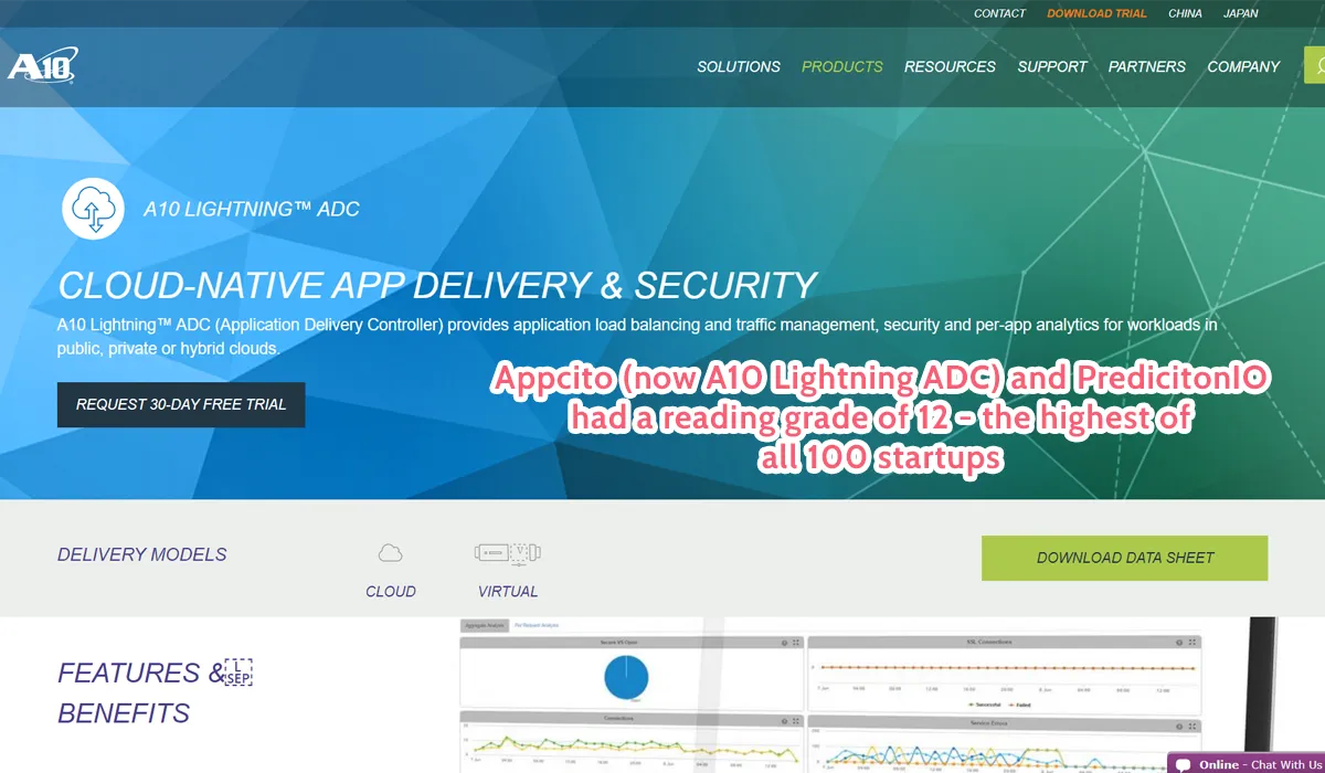
This once again shows the difference in the intended audience. Developer tools serve a more specific purpose, and an audience who likely have some kind of previous experience with language a wider audience might find difficult.
In other words, while you still need to keep your copy simple when marketing to developers, you can warrant using slightly more complex terms to better summarize what you are offering. Terms like “API” and “developer stack” mean nothing to most, but when your target audience is all but guaranteed to know what they mean, it pays to take advantage of that.
The average word count was 609.83
Next up we have the word count of the home pages. With an average of 609.83 words, you do not exactly have much room to mince your words.
You need to cover everything you can, and you need to do it in the smallest number of words you can without making the content less valuable. Also, bear in mind that this was just the average. There were many pages which contained even fewer (and a much smaller number that exceeded 1,000 words), so do not be afraid to condense your information as much as you think you can.
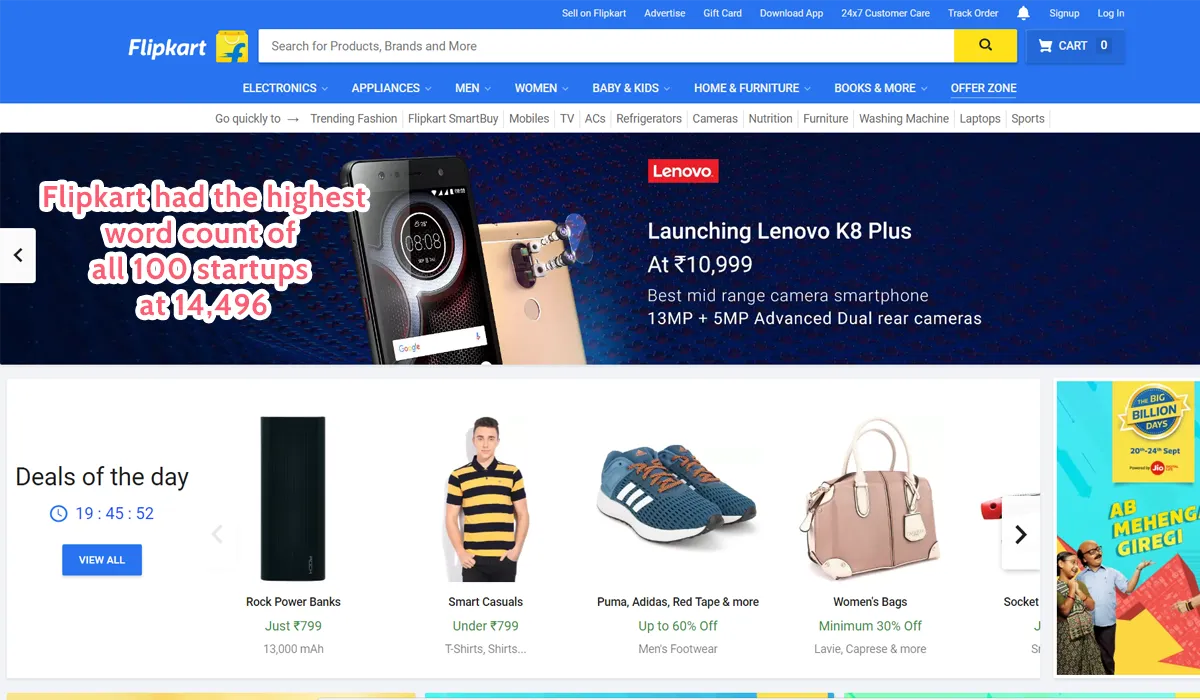
In terms of the different types of startup:
- 412.35 was the average word count for developer tools
- 803.36 was the average for general startups
Despite having a higher average reading grade, developer tools had nearly half the average word count for home page copy. In a way, this almost suggests that developers (more than a general audience) will make a decision on your product extremely quickly.
Remember that not only is the word count almost half that of startups in general, but only 20% use marketing videos (compared to the wider 34%). In other words, developer tools startup home pages on average take far less time to browse through in full.
If you are aiming to target developers, keep things even shorter than you might first think.
Jargon made up 5.75% of each page’s word count
Finally, we also took a look at the percent of each page’s word count which was made up of jargon. This was done using Clarity Jargon Buster, a tool that analyzed text for common jargon terms such as “actionable.”
The specific terms included as “jargon” were not disclosed by the tool, and so we cannot say for certain what words or phrases were picked up. Having said that, there is no one agreed upon definition for what jargon consists of.
While the specifics of what makes up jargon are vague, the same definition was applied to every home page, so at least the measure was consistent.
Anyway, the average amount of each home page’s word count that was made up of jargon was 5.75%. Combined with the average word count itself, this means that around 35.07 words of jargon were present on every home page.
As for the averages of developer tool startups versus general ones:
- 6.11% was the average jargon amount for developer tools startups (37.26 words)
- 4.72% was the average jargon amount for startups in general (28.78 words)
While the difference between these two is a mere 1.4%, when put into context that is a massive difference in terms of the level of jargon the audience is exposed to.

This does, however, make a fair bit of sense. Technical language is usually considered to be jargon, and while it is not usually good practice to include too much, when targeting developers you are free to include more technical language, as your audience will understand those terms.
How to apply these findings to your own home page
Whether you are trying to sell a product, build a blog, or guide your audience to further action, there is little point in taking a stab in the dark. Instead, it pays to look at current success stories and take what they do as a foundation to start from.
Although a lot can be learned through looking at this data and seeing what the average results are, it is worth bearing in mind that there are plenty of exceptions to the rules this sets.
Every company’s audience is going to differ in some way or another, and these differences mean that you will need to take different approaches to making the best home page possible.
The principles in this study, clear CTAs above the fold, restrained use of pricing, social proof for trust, and concise copy written at a low reading grade, remain as relevant today as they were when the data was collected. What has changed is the tooling: AI-powered personalization can now dynamically adjust CTAs and messaging, interactive product demos replace passive videos, and modern business tools can automate the testing and optimization of every element on the page.
If in doubt, try out the tips above and measure the results (conversions, click-through to key locations on your site, and bounce rate). If it works, keep it up, and if it does not, take the opportunity to cater more to your specific audience.
The post 11 Best Home Page Tips From Analyzing 100 Startups first appeared on Process Street | Compliance Operations Platform.