
How to style dashboards
Blog: Aris BPM Blog
In one of my previous blog posts, I showed you how to prepare a dashboard including a pie chart. On your dashboard, you can have multiple fields to display various data, graphs, statistics, results, etc. To have an easy-to-read and well- organized dashboard, you can style it according to your preferences.
The first step is to create a dashboard (see my post “How to start your first dashboard“).
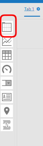
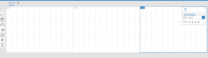
To create a new layout field that will display your data, use “Layout group” on the left side.
You can expand layout groups over multiple columns and adjust the groups according to your needs. You can also add or delete rows inside a layout group. To do this, use the toolbar on the right side.
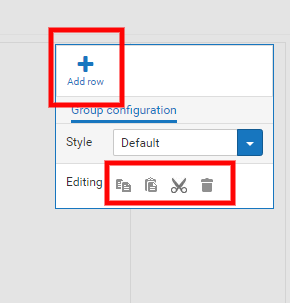
Once you have prepared an area and want to use the same settings in other groups, you can just copy the area using the toolbar. If you want every layout to look differently, you have to style every single one separately.
If you select the layout group, you have the possibility to select predefined styles in the configuration window, e.g., “Card-White”. The “Card-White” style sets the background color of the layout group to white, for example.
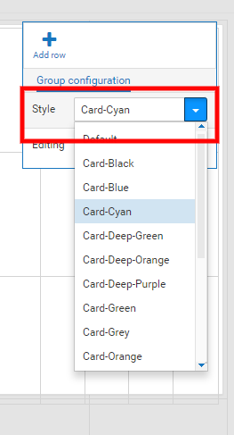
Using the “Card-White” style also adds space between the layout groups (see the next picture).
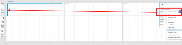
Select a row in the layout group. You can use a marker style to mark headlines with specific colors. This improves the structure of your layout group. Click the row you want to style and choose the relevant marker style.
If you want to add text to your box, choose the “Rich text area” widget and place it in your preferred area.
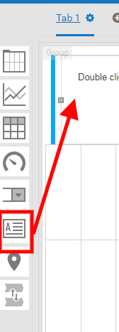
If you double click the area, you can write text and adjust it based on your needs (style, size, color, etc.). You can choose between various text styles.

You can style both the text and your widgets.
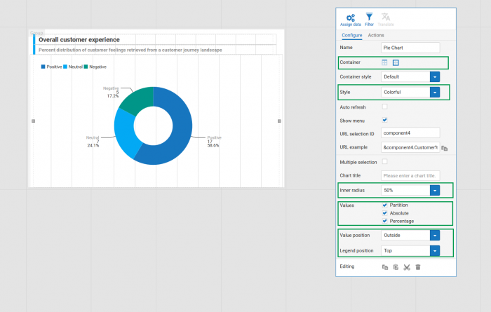
You can do the following to style the widget in your preferred way:
- You can change the color of your graph (I chose “Colorful”).
- By changing the value of the “Inner radius” option, you can change the size of the inner (white) circle.
- You can decide how a value is to be displayed. Available options are “Partition”, “Absolute”, and “Percentage”. If you use “Absolute” or “Percentage” for displaying a value, it is recommended that you add a legend to your widget. The legend can be displayed beside, below, or above the pie chart..
- You can hide header and border
- ….
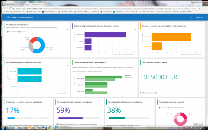
For different layouts you can use a different data display (graphs, grids, numbers, pictures, text, etc.) depending on the information you want to display (just drag the option you choose on the left side and drop it where you want). For styling, you can also use the toolbar that is displayed after you click (left or right) the object you want to style. The final dashboard might look like this, for example:
Leave a Comment
You must be logged in to post a comment.