Top Free Spotfire Templates on Exchange.ai
Blog: The Tibco Blog
We all know that TIBCO Spotfire is a powerful tool that packs a lot of functionality on your screen. As someone who is tasked with a creative data project—whether it’s a new dashboard for your team or a personal tool to do some fast visualization and calculations—Spotfire can get the job done. With Exchange.ai, you can get it done faster and better.
Here’s a list of some top free templates on Exchange.ai:
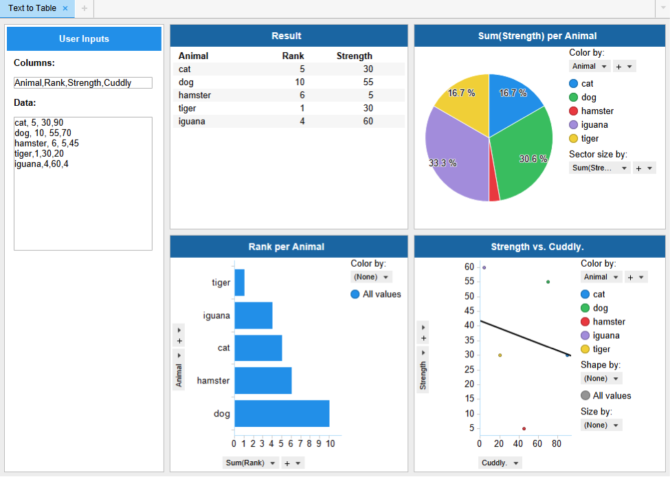
Sometimes you just want to generate a quick table in Spotfire without having to go through the hassle of building something in Excel. This template walks through how you can convert user text input to a new data table. If you are working on a project that needs on-the-fly data that users can paste in, this is a great module to bring in. Check out the full blog on it here.
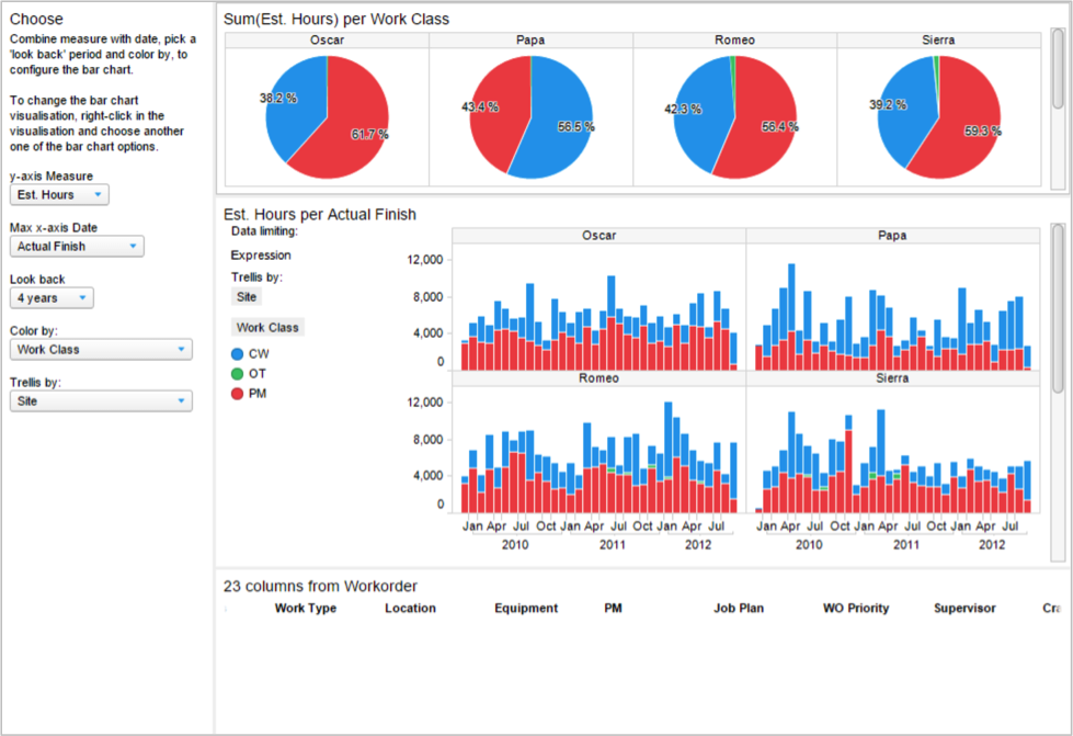
2. IBM Maximo Workorder Starter Template
GreyCloud provides this awesome template for visualizing workorder data from IBM Maximo. It demonstrates how you can put together a very powerful dashboard with UI controls in the text area and nice color coordination across charts. This also provides a good model for using Spotfire as a front-end for vendor systems that have a database backend. It comes complete with an SQL script for creating and viewing your Maximo database that Spotfire can pull easily. There are lots of those vendor products that could use a facelift, right?
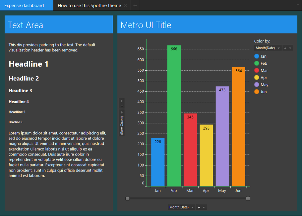
Feeling like your dashboard is coming off drab but you have no idea how to pick a color palette? This easy-to-use theme gives you a nice Windows-y Metro look. Spotfire as of 7.0 allows you to change the visual theme of your DXP. This a great way to skin the analysis so that it matches your company’s or client’s style. The bold look of the Metro UI theme is great for Spotfire, giving it a touch-friendly design that looks fantastic on mobile and tablet. Once the theme is downloaded and saved in the library, it can be dropped into any analysis, making it quicker to customize your work with a theme.

4. KPI and Map Charts to Track Zika Virus
If you want to see the new Spotfire features in action, check out this free template that visualizes the spread of Zika from South America northwards. Data for Zika cases comes from the Pan American Health Organization. Spotfire 7.6 packs great new features including the waterfall chart, a highly requested visualization that helps users understand a set of positive and negative values over a period of time, as well as a KPI chart, a touch-friendly visualization for presenting critical benchmarks and metrics.
About Exchange.ai
Build your BI and data science project with a rapidly growing community of data creatives. Exchange.ai is a marketplace, where data creatives sell ready-made templates and extensions to help accelerate your analytic projects. Buy anything from dashboards to advanced data science and new visualization types.
Leave a Comment
You must be logged in to post a comment.