
Getting the most out of your burndown chart
Blog: Monday Project Management Blog
A recent survey found that Scrum is still the most popular Agile framework by a longshot. As Scrum continues to gain popularity, more and more people are asking questions like:
What is a burndown chart?
And how can I use one to ensure my team’s making good progress on our current project?
In Scrum, how you work is just as important as the work itself and the progress you make.
Get it right, and you’ll unleash a consistent formula that’s easily replicable. Do it wrong, and you may end up making more work for yourself.
If you’re new to Scrum, you’ll quickly figure out that it’s not about the individual pieces, ceremonies, or artifacts, but all of it working in unison.
Sure, there are hybrid methods that create a Frankenstein Agile approach, but it’s important to fully understand the basics before jumping ahead. That’s what we intend to do with this article.
Here you’ll find a detailed definition of burndown charts, the benefits of implementing one, how to accurately use one, and a few more common questions answered:
What is a burndown chart?
Like you, I often catch myself thinking that there aren’t enough hours in the day to get everything done. If only there were a few more hours of uninterrupted time that I could capitalize on.
The best leaders know that getting a grip on the day-to-day requires data. Only with clear data can you expect to deliver outcomes on time, within budget, and to satisfaction.
A burndown chart collects project data for that exact purpose.
Burndown charts are visual representations of a project’s progress. As your team works through backlog items and customer stories, their progress “burns” the chart down to zero.

As you can see, the burndown chart provides a simple visual that shows complete work and what’s left. It’s a simple visual of the number of days in the sprint or project compared to capacity or tasks remaining. While burndown charts will vary by industry, there are 2 main types:
- Sprint burndown charts — track the work remaining in a sprint.
- Product burndown charts — track the work remaining in the entire project.
Each tracks the project and the work in a similar way, but the sprint burndown chart focuses on the short term while the product burndown chart has more of a long-term view.
Why is a burndown chart valuable?
Your sprint or project is only as good as the outcome it delivers. For some stakeholders, the finished product is everything, no matter the budget. But let’s face it, no one is happy when a project is delivered months — or even years — late.
For most teams, there’s a balance of providing value to the consumer and delivering in a timely and budget-conscious manner.
Burndown charts are for those that care about delivering on time — which is the majority of us.
If you’re looking to fulfill your sprint obligation or deliver on the product you promised, then burndown charts are invaluable for tracking completed work and overall project progress. Burndown charts also:
- Act as a simple status report that keeps everyone on the same page.
- Help identify issues so you can clear bottlenecks before they become problems.
- Motivate the team by showing how much work they’ve accomplished.
- Track velocity so you can measure progress for future work in a more accurate way.
Ultimately, burndown charts help you stick to your plan, or at the very least get close to it.
The difference between burndown and burnup charts
Burndown and burnup charts are both essential to managing your Scrum workflow effectively, but they’re ultimately 2 different things:
- Burndown charts manage the work remaining.
- Burnup charts show how much work you’ve completed.
Project managers use burndown charts to evaluate whether things are progressing as expected or not. They also use them as a visual aid to determine how much work and time left there is in the project.
Project managers use burnup charts to motivate their teams. When projects are large and complex, it’s easy to think about what’s left ahead instead of how much you’ve already accomplished. Burnup charts make it easy to celebrate what’s already checked off.

Burnup charts also give you a running total of the entire scope, which makes it easier to see changes.
If you had 50 items left to complete yesterday and you have 50 items left to complete today, a burndown chart will tell you that the amount of work left didn’t decrease — which could make it look like you just lazed around for an entire day.
With a burnup chart, you can easily tell whether there’s still 50 items left because nothing got done, or because more items got added (i.e., if you completed 20, but the client just added 20 more.)
Here at monday.com, we find both charts useful… but neither one of them really has the level of detail and flexibility we know is important for Scrum teams. That’s why we provide 8 different data visualizations.
That’s right, 8!
You get Gantt charts, timeline, table, Kanban, calendar, workload, form, and chart views.

Take the Gantt chart above as an example.
It’s still technically “burning down” and provides even more data than simple progress since you see all tasks by phase, their dependencies, key milestones, and more.
How to use a burndown chart
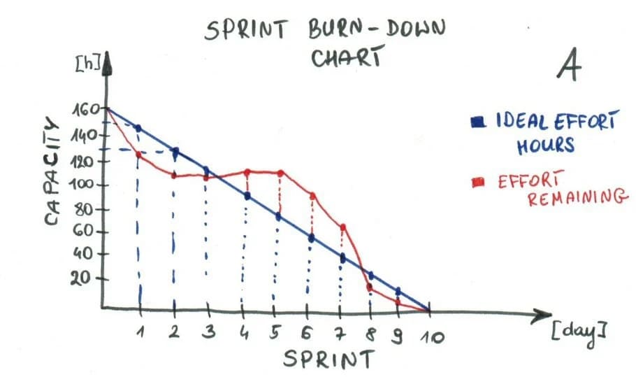
The simplicity of a burndown chart lies in each axis. On the y-axis, you have the total work remaining either represented in capacity, story points, or number of tasks. On the corresponding x-axis, you have the time, often represented in days.
From there, the work is denoted by 2 lines. One that shows “ideal” work remaining (often in red) since that was your original plan. Next to that, you’ll have a blue line showing actual work progress.
Let’s take a closer look at how everything takes shape:
Creating estimate effort
If you’re working in sprints, then there’s a core question you have to answer upfront:
What are your baseline available hours over the entire sprint?
In the simplest terms possible, this is essentially the available hours divided by the number of days. In this example, we have 80 hours divided over 5 days.

As you can see, it provides a running total starting with 80 hours and working its way down to zero by the final day.
Tracking daily progress
Now that you have a baseline view of effort, you can measure daily progress in a similar table beside each task. In action, teams typically form an arc on the burndown that ramps up in the beginning, dips toward the middle, and corrects at the end to finish on time. But every team and project will vary.
In action, this might mean Day 1 starting off strong with 3 hours of work, dipping to low levels by day 3, then finishing strong on day 5 with 4 hours.

Since we’re tracking estimated effort and not actual, we can use a similar pattern across the board.
Again, this is ideal work, so the progress will look uniform and ideally shift as you get more sprints under your belt to reflect reality.
Computing actual effort
Total remaining effort gets captured at the end of the workday to keep the measurement as accurate as possible. Since we’re no longer estimating, this is arguably the easiest part because you simply jot down the total sum of hours/effort performed and remove that from the effort remaining:

Again, work here will fluctuate based on the project, sprint, team, and a million other factors.
Be honest with yourself and jot down as accurately as possible to get the most out of your burndown chart.
Obtaining the final dataset and plotting the burndown
Once the data is available, you can create the burndown chart based on the tables created. In Excel, it’s a simple line chart that’ll show effort on the y-axis and days on the x-axis. Then you have 2 simple lines showing actual effort and estimated effort.

Ideally, the two lines are right on top of each other, meaning that planning and actuality are one and the same.
The other 2 scenarios include:
- When the actual work line is above the ideal or estimated work line (as shown on Days 3 & 4 in the image above.) This means there’s more work left than you expected, and the sprint is behind schedule.
- When the actual work line is below the ideal work line (as shown on Days 1 & 2.) This means there’s less work left than you expected, and the sprint is ahead of schedule.
It doesn’t get much more simple than a burndown chart that shows whether you’re ahead of schedule or behind.
Keep in mind, though, that a burndown chart doesn’t tell you why you’re ahead or behind. And knowing you’re behind without knowing the cause, is well, pointless.
That’s why monday.com offers intuitive, customizable, real-time dashboards, where you can see all of your essential metrics in one place, and drill down into the individual board data to understand what’s driving your results.
Related burndown questions answered
Burndown charts are simple in nature, but there’s plenty of questions that dig below the surface to get to the root of their value.
To help drive the point home, we’ve rounded up a few more frequently asked questions that’ll help you get the most out of your burndown charts and keep your project on track:
Who creates the burndown chart?
A common role in Scrum project management is the Scrum Master. Typically they’re the ones creating and keeping up with the burndown chart since their chief responsibility is making sure all processes are running smoothly so the team can focus on their tasks at hand.
Also, modern software makes it easier than ever to automate your workflow and keep the Scrum process flowing.
Take monday.com as an example, it’s a Work OS that makes it dead simple to create Scrum boards, plan, and track your sprints.

In situations where there is no Scrum Master, the product owner, development team, and other stakeholders manage themselves and work jointly to create and maintain their systems, including the burndown chart.
When should the burndown chart be updated?
It’s ultimately up to the team to update the burndown chart since they’re self-organized.
As we alluded to above, some companies use Scrum Master roles, which is a possible answer here as well. That way, the team can fully focus on user stories and not what many developers refer to as project administrative tasks.
However, modern Work OS like monday.com has built-in automations that’ll help keep things on track without the need for a bunch of data entry.
Charts will update when you change the task’s status, and you can set email notifications, so all stakeholders are informed of your progress.
Is the burndown chart a Scrum artifact?
Yes and no. Technically, it’s not a Scrum artifact, and the Scrum Alliance would back us on that.
Some companies add it to their long list of Scrum artifacts, but there are technically 3 official artifacts which include the product backlog, sprint backlog, and product increment.
- The product backlog is a comprehensive list of everything the team needs to complete before the project’s finished. In software development, the product backlog is truly never complete because feature suggestions are endless.
- The sprint backlog is just like the product backlog in that it’s a comprehensive list of items that require completion. However, it’s a prioritized list that’s relevant to the current sprint, which has a desired outcome or deliverable in mind.
- Product increments are the sum of all product backlog items your team completed during a sprint, plus the value of all the previous sprint increments.
The burndown chart is useful for ensuring the project or sprint is on track, but it’s not a list or a deliverable like the other 3.
What are the limitations of burndown charts?
Burndown charts are one of many tools you can use to keep your sprint or project on track. For many people, burndown charts are simple and straightforward enough to get the job done.
For others, burndown charts represent an imperfect tool that’s definitely got a few limitations. For starters, they rely heavily on accurate sprint planning. If your estimations are off, then the burndown chart won’t reflect reality.
They also don’t take backlog items into account. Scope creep is real, and if story points are added or removed, it’s going to irreversibly shift your timeline.

Don’t settle for Excel or some third-rate Work OS that won’t automate your team’s work or flex when you need it most.
monday.com will keep your time connected, mobile, and on the same page at all times.
Getting started
While monday.com doesn’t have a native burndown chart, it does have one on the monday.com marketplace that you can seamlessly integrate with the platform.
With it, you’ll determine if the team finishes early, misses from too much work, or if your estimations are off.
If you’re ready to take your sprints to the next level with monday.com, then check out our Sprint Planning Template. You could be up and running in minutes, and with our 8 data visuals, you can see every angle of your project with the click of a button.
The post Getting the most out of your burndown chart appeared first on monday.com Blog.
Leave a Comment
You must be logged in to post a comment.